|
When we looked at the embroidered chasuble from Fritzlar with the Virgo inter Virgines iconography last week, I was sure that I would be able to find many Doppelgänger. I had seen this iconography many times before and I was quite sure that these pieces were all very similar. Nope. They are not. As soon as you start to look at these pieces in more detail you will find that they are all different. Either in the placement of the individual figures and/or in the embroidery techniques used. Now what does this mean? On the one hand, these pieces are readily recognisable as a group and on the other hand, they are all different. This, I think, must mean that there was a late medieval model book that was in use by embroiderers in Central Europe. As no medieval model books used by embroiderers seem to have survived, reconstructing one using actual medieval goldwork embroidery is pretty exciting.
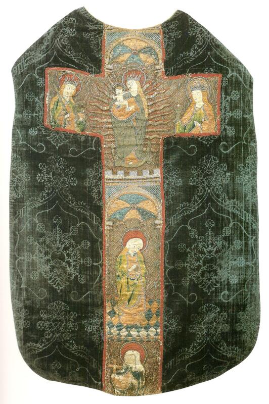
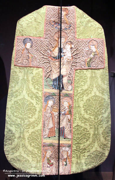
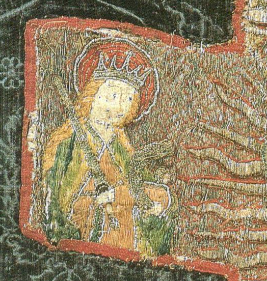
Here you see two typical embroidered chasuble crosses showing the Virgo inter Virgines from the late 15th century. The left chasuble was made in Austria in the second half of the 15th century and is kept at the Hungarian Museum of Applied Arts. The piece on the right is part of the private collection of the Bernheimer family. It was made in Southern Germany shortly before AD 1500. In both embroideries, Mary is depicted as the Madonna with child standing on the crescent moon with rays of light behind her. This 'Mondsichelmadonna' was very popular in the 15th century and refers to the Woman of the Apocalypse. On both embroidered chasubles the figures accompanying the Madonna in the large top orphrey are Catherine of Alexandria (with sword) on the left and Saint Barbara (with chalice) on the right. Everything else differs. No angel is crowning Mary on the Bernheimer chasuble. The figures in the two smaller orphreys below the Madonna differ for both embroideries too. On the left, we see Saint Apollonia (?) followed by Saint Ursula. On the right, we see Mary Magdalene followed by Catherine of Siena (?). When we look at the embroidery techniques used, there are differences but also many similarities. For starters, the colours used are very similar. There's mainly blue for Mary and a combination of green and orange for the other virgins. Both embroideries use the same diaper pattern for the golden background: open basket weave. Couched down with a yellow thread for the piece from Austria and couched down with a red thread for the piece from Southern Germany. The treatment of the halos is also identical. There's a layer of silken flat stitches as the base with a couched gold thread on top. The halo is edged with one of these composite threads: a thick textile yarn with a gold thread wound around it. This is sometimes called gold gimp in the German literature. These similarities in both iconography and embroidery techniques show that these pieces are made in the same geographical area. After all, Southern Germany shares a border with Austria. The differences show that the pieces were not made in the same town or guild. Likely, the customer could choose which additional figures to add to the central scene of the Madonna. These additional figures likely had some special meaning for the customer. As the iconography of the Virgo inter Virgines is strongly associated with convents, name days and patron saints of the nuns probably played a role here.
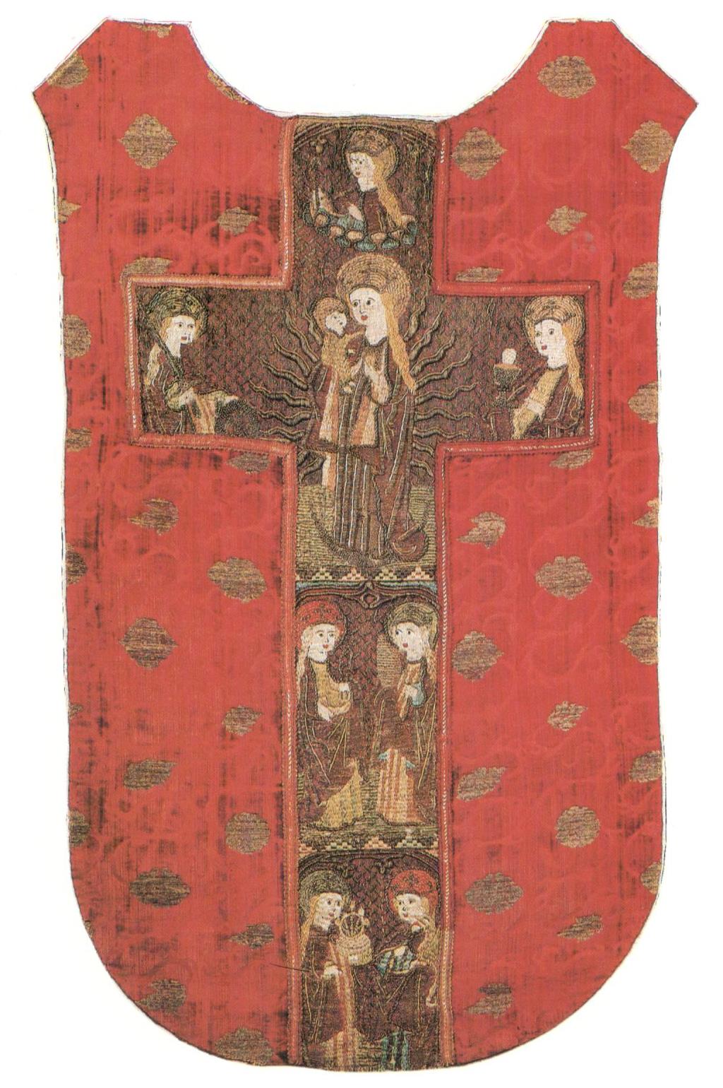
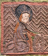
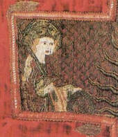
And here you see the other main type of the Virgo inter Virgines iconography. The central top orphrey with the Madonna is very similar to that of the two previous examples (Catherine, Ursula, Barbara and Madonna). However, the two smaller orphreys below now show two saints each. We see Dorothea of Caesarea (basket) with Margaret the Virgin (dragon) and Saint Apollonia (thongs with tooth) with Mary Magdalene (ointment box). These two chasuble crosses are identical in their iconography. The treatment of Saint Ursula on a cloud above the Madonna is only seen on these two embroideries as far as I am aware. But there is more. There are other identical embroidery techniques too. See the bands that separate the different orphreys? They are made by couching silk and gold threads over horizontal string padding. And they are identical on both embroidered chasuble crosses. To me, this suggests that both embroideries were made in the same town. Will we ever find out which one?
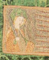
And when we look at the Saint Catherine's of all four embroidered chasuble crosses, they look pretty similar. How did this happen? In the 15th century, ecclesiastical embroidery had already evolved into mass production. Certain scenes were very popular and every self-respecting church wanted them. The 15th century also saw the invention of block book printing (major centres in the South of Germany) and the printing press (invented in Mainz, Central Germany). Likely, cheap block books with simple line drawings of the different Virgins existed in this geographical area too. These would have been used in the embroidery workshops as design inspiration. Designs would have been drawn free-hand or by using a grid to enlarge them more easily. Especially the faces differ between the various versions of a particular figure. This seems to be quite understandable as this is the hardest thing to get right in both drawing and subsequent embroidering.
By consequently digitizing these embroidered figures into line drawings and combining these with the used embroidery techniques, I have a feeling that it should be possible to group them. This hopefully leads to more precise provenances for these embroidered chasuble crosses. It should also help with the identification of incomplete figures on cut orphreys. I am planning to spend my summer holiday learning how to digitize with the help of Inkccape. In the meantime, I am collecting the Virgo inter Virgines embroideries on a Padlet for my Journeyman and Master Patrons to enjoy. Next week, we will work a practical sample based on the above embroideries!
1 Comment
Have you seen my new blog index? So far, all blogs up until January 2020 have been neatly indexed. You'll find a list of book reviews, my projects listed according to embroidery techniques, historical embroideries listed according to century and a complete list of all tutorials. Today's tutorial is all about the white string we see in many medieval goldwork embroideries. This padding is often all that remains from the original bead embroidery worked with freshwater pearls. When we are really lucky, a few pearls still adhere. As is the case for the chasuble I showed you two weeks ago. In this tutorial, I will show you how the padding and the beading were worked. I was really surprised by how sturdy this technique actually is. The beaded edge is VERY firm. 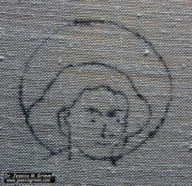 Inked design drawing on my linen embroidery fabric As always, I worked my sample on a piece of high-count (think 40ct and up) linen stretched on my slate frame. I determined the approximate size of St John's head with nimbus from the original embroidery. It is about 5.3 x 5.9 cm. I made a pricking on transparent paper and transferred the design with pounce powder and ink. 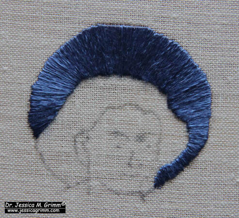 Adding a layer of satin stitches As is a favourite with medieval embroiderers, the simple nimbus is actually built up of several layers of embroidery. Start with a layer of radiating satin stitches in blue flat silk. The radiating does not need to be super precise. You can hardly spot the radiating stitches once the next layer of embroidery has been worked. 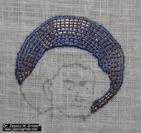 Adding the couched gold The next layer consists of couched gold thread. Use a fine red silken thread for the couching. Work from the outside in. The first few rows consist of a double gold thread, whilst the last couple of rows consist of a single thread. In the original, the embroiderer would have hidden de turns under the slip of the head of St John. I have turned my threads on the edge of the nimbus. 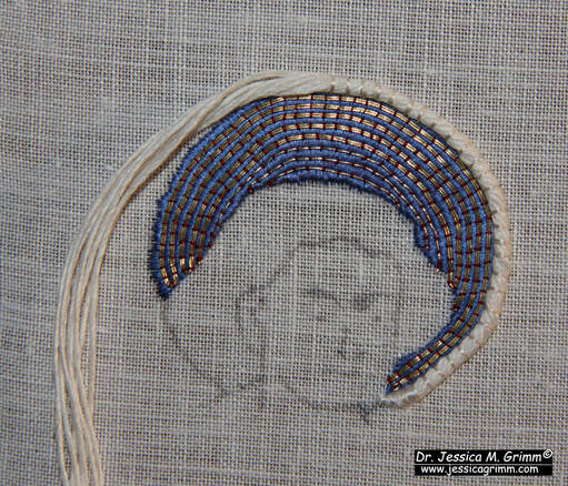 Adding the string padding for the beads It is now time to add the actual string padding. It is made up of a twisted-together bundle of linen threads. These are couched down with white silk. Start from the middle and retwist your bundle as you go. The ends seem to be tapered in the original. To achieve this, start to cut away pairs of threads from your bundle about a cm before the end. Keep couching and removing pairs of threads until you are left with a single pair on the design line. 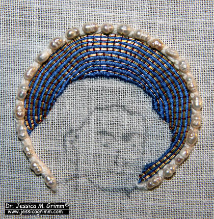 Adding the freshwater pearls onto the string padding Sew down the freshwater pearls (Etsy is a good source for these!) onto the string padding using white silk. You might want to wax your thread as the holes of the pearls can be quite rough. Go through each bead twice. In the original, the pearls are sewn down with a little bit of space between them. This was possible done to save costs. 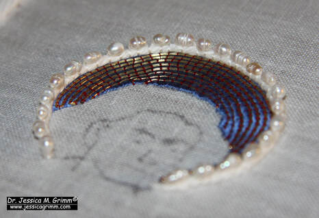 Finished pearl-edged nimbus It is said that the string padding was used to elevate the pearls away from the very shiny gold. It also provided a continuous white edging for when the pearls were slightly spaced apart to save on costs. The end result is very stunning!
As always, my Journeymen and Master Patrons find a downloadable PDF of this tutorial on my Patreon page. For as little as €5 per month, you can build your own library of medieval embroidery technique tutorials. Not a bad deal at all! Last week, we looked at a mid-15th century orphrey from Venice with an interesting goldwork background worked on silk. I've adapted the design slightly and turned it into a goldwork tutorial. The stitching is relatively simple but teaches you a few key things when it comes to medieval goldwork embroidery. Journeyman and Master Patrons find a downloadable PDF on my Patreon page. Becoming a Journeyman or Master Patron is an affordable way to obtain an archivable goldwork lesson each month. Let's dive in! 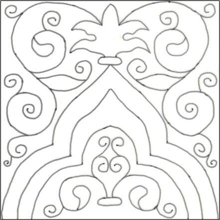 The design should measure c. 10 x 10 cm. This is approximately the size of the original. However, I've squared it off a little to make it look like a Moroccan tile. It is best to work a project like this, there is some heavy goldwork, on a professional slate frame. Dress it with a layer of high-count linen (40 ct or up would be good) and apply a piece of silk on top. You can find my free video tutorial on the process here. Transfer the design any way you prefer. I've used prick-and-pounce and watercolour paint. 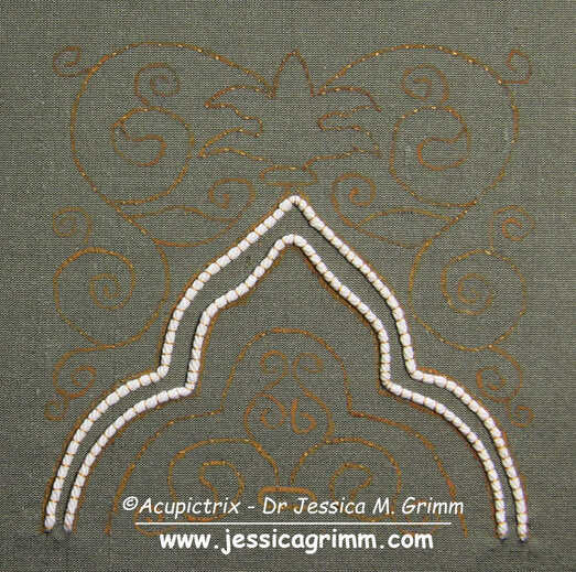 You will need to fuse your silk to the linen with tacking stitches on all the major design lines. This is basically a running stitch with a short stitch on the top and a long stitch on the back. Use a gold-coloured silk or sewing thread for this. Next, attach the white string padding by couching it down securely with the same gold-coloured thread. The padding threads need to lay well within the design lines. The design line is where your gold threads will turn. You do not want the padded area to encroach on the rest of the design. 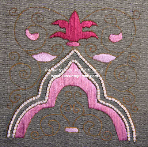 Time to fill the appropriate areas with silken satin stitches. The original shows quite stark shading and the silken areas have a very stripey appearance. The satin stitches are also worked a little 'open' with some background fabric showing. Instead, I've opted for solid fillings. There is no split stitch edge beneath the satin stitches as all the edges are going to be covered with gold. This will neaten them automatically. (Please note: I forgot to fill in the two small leaves at the bottom!). 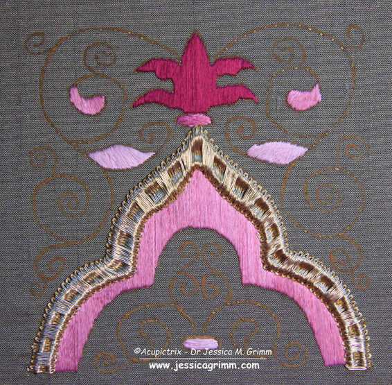 Couch down the gold threads over the padding. Gold threads are couched down in pairs. Start in the middle of the shape. I've used Stech 70/80 which is comparable to passing thread #3. The couching rhythm is as follows: 5x with an extra couching stitch in between the padding threads and 5x without this extra stitch. Alternate all the way down. You will need to fudge a little as you start vertical, but need to end horizontal. 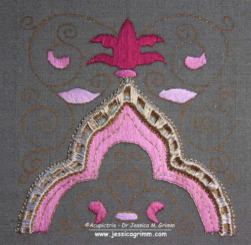 Couch two single lines of gold thread in place on the pink area underneath the padded gold. How you end your gold threads is up to you. You can either plunge and tie back on the back or you can oversew on the front and clip.  The 'only' thing left to do, is to cover the tendrils with couched gold. You aim for as few starting and stopping points as possible. And you try to hide starting and stopping under subsequent goldwork. This was common practice in medieval goldwork embroidery as it made the finished product more durable. And that's your goldwork project finished!
This is the last blog of the year. The next one will appear on the 8th of January 2024. Between now and then, I will be finishing off some loose threads. I will probably need to close the webshop just before the end of the year to implement some changes. Next year will hopefully see the delayed release of my next self-paced online embroidery course. I am very close to finishing it! Wishing you all a lovely holiday season and all the best for 2024! Thank you for being such a loyal audience. Last month, we looked at some early 15th century embroidery from Venice, Italy. You can read about it here: Cope of Pope Gregory XII, further early 15th century embroidery from Venice and a tutorial. This week, we will look at a Venetian piece from the second half of the 15th century. It has some lovely embroidery techniques that would work well for modern goldwork embroidery. And the embroidery background is a bit unusual as well. Instead of using a diaper pattern, it is made of floral motives stitched directly on coloured silk. Let's have a look! 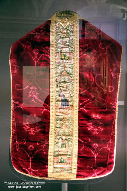 Chasuble from the parish church of Saints Philip the Apostle and James the Apostle, Azzone (Bergamo), Italy I saw the above chasuble at the exhibition in Castello del Buonconsiglio in 2019. The exhibition presented an overview of medieval goldwork embroidery made in Italy; complemented by those pieces that were obtained by trade from Northern Europe. The chasuble is kept, and still being worn once a year!, at the parish church of Azzone, near Bergamo, in the Scalve Valley. The valley came under Venetian rule in 1427 and this probably explains why this piece of Venetian embroidery can be found in Azzone. The chasuble has an embroidered orphrey cross on the front and an embroidered orphrey column on the back. As the figures on the front cannot be identified, the exhibition showed the back. Here we see John the Evangelist at the top, followed by a male martyr with a palm branch and architectural model (According to the literature it is a church. However, it looks more like a castle to me.) and the figure at the bottom is Saint Barbara with her tower. Saint Barbara is the patron saint of miners. The Scalve Valley was famous for its iron ore mines. 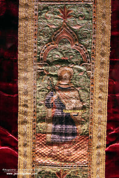 Orphrey with the male martyr on the chasuble from the parish church of Saints Philip the Apostle and James the Apostle, Azzone (Bergamo), Italy The embroidery is executed on a layer of silk backed with linen for the background and a layer of linen for the figures. The heads were embroidered separately. The finished orphrey column was stiffened with cardboard. The orphreys measure about 33 x 12 cm. 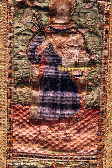 Detail orphrey with the male martyr on the chasuble from the parish church of Saints Philip the Apostle and James the Apostle, Azzone (Bergamo), Italy The embroidery is a rather simple, yet very effective, affair. The figures stand on a floor made with laid shaded silk and couched down with a trellis. By having the lighter colour at the front and the darkest colour at the back, the embroiderer created a sense of depth. The undergarment of the martyr is stitched in a similar way. This time, the laid silk is couched down horizontally. The cloak consists of horizontally laid pairs of gold thread which are couched down with white silk. Folds are accentuated with couched coloured silk. The heads are stitched in split stitch.
The treatment of the background behind the figures is quite special. The coloured silken background is part of the design. It is covered with the obligatory arch under which the saint stands. The background is further filled in with tendrils and floral elements. These are made by couching down a pair of gold threads and filling in some elements with shaded satin stitch. The frame around the orphrey consists of a very simple padded basket weave over two padding threads (over three is probably more common). All in all, the embroidery techniques used (laid work instead of brick stitching for the undergarments, simple monochrome couching for the cloaks instead of or nue, embroidered coloured silk for the background instead of a diaper pattern, etc.) are simple and far more speedy to execute than or nue, brick stitching and diaper couching. This likely means that these embroideries were not as expensive as the ones we investigated last month. Literature Prá, Laura Dal; Carmignani, Marina; Peri, Paolo (Eds.) (2019): Fili d'oro e dipinti di seta. Velluti e ricami tra Gotico e Rinascimento. Trento: Castello del Buonconsiglio. FINALLY: three years and one month after I ordered the above title, it finally arrived a couple of days ago. It is the third (and last) volume on a research project regarding the Imperial Vestments kept in Bamberg. I have written two previous book reviews which you can find here: volume 1 and volume 2. And I have written several blogs (you can scroll through them) before about the Imperial Vestments. These are six embroidered textiles associated with Emperor Henry II and his wife Kunigunde. They date to the first quarter of the 11th century. Although none of the vestments has survived in its original shape, they are among the oldest complete gold embroidered vestments in the world. Hence, they are unique and pretty important as objects of study. This third volume was the volume I looked forward to the most as it contains the "Art technology and material science aspects" (i.e. the materials and the way they were used) of the research. Let's see if my expectations were being met. 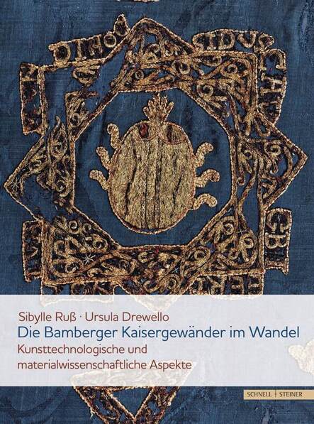 The book is divided into two main parts. The first part is written by Sibylle Ruß. She is a conservator and restorer of cultural property. She started her education at an embroidery workshop and finished with a Gesellenprüfung (Journeyman examination) before being trained at the Germanisches Nationalmuseum as a conservator and restorer. Sybille describes each vestment in great detail. Especially the different conserving and restoring measures which took place over the centuries. The original embroidery does not get nearly as much attention. This is a missed opportunity. Some things I miss: how where the gold threads being turned? Are the gold threads plunged or just secured on the front with a few extra couching stitches? What are the stitch lengths of the stem stitches? A huge amount of raw data has been collected for this research. There are tantalising glimpses of this data in the form of drawings of the individual design elements with their gold thread directions and couching patterns. I would have loved a CD with this additional information accompanying the book. I am also missing digital reconstructions of the original embroideries. This has been done for some other medieval goldwork embroideries (most notably the Hungarian Coronation Mantle, which is related to these Imperial Vestments). Some of the embroidery is in such bad shape that a digital reconstruction would have really helped to point out how splendid they once were. 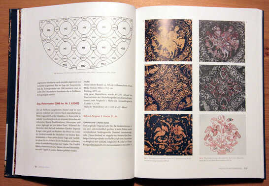 The second part of the book is written by Ursula Drewello. She works at the Laboratory Drewello and Weißmann and was responsible for the material science part of the research project. The dyestuff analysis was done by Ina Vanden Berghe of KIK-IRPA the Royal Institute of Cultural Heritage in Belgium. Reading about the exact composition of the gold threads, the angle of wrapping the gold foil around the silken core, the dye used for the silken core, etc., was really nice. But I am missing something here too: how do these parameters compare to the modern gold threads available from M.Maurer in Vienna and Golden Threads and Benton & Johnson in the UK? These three are the main gold thread suppliers in Europe. In a way, they are the descendants of the medieval thread makers. 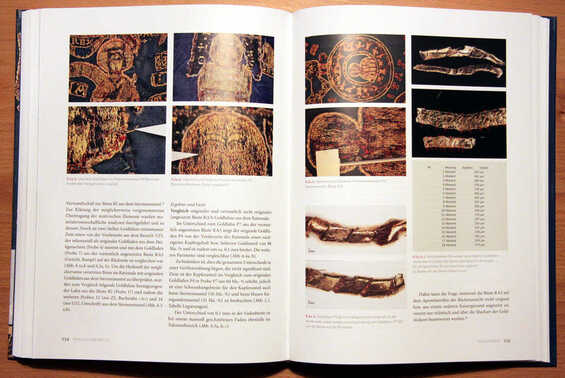 In the second part of the book, there is a whole chapter on design transfer. This is particularly important to us embroiderers. And whilst the chapter is not bad, one conclusion just left me speechless. On three of the vestments (Blue Kunigunde Mantle, Star Mantle and Reitermantle) remnants of the design drawing were analysed. As these remnants did not contain charcoal particles the use of the prick-and-pounce method was excluded. Huh?! Are you kidding me? Really?! All three vestments were made of dark-blue samite. The goldwork embroidery was executed directly on this dark silken fabric. Would any of you use black charcoal for the prick-and-pounce method? I surely hope not. You would use a white powder. And guess what? The remnants of the design drawing of two of the three vestments did contain white substances. The other one used a yellow one. And these substances were (also) used to make a kind of a paint. When you paint over the dots with a similar coloured paint-like substance these two likely mix. When you only have remnants of the design drawing, how can you be so sure that they are not the result of two different steps? Instead, the author proposes that the design was being transferred using templates/stencils. However, they have a tendency to smudge and move when used on textiles with a paint-like substance. Now, let me be VERY clear. I am not saying that the prick-and-pounce method was used for the pattern design transfer on the Imperial Vestments. I cannot prove that. Neither does the absence of charcoal particles prove that the method was not used. 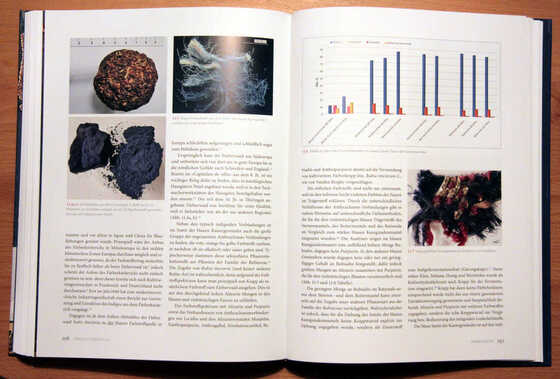 As has been the case before with this project, the inclusion of a professional goldwork embroiderer would have helped. I've written about early glitches before: here. Throughout the book, the authors emphasize the high quality and professionalism of the medieval embroideries. These embroideries and their medieval makers would have deserved a professional goldwork embroiderer on the team! And no, that does not need to be me. I am not the only one :).
In the past two weeks, we have explored the early 15th century gold embroidery from Venice, Italy. One of its characteristics is the ornate orphrey borders with the twisted columns. I've always been curious how they were made! So out came the cotton padding threads and the gold threads and off I went.  Orphrey with Saint Jerome kept at the Museo Diocesano Recanati, Italy. This kind of embroidery is best done on a slate frame. If you would like a reminder of what this is and how to set it up, please have a look at my instruction videos. Next, you will need to attach your string padding. The original uses two different kinds of padding. There seems to be something like soft cotton underneath the twisted columns. And a thinner string is used as padding on either side. I've used two thicknesses of the same cotton string for the padding. In order for the gold threads to be able to sit crisp on the padding, make sure that you couch down your padding well. 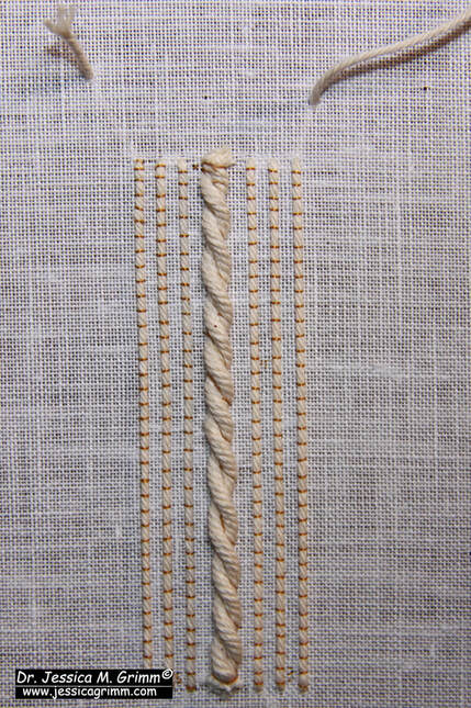 String padding couched down and ready for the gold threads. The gold thread used in the original embroidery is a passing thread. In my recreation, I've opted for Stech 70/80, which is comparable to passing #3. I was also curious to know what the difference would be between a gilt and a real gold thread. I worked the main part of the sample with the cheaper gilt and the bottom section with the real gold (more yellow). I prefer the real gold :). It is a tat better at going and staying where I want it to go and stay. The result is a bit crisper. Still not as crisp as the original, but closer. If you have the opportunity to try different brands of passing thread, please do and see how they behave. 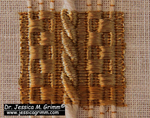 The couching rythm alternates every 6th row. Working over this amount of padding will cause slight problems. Although you place a couching stitch over the gold and in the 'groove' of the twisted column, the gold is not very securely attached in this place. The twisted padding threads are also very round. Your gold thread wants to 'escape' and roll off. This is also visible in the original embroidery. And it comes as no surprise that the embroidery is most damaged in this area.
My Journeyman and Master Patrons will find a downloadable PDF with this stitch sample on my Patreon page. As I am travelling in the coming week, there will be no blog post next Monday. I will be visiting various Diocesan Museums in Germany and the Netherlands. All my Patrons will be able to virtually travel with me as I hope to be able to post some pictures along the way. There will also be a meeting of the Medieval Embroidery Study Group for my Master Patrons on Saturday the 2nd of December at 19h CET. Details can be found on my Patreon page. From last week's blog post, you might have gotten the idea that Venetian goldwork embroideries from the early 15th century are somewhat plentiful. They are not. However, another magnificent piece was exhibited at Castello del Buonconsiglio in Trento, Northern Italy. Some parts are remarkably modern in their appearance. Parts of the design could be easily adapted for modern goldwork embroidery. Let's have a look at the medieval eye candy. 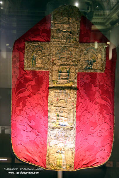 Chasuble, Venice 1410-1420, the Basilica of Santa Maria Gloriosa dei Frari (from the church of San Pantalon) The embroidered chasuble cross on the red chasuble comes originally from the Church of San Pantalon in Venice. It is now kept in the Frari church in Venice. From the top, we see the Resurrection of Christ, Gregory the Great, Saint Jerome and Saint Augustine with angels in the side arms of the cross. There is another corresponding chasuble cross on the front. Unfortunately, the way it was exhibited did not permit the viewer to see the front as well. On that chasuble cross are depicted Saint Mark (tentative identification), Saint Ambrose and Saint Catherine with John the Baptist and a male saint on the side arms of the cross. Personally, I love this type of iconography. We have the four fathers of the church: Gregory the Great, Ambrose, Augustine of Hippo and Jerome. All four are seen as important theologians of the late Roman-Early medieval church (that's roughly 800-1000 years before this embroidery was made). Then there are Saint Catherine and John the Baptist. Two very important saints seen throughout the Middle Ages all over Europe. The story of Saint Catherine is also all about learning, philosophy and theology. A chasuble with a high IQ. 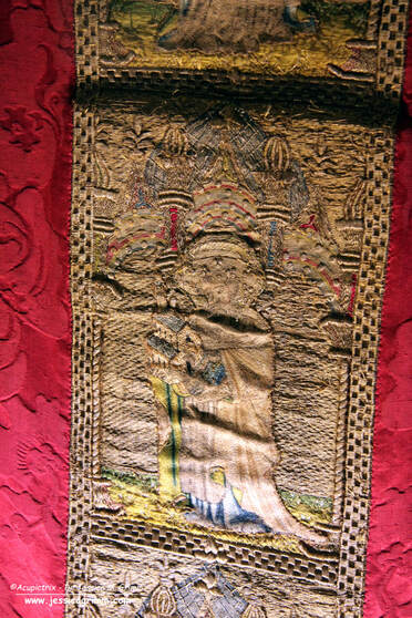 Orphrey with Saint Jerome, Venice 1410-1420, the Basilica of Santa Maria Gloriosa dei Frari (from the church of San Pantalon) As you can see from the orphrey of Jerome in the picture above, the embroidery is a bit damaged. The orphrey has warped quite a bit and this made it difficult to take good pictures. The shaded inky underdrawing is very fine and of exceptional quality. And so is the embroidery (made with gilded silver foil around a yellow silk core or silver foil around a white silk core). The goldwork is very accurate and the silken directional split stitches are very small and regular. As seen on last week's embroidery, the frame around the orphrey is padded. And we see the twisted padded columns again. 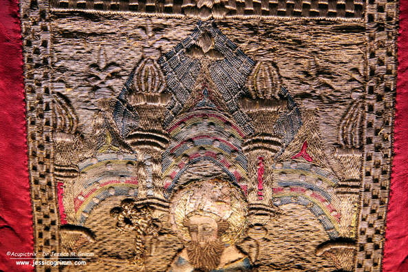 Detail orphrey with Saint Augustine, Venice 1410-1420, the Basilica of Santa Maria Gloriosa dei Frari (from the church of San Pantalon) And did you spot the 'measles'? This time, they are not located on the clothing (except for the hat of Jerome, see above). Instead, they decorate the multi-coloured arches (not really or nue as there is no shading; there is on the armour of the soldiers in the Resurrection scene) beneath the pinnacles and the large blue dome. In this case, the 'measles' are made over a disc of pressed paper. The same padding material is also used in the thicker parts of the pinnacles. Paper was a rather 'modern' material. Its use in Italian embroidery shows that trading ports such as Venice had easier access to it. It is not seen as a padding material in embroideries from Northern Europe. I absolutely love this background! It looks so very modern and oriental. This would make for a lovely modern embroidery design.
If you would like to see more downloadable pictures of this amazing embroidery and if you would like to join our Zoom call on the early 15th century embroideries from Venice, then please consider becoming a Patron. Your monthly contribution keeps this blog and my research going. Thank you very much! Literature Prá, Laura Dal; Carmignani, Marina; Peri, Paolo (Eds.) (2019): Fili d'oro e dipinti di seta. Velluti e ricami tra Gotico e Rinascimento. Trento: Castello del Buonconsiglio. In September 2019, I visited the exquisite exhibition "Fili d'oro e dipinti di seta" in the Castello del Buonconsiglio in Trento, Northern Italy. Together with the 2015 exhibition in the Catharijneconvent and the 2016 Opus Anglicanum exhibition in the V&A, this was one of those 'must-see' exhibitions. This one visit provided me with research material for several years. Especially as I was allowed to take as many pictures as I liked. As long as you don't use flash, the textiles absolutely do not mind. Today, we are going to look at some early Venetian embroidery. It includes some techniques unique to the Venetian embroidery workshops. Let's dive in! 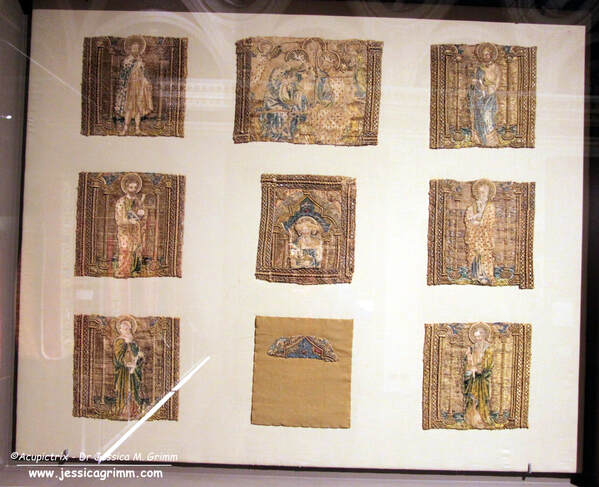 Nine orphreys kept at the Museo Diocesano Recanati, Italy. As you can see in the picture above, the cope is no longer an actual vestment. Only the mutilated orphreys have survived. They were used secondarily on an antependium which was probably made at the end of the 19th century. The orphreys were taken of this newer antependium in 2006 when they were restored and applied to a neutral backing. The orphreys represent three pairs of saints facing each other, a smaller square orphrey that would have sat on the neck of the wearer and which connected the two sets of three and part of the cope's hood with the Coronation of the Virgin. Identifiable among the saints are: John the Baptist (top left), James the Great (top right), Bartholomew or Peter (middle left) and Saint Jerome (square in the middle). The embroideries were made in a Venetian embroidery workshop around AD 1410-1417. 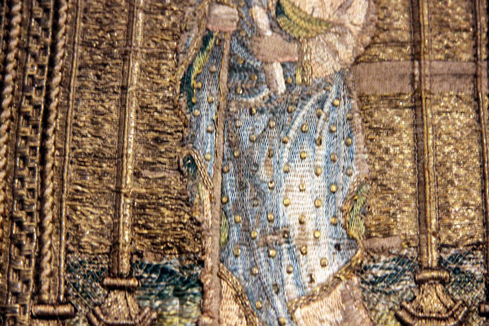 Orphrey with James the Great kept at the Museo Diocesano Recanati, Italy. When you look at the outer garments of the figures, it looks like they have the measles. These 'measles' are actually characteristic of Venetian embroidery. The 'measles' are made by covering a metal disc, with a central or off-centre hole (think spangle/sequin), with gold thread. Some discs are made of pressed paper. The gold threads that cover the discs are worked in gimped couching, but with an underside couching stitch. Proof again that underside couching is not exclusively English. Keeping the gold threads from rolling off the edges of the padding was probably no small feat! 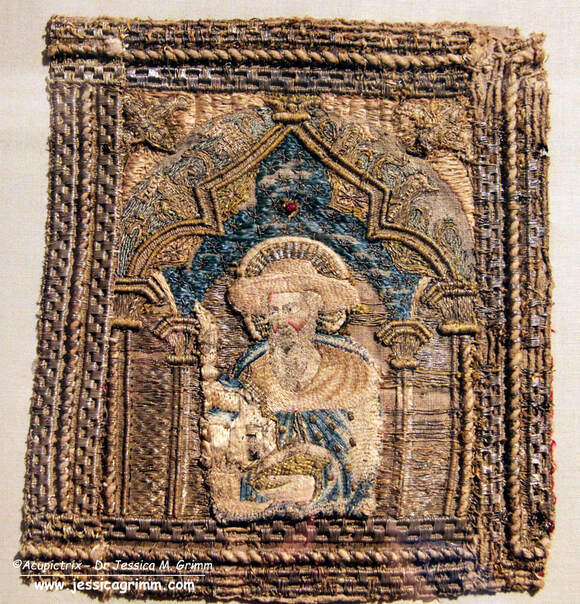 Orphrey with Saint Jerome kept at the Museo Diocesano Recanati, Italy. Another characteristic of Venetian embroidery is the elaborate dimensional frame around the orphreys. String padding is used to achieve the different textures. By using strings with different thicknesses, they could achieve several 'levels' in the frame.
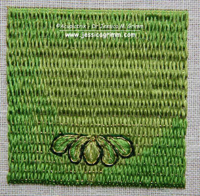
In general, many different embroidery techniques are used in these Italian embroideries from the Middle Ages. There is beautiful (directional) split stitch in silk, there is laid work, diaper couching and trellises. Or nue is absent as that was probably invented in the Southern Netherlands/Northern France and had not yet made its way to Italy. If you would like to see more (detailed) pictures of these nine orphreys, then please visit my Patreon page. Journeyman and Master members will find 23 images which can be downloaded. Literature Prá, Laura Dal; Carmignani, Marina; Peri, Paolo (Eds.) (2019): Fili d'oro e dipinti di seta. Velluti e ricami tra Gotico e Rinascimento. Trento: Castello del Buonconsiglio. We have been exploring the embroidery and the iconography on the lone cope hood from the V&A (990-1888) in the past two weeks (part 1 & part 2). This week, I'll show you how to work a small embroidery sample based on one of the flowers seen on that cope hood. It is an exercise in both counted threadwork and free-hand embroidery. It also teaches you to work goldwork embroidery on top of a base layer of goldwork embroidery. This was common practice in late-medieval goldwork embroidery. It is often done to hide the ends/turns of gold threads and it adds some depth. Below is a summary of how the sample was probably originally stitched. Journeyman and Master Patrons can download a 9-page PDF with detailed instructions.
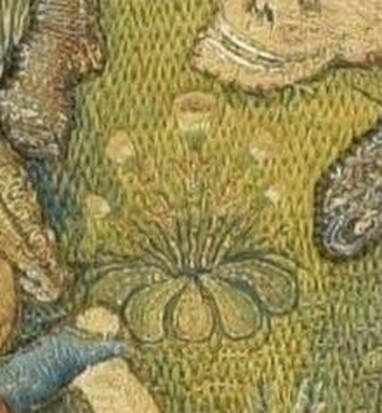
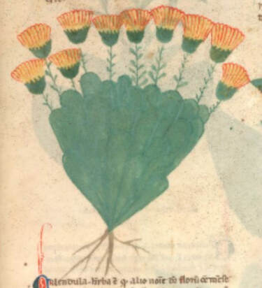
My clever husband happened to have a book on medieval flowers and was able to identify one of the flowers on the original cope hood as marigolds. The Egerton Manuscript from c. AD 1300 (MS 747, f. 30r) shows a drawing of the marigold that is quite comparable to the embroidered version. The embroidered version is about 3,5 cm high, and the detail is amazing. As you can see in the original, the marigolds are stitched on top of a layer of Brick Stitches (upper part) and Burden Stitch (lower part). These are both counted thread techniques. The foundation thread for the Burden Stitch (a passing thread) also runs under the Brick stitches. It is just being ignored. It is needed under the Brick stitches as padding. If you omit it, this section will be flatter compared to the Burden stitches. As the gold thread is (nearly) completely covered by the Brick stitches it shows that the price of gold thread had come down considerably by the end of the medieval period.
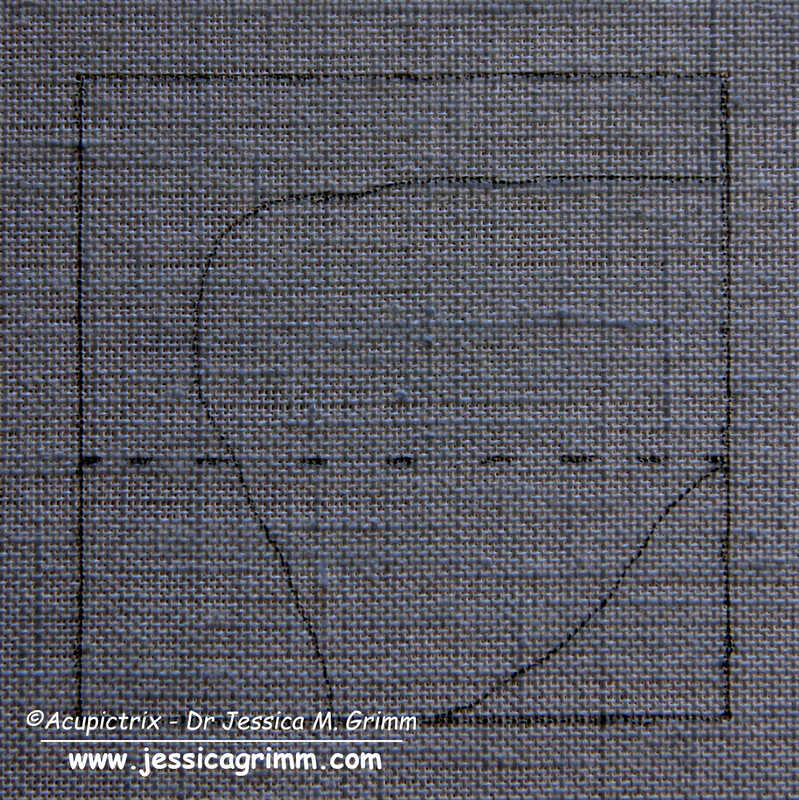
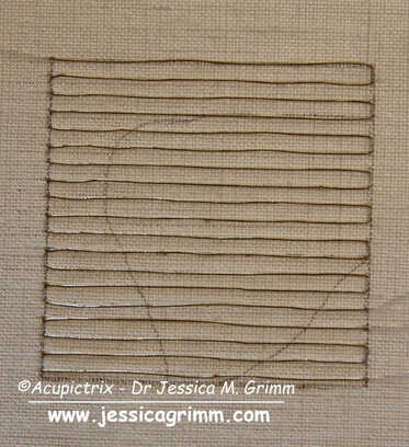
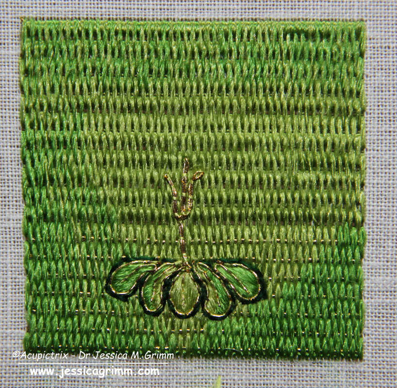
Start your sample by drawing a 5 x 5 cm square on the grain of the fabric. You can also add guidelines for the shading and for when you want to change from Brick to Burden stitch. I am using a 46 ct linen, Stech vergoldet 80/90 (comparable to passing thread #4) and Chinese flat silk from Oriental Cultures. Start by laying the passing thread foundation. My passing threads are spaced 5 fabric threads apart.
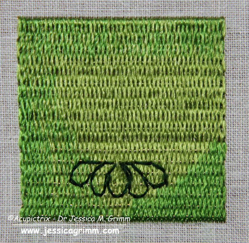
Once your base layer of Brick and Burden stitches is in, the fun free-hand part begins! And this is where each sample will become truly unique. Start with outlining the five green leaves. I've used a simple back stitch, but you can also use stem stitch. These are then filled with a few satin/straight stitches. On top comes an outline and vein (stitched in one go) in couched gold thread.
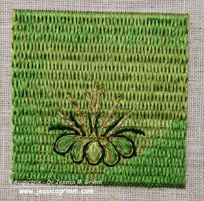
Next up are the stems. They are made of gold thread. Start at the top (where the flower attaches) and separate the two threads to form a leaf on either side of the stem. Re-unite the threads again to form the bottom of the stem. Add dark green stems for a bit more definition. I've used stem stitches. 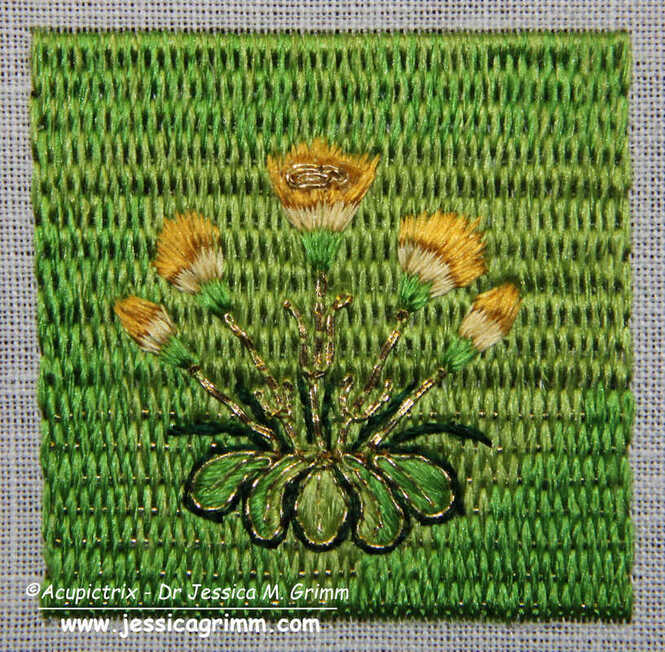 The flower heads are stitched in long-and-short stitches (i.e. split your stitches). Start with the green bits at the bottom. Then add the light-yellow bottoms of the petals and end with the dark yellow tops. The central flower gets a flower heart made of a couched piece of gold thread. And that's your marigolds finished! Mine turned out more like dandelions ...
One of the things that amazed me when I was whipping up this embroidery sample, is the fineness of the original embroidery. My rendition looks bulky in comparison. Another hint that the original cope hood was once part of a very high-end vestment intended for an important clergyman and/or church! Literature Fisher, C., 2007. The Medieval Flower Book. The British Library, London. Last week, we explored the iconography and the embroidery techniques used on a cope hood from the V&A. The museum acquired the cope hood in 1888 and nothing more is known about it. Ever since I saw the piece in November 2019, I have wanted to know more about this outstanding piece of embroidery. And I have found some intriguing parallels in my ever-growing database of medieval goldwork embroidery. By now, my database contains 40 cope hoods that date to the 15th and 16th centuries and that are made in the historic Netherlands (present-day Belgium and the Netherlands). Of these, only 22 also have their matching orphreys preserved. Not a huge amount of data to work with ...  © KIK-IRPA, Brussels (Belgium), cope with crucifixion from Averbode Abbey, Belgium. My closest match is a cope hood from a cope from Averbode Abbey in Belgium. The scene is very similar to the crucifixion scene on the lone cope hood from the V&A. And the embroidery techniques are similar too. There's a lot of high-quality or nue in the figures. And the grassland is partly stitched in Burden stitch with additional plant motives on top (some grassland is or nue). Thanks to the accounts of Averbode Abbey, this cope can be precisely dated to AD 1530. The lone cope hood from the V&A dates to the second half of the 15th century (1450-1499). This would mean that there is a time difference of 30-80 years between the two. As this cope is still complete, we also have an idea of what the matching cope orphreys of the lone cope hood of the V&A might have looked like. There are six orphreys in total and they show: Agony in the Garden of Gethsemane, Betrayal of Christ, Christ before Pontius Pilate, Flagellation of Christ, Crowning with thorns and Christ carrying the cross. Do click on the link above to see more pictures of the cope. You can enlarge them and/or download them.  BMH t5788b, Museum Catharijneconvent, Utrecht, foto Ruben de Heer One of the things that makes the design of the lone cope hood from the V&A so outstanding is the amount of storytelling that's going on. Embroidered art can be pretty static. The above cope hood from Museum Catharijneconvent also has a very dynamic design with whimsical details. See the man untying his shoes? And the woman being helped out of her coat? These people are preparing for their own baptism. Some people look on in quiet contemplation whilst others look a bit sceptical. It needs a good designer, in this case, Jacob Corneliz van Oostsanen, and an equally brilliant embroiderer to put it into stitch!
This cope hood was made around AD 1520-1529 in Amsterdam. That's about 30-70 years after the supposed stitching date of the lone cope hood from the V&A. Maybe the lone cope hood from the V&A should be dated a little later? Any art historians in the audience that could chime in on this? When everything goes to plan (hear the universe roar with laughter?), we will try our hands at a little bit of recreation of a small part of the lone cope hood next week! Literature: Gerits, T. J. (1973): Historische schoonheid van Averbode. Averbode: Abdij der Norbertijnen. |

Want to keep up with my embroidery adventures? Sign up for my weekly Newsletter to get notified of new blogs, courses and workshops!
Liked my blog? Please consider making a donation or becoming a Patron so that I can keep up the good work and my blog ad-free!

Categories
All
Archives
April 2024
|
 RSS Feed
Contact: info(at)jessicagrimm.com
Copyright Dr Jessica M. Grimm - Mandlweg 3, 82488 Ettal, Deutschland - +49(0)8822 2782219 (Monday, Tuesday, Friday & Saturday 9.00-17.00 CET)
Impressum - Legal Notice - Datenschutzerklärung - Privacy Policy - Webshop ABG - Widerrufsrecht - Disclaimer
Copyright Dr Jessica M. Grimm - Mandlweg 3, 82488 Ettal, Deutschland - +49(0)8822 2782219 (Monday, Tuesday, Friday & Saturday 9.00-17.00 CET)
Impressum - Legal Notice - Datenschutzerklärung - Privacy Policy - Webshop ABG - Widerrufsrecht - Disclaimer