|
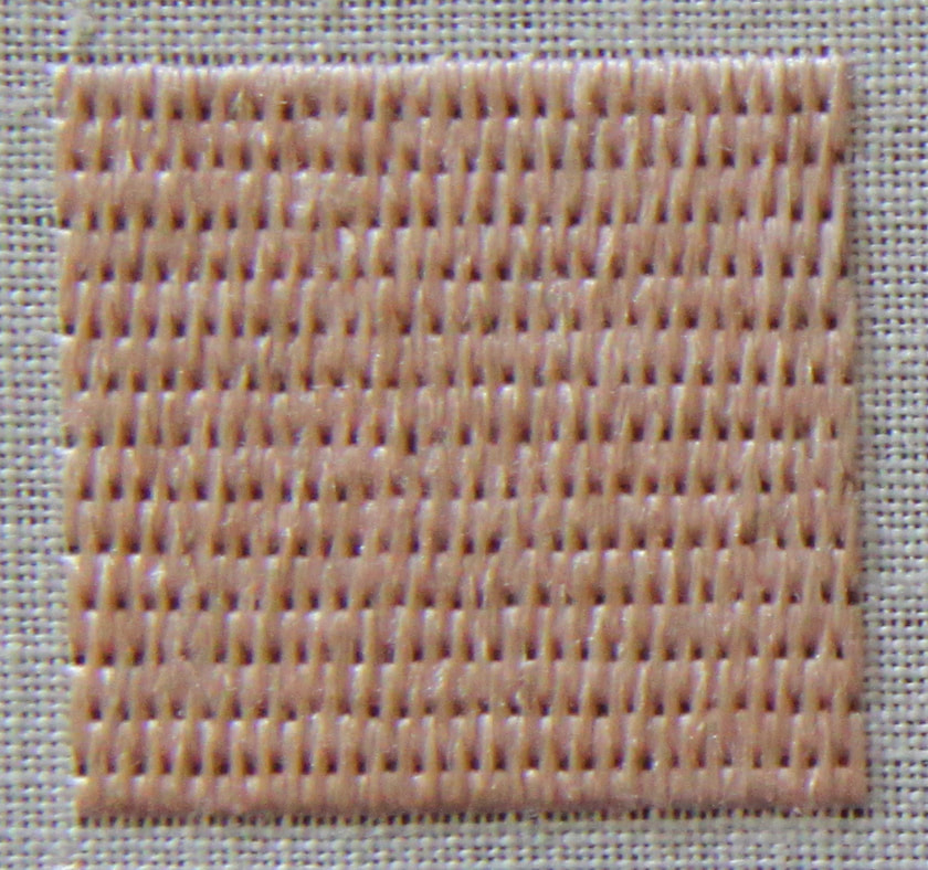
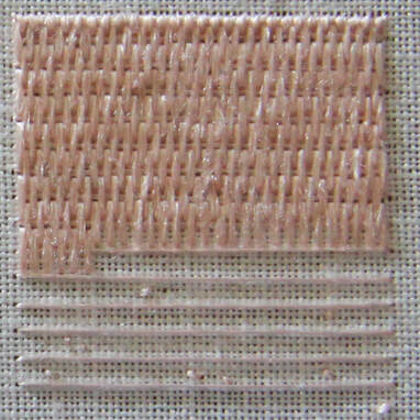
In the past two weeks, we have explored the early 15th century gold embroidery from Venice, Italy. One of its characteristics is the ornate orphrey borders with the twisted columns. I've always been curious how they were made! So out came the cotton padding threads and the gold threads and off I went.  Orphrey with Saint Jerome kept at the Museo Diocesano Recanati, Italy. This kind of embroidery is best done on a slate frame. If you would like a reminder of what this is and how to set it up, please have a look at my instruction videos. Next, you will need to attach your string padding. The original uses two different kinds of padding. There seems to be something like soft cotton underneath the twisted columns. And a thinner string is used as padding on either side. I've used two thicknesses of the same cotton string for the padding. In order for the gold threads to be able to sit crisp on the padding, make sure that you couch down your padding well. 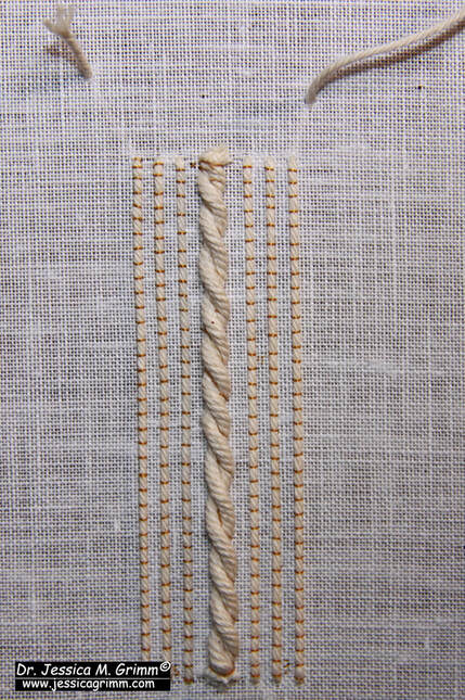 String padding couched down and ready for the gold threads. The gold thread used in the original embroidery is a passing thread. In my recreation, I've opted for Stech 70/80, which is comparable to passing #3. I was also curious to know what the difference would be between a gilt and a real gold thread. I worked the main part of the sample with the cheaper gilt and the bottom section with the real gold (more yellow). I prefer the real gold :). It is a tat better at going and staying where I want it to go and stay. The result is a bit crisper. Still not as crisp as the original, but closer. If you have the opportunity to try different brands of passing thread, please do and see how they behave. 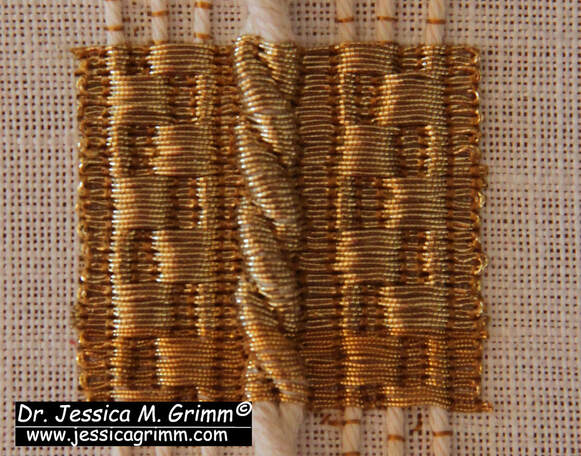 The couching rythm alternates every 6th row. Working over this amount of padding will cause slight problems. Although you place a couching stitch over the gold and in the 'groove' of the twisted column, the gold is not very securely attached in this place. The twisted padding threads are also very round. Your gold thread wants to 'escape' and roll off. This is also visible in the original embroidery. And it comes as no surprise that the embroidery is most damaged in this area.
My Journeyman and Master Patrons will find a downloadable PDF with this stitch sample on my Patreon page. As I am travelling in the coming week, there will be no blog post next Monday. I will be visiting various Diocesan Museums in Germany and the Netherlands. All my Patrons will be able to virtually travel with me as I hope to be able to post some pictures along the way. There will also be a meeting of the Medieval Embroidery Study Group for my Master Patrons on Saturday the 2nd of December at 19h CET. Details can be found on my Patreon page.
4 Comments
From last week's blog post, you might have gotten the idea that Venetian goldwork embroideries from the early 15th century are somewhat plentiful. They are not. However, another magnificent piece was exhibited at Castello del Buonconsiglio in Trento, Northern Italy. Some parts are remarkably modern in their appearance. Parts of the design could be easily adapted for modern goldwork embroidery. Let's have a look at the medieval eye candy. 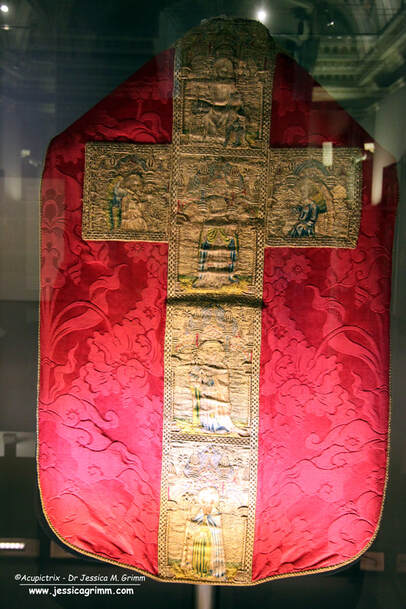 Chasuble, Venice 1410-1420, the Basilica of Santa Maria Gloriosa dei Frari (from the church of San Pantalon) The embroidered chasuble cross on the red chasuble comes originally from the Church of San Pantalon in Venice. It is now kept in the Frari church in Venice. From the top, we see the Resurrection of Christ, Gregory the Great, Saint Jerome and Saint Augustine with angels in the side arms of the cross. There is another corresponding chasuble cross on the front. Unfortunately, the way it was exhibited did not permit the viewer to see the front as well. On that chasuble cross are depicted Saint Mark (tentative identification), Saint Ambrose and Saint Catherine with John the Baptist and a male saint on the side arms of the cross. Personally, I love this type of iconography. We have the four fathers of the church: Gregory the Great, Ambrose, Augustine of Hippo and Jerome. All four are seen as important theologians of the late Roman-Early medieval church (that's roughly 800-1000 years before this embroidery was made). Then there are Saint Catherine and John the Baptist. Two very important saints seen throughout the Middle Ages all over Europe. The story of Saint Catherine is also all about learning, philosophy and theology. A chasuble with a high IQ. 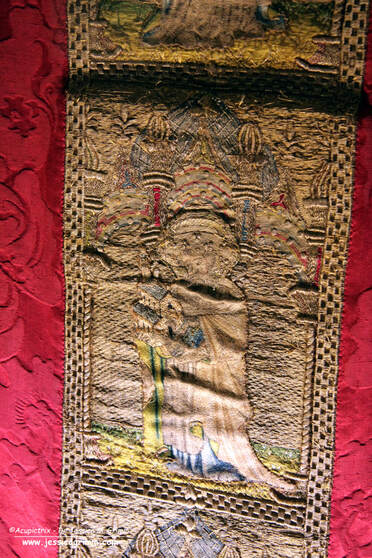 Orphrey with Saint Jerome, Venice 1410-1420, the Basilica of Santa Maria Gloriosa dei Frari (from the church of San Pantalon) As you can see from the orphrey of Jerome in the picture above, the embroidery is a bit damaged. The orphrey has warped quite a bit and this made it difficult to take good pictures. The shaded inky underdrawing is very fine and of exceptional quality. And so is the embroidery (made with gilded silver foil around a yellow silk core or silver foil around a white silk core). The goldwork is very accurate and the silken directional split stitches are very small and regular. As seen on last week's embroidery, the frame around the orphrey is padded. And we see the twisted padded columns again. 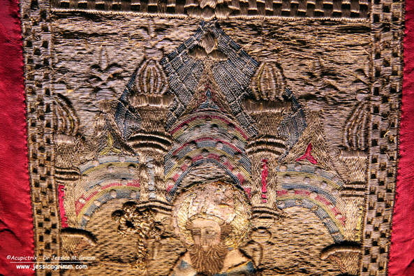 Detail orphrey with Saint Augustine, Venice 1410-1420, the Basilica of Santa Maria Gloriosa dei Frari (from the church of San Pantalon) And did you spot the 'measles'? This time, they are not located on the clothing (except for the hat of Jerome, see above). Instead, they decorate the multi-coloured arches (not really or nue as there is no shading; there is on the armour of the soldiers in the Resurrection scene) beneath the pinnacles and the large blue dome. In this case, the 'measles' are made over a disc of pressed paper. The same padding material is also used in the thicker parts of the pinnacles. Paper was a rather 'modern' material. Its use in Italian embroidery shows that trading ports such as Venice had easier access to it. It is not seen as a padding material in embroideries from Northern Europe. I absolutely love this background! It looks so very modern and oriental. This would make for a lovely modern embroidery design.
If you would like to see more downloadable pictures of this amazing embroidery and if you would like to join our Zoom call on the early 15th century embroideries from Venice, then please consider becoming a Patron. Your monthly contribution keeps this blog and my research going. Thank you very much! Literature Prá, Laura Dal; Carmignani, Marina; Peri, Paolo (Eds.) (2019): Fili d'oro e dipinti di seta. Velluti e ricami tra Gotico e Rinascimento. Trento: Castello del Buonconsiglio. In September 2019, I visited the exquisite exhibition "Fili d'oro e dipinti di seta" in the Castello del Buonconsiglio in Trento, Northern Italy. Together with the 2015 exhibition in the Catharijneconvent and the 2016 Opus Anglicanum exhibition in the V&A, this was one of those 'must-see' exhibitions. This one visit provided me with research material for several years. Especially as I was allowed to take as many pictures as I liked. As long as you don't use flash, the textiles absolutely do not mind. Today, we are going to look at some early Venetian embroidery. It includes some techniques unique to the Venetian embroidery workshops. Let's dive in! 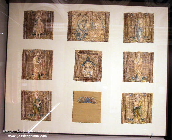 Nine orphreys kept at the Museo Diocesano Recanati, Italy. As you can see in the picture above, the cope is no longer an actual vestment. Only the mutilated orphreys have survived. They were used secondarily on an antependium which was probably made at the end of the 19th century. The orphreys were taken of this newer antependium in 2006 when they were restored and applied to a neutral backing. The orphreys represent three pairs of saints facing each other, a smaller square orphrey that would have sat on the neck of the wearer and which connected the two sets of three and part of the cope's hood with the Coronation of the Virgin. Identifiable among the saints are: John the Baptist (top left), James the Great (top right), Bartholomew or Peter (middle left) and Saint Jerome (square in the middle). The embroideries were made in a Venetian embroidery workshop around AD 1410-1417. 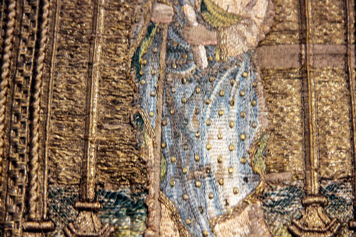 Orphrey with James the Great kept at the Museo Diocesano Recanati, Italy. When you look at the outer garments of the figures, it looks like they have the measles. These 'measles' are actually characteristic of Venetian embroidery. The 'measles' are made by covering a metal disc, with a central or off-centre hole (think spangle/sequin), with gold thread. Some discs are made of pressed paper. The gold threads that cover the discs are worked in gimped couching, but with an underside couching stitch. Proof again that underside couching is not exclusively English. Keeping the gold threads from rolling off the edges of the padding was probably no small feat! 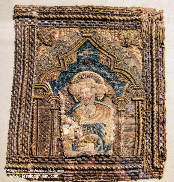 Orphrey with Saint Jerome kept at the Museo Diocesano Recanati, Italy. Another characteristic of Venetian embroidery is the elaborate dimensional frame around the orphreys. String padding is used to achieve the different textures. By using strings with different thicknesses, they could achieve several 'levels' in the frame.
In general, many different embroidery techniques are used in these Italian embroideries from the Middle Ages. There is beautiful (directional) split stitch in silk, there is laid work, diaper couching and trellises. Or nue is absent as that was probably invented in the Southern Netherlands/Northern France and had not yet made its way to Italy. If you would like to see more (detailed) pictures of these nine orphreys, then please visit my Patreon page. Journeyman and Master members will find 23 images which can be downloaded. Literature Prá, Laura Dal; Carmignani, Marina; Peri, Paolo (Eds.) (2019): Fili d'oro e dipinti di seta. Velluti e ricami tra Gotico e Rinascimento. Trento: Castello del Buonconsiglio. We have been exploring the embroidery and the iconography on the lone cope hood from the V&A (990-1888) in the past two weeks (part 1 & part 2). This week, I'll show you how to work a small embroidery sample based on one of the flowers seen on that cope hood. It is an exercise in both counted threadwork and free-hand embroidery. It also teaches you to work goldwork embroidery on top of a base layer of goldwork embroidery. This was common practice in late-medieval goldwork embroidery. It is often done to hide the ends/turns of gold threads and it adds some depth. Below is a summary of how the sample was probably originally stitched. Journeyman and Master Patrons can download a 9-page PDF with detailed instructions.
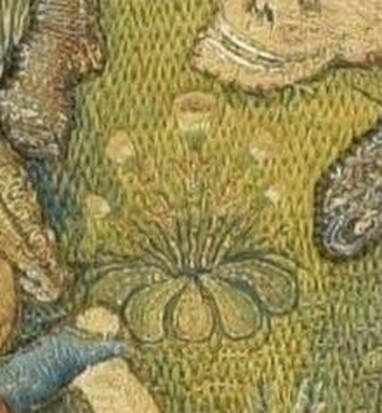
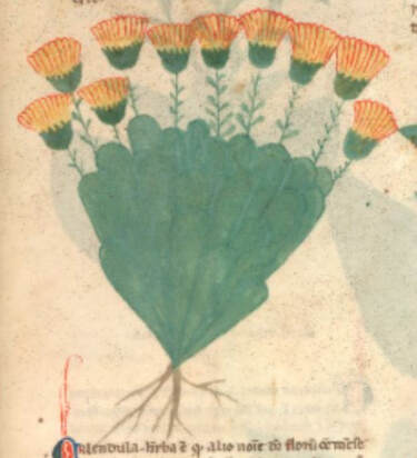
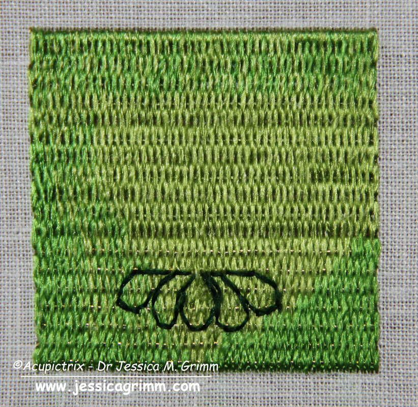
My clever husband happened to have a book on medieval flowers and was able to identify one of the flowers on the original cope hood as marigolds. The Egerton Manuscript from c. AD 1300 (MS 747, f. 30r) shows a drawing of the marigold that is quite comparable to the embroidered version. The embroidered version is about 3,5 cm high, and the detail is amazing. As you can see in the original, the marigolds are stitched on top of a layer of Brick Stitches (upper part) and Burden Stitch (lower part). These are both counted thread techniques. The foundation thread for the Burden Stitch (a passing thread) also runs under the Brick stitches. It is just being ignored. It is needed under the Brick stitches as padding. If you omit it, this section will be flatter compared to the Burden stitches. As the gold thread is (nearly) completely covered by the Brick stitches it shows that the price of gold thread had come down considerably by the end of the medieval period.
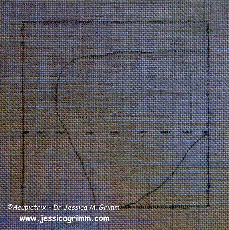
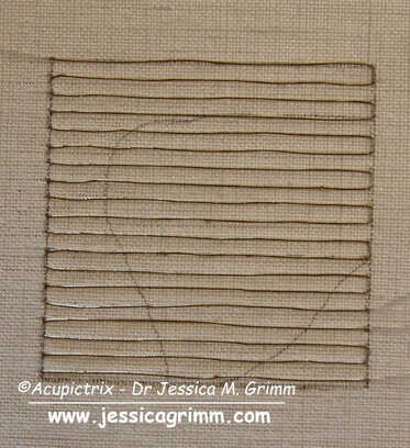
Start your sample by drawing a 5 x 5 cm square on the grain of the fabric. You can also add guidelines for the shading and for when you want to change from Brick to Burden stitch. I am using a 46 ct linen, Stech vergoldet 80/90 (comparable to passing thread #4) and Chinese flat silk from Oriental Cultures. Start by laying the passing thread foundation. My passing threads are spaced 5 fabric threads apart.
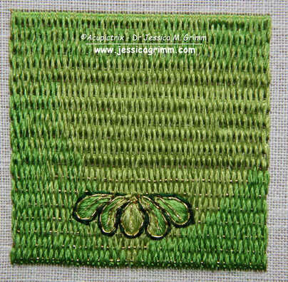
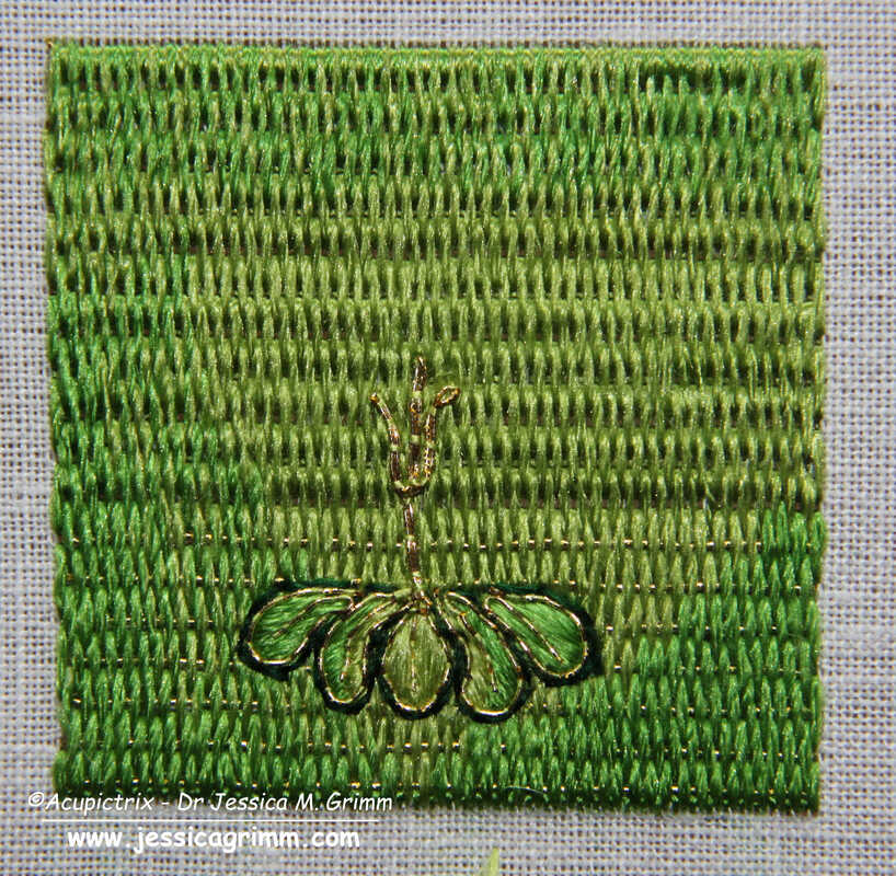
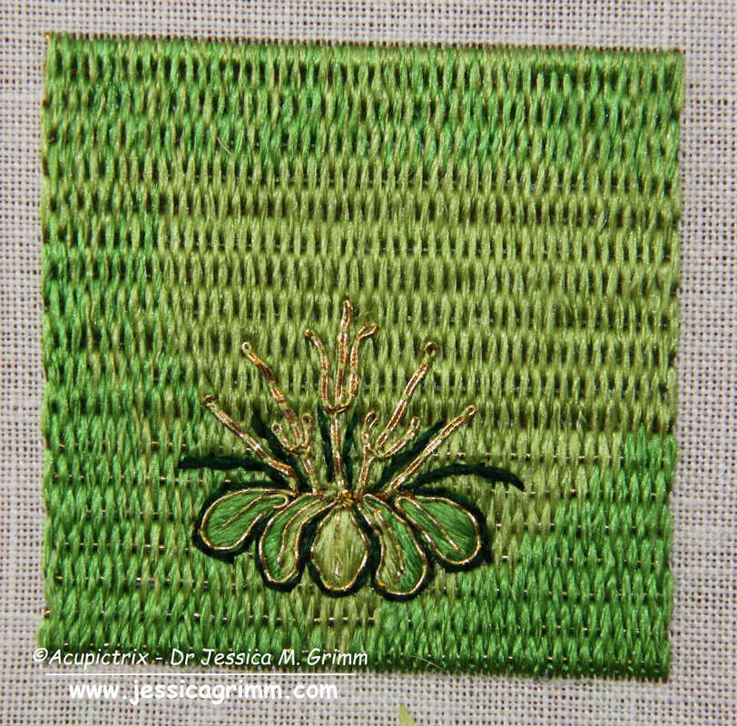
Once your base layer of Brick and Burden stitches is in, the fun free-hand part begins! And this is where each sample will become truly unique. Start with outlining the five green leaves. I've used a simple back stitch, but you can also use stem stitch. These are then filled with a few satin/straight stitches. On top comes an outline and vein (stitched in one go) in couched gold thread.
Next up are the stems. They are made of gold thread. Start at the top (where the flower attaches) and separate the two threads to form a leaf on either side of the stem. Re-unite the threads again to form the bottom of the stem. Add dark green stems for a bit more definition. I've used stem stitches. 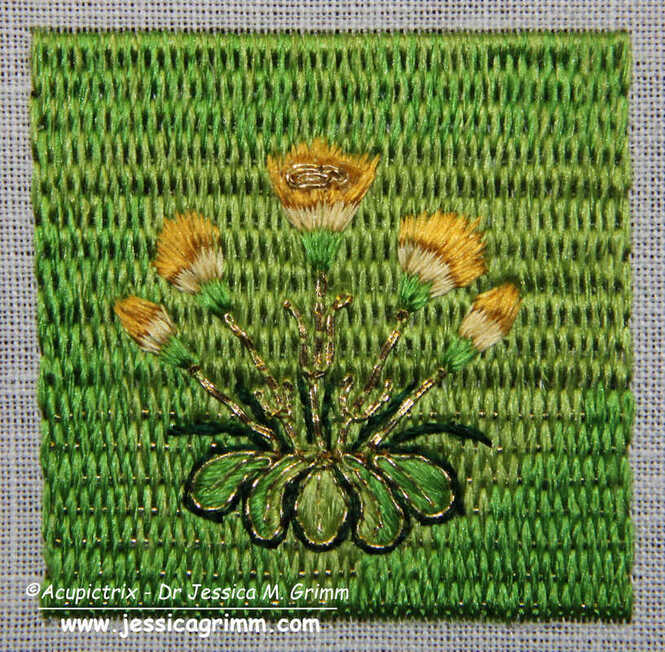 The flower heads are stitched in long-and-short stitches (i.e. split your stitches). Start with the green bits at the bottom. Then add the light-yellow bottoms of the petals and end with the dark yellow tops. The central flower gets a flower heart made of a couched piece of gold thread. And that's your marigolds finished! Mine turned out more like dandelions ...
One of the things that amazed me when I was whipping up this embroidery sample, is the fineness of the original embroidery. My rendition looks bulky in comparison. Another hint that the original cope hood was once part of a very high-end vestment intended for an important clergyman and/or church! Literature Fisher, C., 2007. The Medieval Flower Book. The British Library, London. Last week, we explored the iconography and the embroidery techniques used on a cope hood from the V&A. The museum acquired the cope hood in 1888 and nothing more is known about it. Ever since I saw the piece in November 2019, I have wanted to know more about this outstanding piece of embroidery. And I have found some intriguing parallels in my ever-growing database of medieval goldwork embroidery. By now, my database contains 40 cope hoods that date to the 15th and 16th centuries and that are made in the historic Netherlands (present-day Belgium and the Netherlands). Of these, only 22 also have their matching orphreys preserved. Not a huge amount of data to work with ... 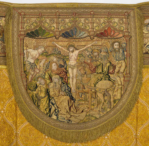 © KIK-IRPA, Brussels (Belgium), cope with crucifixion from Averbode Abbey, Belgium. My closest match is a cope hood from a cope from Averbode Abbey in Belgium. The scene is very similar to the crucifixion scene on the lone cope hood from the V&A. And the embroidery techniques are similar too. There's a lot of high-quality or nue in the figures. And the grassland is partly stitched in Burden stitch with additional plant motives on top (some grassland is or nue). Thanks to the accounts of Averbode Abbey, this cope can be precisely dated to AD 1530. The lone cope hood from the V&A dates to the second half of the 15th century (1450-1499). This would mean that there is a time difference of 30-80 years between the two. As this cope is still complete, we also have an idea of what the matching cope orphreys of the lone cope hood of the V&A might have looked like. There are six orphreys in total and they show: Agony in the Garden of Gethsemane, Betrayal of Christ, Christ before Pontius Pilate, Flagellation of Christ, Crowning with thorns and Christ carrying the cross. Do click on the link above to see more pictures of the cope. You can enlarge them and/or download them.  BMH t5788b, Museum Catharijneconvent, Utrecht, foto Ruben de Heer One of the things that makes the design of the lone cope hood from the V&A so outstanding is the amount of storytelling that's going on. Embroidered art can be pretty static. The above cope hood from Museum Catharijneconvent also has a very dynamic design with whimsical details. See the man untying his shoes? And the woman being helped out of her coat? These people are preparing for their own baptism. Some people look on in quiet contemplation whilst others look a bit sceptical. It needs a good designer, in this case, Jacob Corneliz van Oostsanen, and an equally brilliant embroiderer to put it into stitch!
This cope hood was made around AD 1520-1529 in Amsterdam. That's about 30-70 years after the supposed stitching date of the lone cope hood from the V&A. Maybe the lone cope hood from the V&A should be dated a little later? Any art historians in the audience that could chime in on this? When everything goes to plan (hear the universe roar with laughter?), we will try our hands at a little bit of recreation of a small part of the lone cope hood next week! Literature: Gerits, T. J. (1973): Historische schoonheid van Averbode. Averbode: Abdij der Norbertijnen. In November 2019, I visited the Clothworkers' Centre in London to study several pieces of embroidery kept in the V&A collection. One of these pieces was a cope hood from Flanders made in the second half of the 15th century (Accession Nr. 990-1888). The piece was bought in 1888 by the museum and lacks any further provenance. Lone cope hoods are pretty common in museum collections. This part of a cope is already relatively loose and could easily be separated before being sold on the art market. Pieces without provenance, like this lone cope hood, always make me a bit sad. So much information was lost. Nevertheless, it is a very fine piece of late-medieval goldwork embroidery. Let's explore! 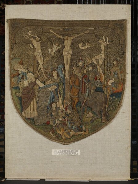 © Victoria and Albert Museum, London The cope hood measures 53.3 x 51.4 cm and the embroidery fabric is a finely woven linen. Originally, the hood would have been trimmed with some sort of decorative fringe. It likely also had a tassel of some sort dangling from its lowest point. In those areas where the embroidery has fallen out (lower part of the undergarment of the lady with the red dress on the left), a finely shaded underdrawing is visible. Although I am generally not very keen on crucifixion scenes, this one I quite 'like'. There is so much going on. There is so much movement. And there are so many fine details. This is late-medieval art at its best! The design is very high quality and was likely made by a famous artist. Maybe a painter or someone who designed church windows (we know from written sources that they provided embroiderers with designs too). It is highly unlikely that the design stems from an embroiderer who happened to be a fine draftsman too. So, what do we see? And how was it embroidered? 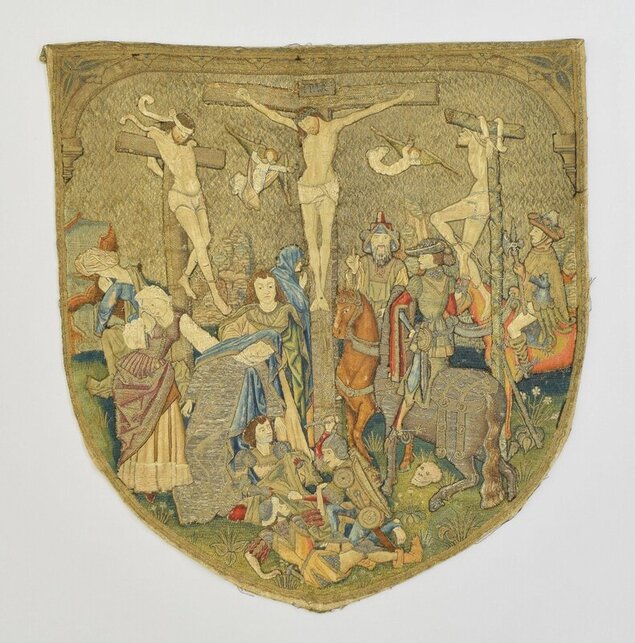 © Victoria and Albert Museum, London We, the viewers, are looking towards Golgotha from under an arch (probably the city gate of Jerusalem as Golgotha was 'outside the city gate' according to Hebrews 13:12). The arch is a far more intricate piece of embroidery than what it looks at first glance. It is partly embroidered as a continuation of the diaper pattern background (capitals on the sides), whilst the gold threads of the rounded arch neatly cover the turns of that same diaper pattern. The silver trefoils in the corners are also very intricately embroidered. There's twist and something that looks like a chain stitch executed with passing thread. On the arch itself, halved quatrefoils are embroidered at regular intervals. Their 'petals' are actually part of the arch. By couching 'petal' outlines onto the arch, the quatrefoils emerge. The diaper pattern used for the background is of the common open basketweave type. The couching stitches were once bright red; the most common colour used. Also part of the background are beautifully stitched rocks. They are embroidered directly onto the background linen. The rocks are made with Burden stitch and use a variety of green and brown silks. On top of this base layer, additional details are stitched with silks and gold thread. The rest of the background consists of a meadow stitched with several shades of green in Burden stitch. At the top, the Burden stitch is worked very densely so that the foundation gold thread can hardly be seen. Towards the bottom, we see the gold thread clearly. On top of the grassy base layer, grasses and several species of plants are stitched with silk and gold. None of the plant shapes is repeated. The flowering plants have different flowers. Maybe the plant lovers in my audience can identify them? Also present in the meadow is a rather funny-looking skull. It has lost most of its embroidery but is still readily identifiable. The skull is a hint to show that we are at Golgotha. According to the bible, Golgotha means 'place of the skull'.  © Victoria and Albert Museum, London And what's with all the people on this piece? They actually tell different parts of the gospels in one very lively scene. Firstly, there are the three crucified people: Jesus in the middle flanked by two criminals. See the body language of those two criminals? The one on the left looks submissive. The one on the right not so much. He even sticks out his tongue. The story of the good thief and the unrepentant thief is told in the gospel of Luke. Interestingly, the crosses of Jesus and the good thief are identical (made of timber), whereas the cross of the unrepentant thief is made of green wood. Has anyone seen this before in embroidery or a painting? Oh, and then there are the two angels with their chalices catching Jesus' blood for the Eucharist.
Next up, are the people on the left. They are on the good side with the good thief. We see four women and a man. The woman on the left with a fancy laced red dress is Mary Magdalene. The woman to her right is Mary mother of Jesus. She is fainting and being caught by Saint John who stands behind her. The two other women in the back are sometimes known as Salome and Mary the wife of Clopas. The bible is vague about these other women. Is this why the designer decided to show them only from the back? On the 'wrong' side are three horsemen. Two are clearly soldiers as they wear weapons. But who is the guy with the strange hat? He points up. What does he want? Is he pointing at Jesus? Is he the centurion who according to the gospel of Mark identifies Jesus as the son of God? Or is he a Jewish priest (as the V&A website suggests)? Any ideas? The last group of figures sits at the bottom of the cross. Three soldiers are dividing Jesus' garment to each have a piece. This is also a well-known story from the gospels. Whoever drew the design for this cope hood was very well acquainted with the biblical stories. Far more so than most people are today. How are all these different figures stitched? None of them are stitched directly onto the background linen. Instead, single figures or a group of figures are stitched on a separate piece of linen and then appliqued onto the background. This creates a little bit of depth in the embroidery. Can you see some of the crude white tacking stitches along the edges of parts of some of these figures? These are later repairs. It never ceases to amaze me that people repaired these very high-class embroideries with such crude stitching in later times! Have a good look at the embroidery of the figures. You will see beautiful or nue in the clothing of some of the figures, on the crosses and on the horse. There is also beautifully shaded medieval long and short stitch (it is more a counted thread technique than our modern version of long and short). The use of both gold and silver thread further enhances the design. The quality of the embroidery matches the quality of the design. This would once have been a very expensive piece of embroidery. It was probably commissioned by an important church or important church leader. Think cathedral or bishop. If we only knew for which church it was originally intended. Or who designed or stitched it! Before we dive into today's topic involving cartoon, pricking and finished embroidery, just a quick heads up that there is a new batch of embroidery kits for the self-paced online medieval sampler course in the shop. The prices are up by a bit due to the price of gold being a bit higher. At the same time, I was able to find a cheaper direct source for the prickers in the transfer kits. My shop isn't as sophisticated as I would like. If the kit you want is no longer available, just put a comment in your order form and I will be able to sort it out for you. When all kits are gone and you missed out, just shoot me a quick email so that I know that there is still interest in another batch of kits. Thanks! Let's explore today's topic. How much does the size of the finished embroidery differ from the cartoon and the pricking it was made with? Any idea? Me neither. But I read a reference by Evelin Wetter a couple of years ago that tried to link a rare surviving medieval pricking to a surviving embroidery. However, the measurements of both were slightly different. So how different are cartoons, prickings and the resulting embroideries? Time for an experiment and in comes Elisabeth. 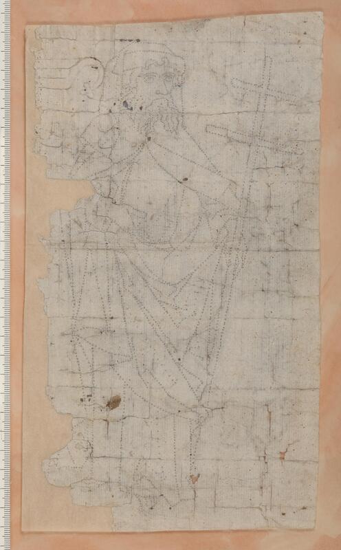 Pricking of Philip the Apostle, Historiska Museet Stockholm, Inv. Nr. 21324. Upphov: Hildebrand, Gabriel, Historiska museet/SHM (CC BY 4.0) The original reference mentions the find of a pricking being reused as the backing for a finished embroidered antependium (to stiffen it) found in Hillersjö, Sweden. The pricking shows Philip the Apostle. The pricking is identical to an embroidered Philip the Apostle on a cope orphrey from Linköping Cathedral in Sweden. According to the reference, "compared to the pricking, the embroidery appears to have shrunk by a few millimeters". Unfortunately, I wasn't able to find precise measurements of either the pricking or the finished embroideries on the cope orphrey. From the ruler depicted in the picture of the pricking, the pricked figure must be about 24,75 cm. 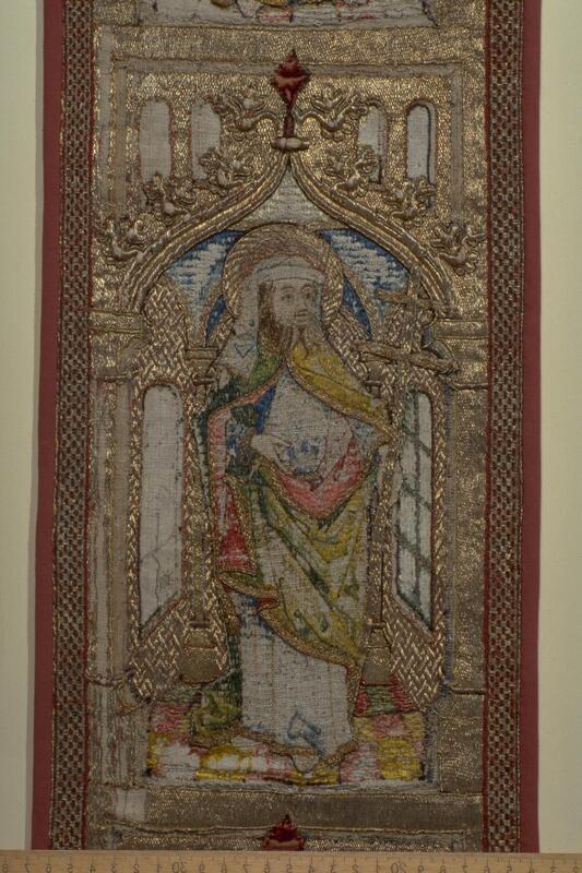 Pricking of Philip the Apostle, Historiska Museet Stockholm, Inv. Nr. 2920:2. Upphov: Hildebrand, Gabriel, Historiska museet/SHM (CC BY 4.0) From the ruler in the picture with the orphrey of Philip the Apostle, the embroidered figure must be about 23.7 cm high (excluding the halo, just as in the pricking). If we compare this with the height of the pricked figure (24.75 cm) we have a difference of about 10.5 millimeters (slightly over a cm!). This would more or less correspond with the original reference's mention of 'a few millimeters'. It looks a little high to me, to be honest. And when my deducted measurements are correct, I doubt pricking and embroidery are identical. In the original reference, the difference between the size of the pricking and that of the embroidery is explained by the transfer process described by Cennini in his Libro dell'Arte of c. AD 1370. In it, a near-dry sponge is used to slightly wet the free-hand drawing to add shading. Now, there's several things mixed up here. Cennini described the embroidery design transfer process for a design drawn onto the embroidery process free-hand. The pricking of Philip the Apostle and the resulting embroidery stem from a very different process. No free-hand drawing. And as we can see in the damaged parts of the finished embroidery: it is a line drawing with no shading. The embroidery linen can thus not have shrunk, as the original reference of Evelin Wetter suggests, due to the application of a little water in the wetting process to add shading. 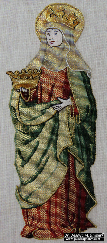 If art historians make assumptions like the one by Evelin Wetter, you might think that they have conducted an experiment with modern embroiderers, don't you? But, nope. So, I decided to use my teaching at the Alpine Experience in 2022 as such an experiment. Just having my own measurements would be a bit skimpy on the data side of things. And I am very grateful that three students of that class finished their embroideries and that I was able to measure their embroideries during 2023's class. Here are the results: 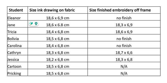 As you can see from the above table, the cartoon (design drawing) and the resulting pricking do not differ in their measurements. Everyone used the same pricking. The resulting design drawing on the embroidery fabric made with pounce and ink already differs slightly: up to 3 millimeters in height and 1 millimetre in width. Some are larger, others are smaller than the pricking. The finished embroidery differs up to 2 mm in height and 2 mm in width. Again, some are larger and some are smaller. This is the comparison we are after as this compares the pricking with the finished embroidery just as for Philip the Apostle.
My conclusion thus is that small differences in measurements between a pricking and the resulting embroidery are normal. These differences can go either way: larger or smaller. They are the result of the maker going through several transfer steps: pounce dots from the pricking, turned into an inked line drawing, turned into an embroidery. The absolute difference in millimetres thus directly relates to the size of the brush for the inking and the size of the embroidery materials. Particularly the width of the gold thread at the turns on the design line probably attributes the most to the size differences seen. A huge thank you to my students who were brave enough to tackle Elisabeth! You have provided me, and the wider research community, with tangible data on this particular topic. Literature Nisbeth, Åke; Estham, Inger (Eds.) (2001): Linköpings domkyrka. Inredning och inventarier. Linköping: Linköping Domkyrka. Wetter, Evelin (2012): Mittelalterliche Textilien III. Stickerei bis um 1500 und figürlich gewebte Borten. Riggisberg: Abegg-Stiftung. P.S. There will be no blog post next week as I am attending the CIETA conference in Krakow, Poland. One of the reasons for writing my weekly blog is to introduce you to medieval embroidered pieces that are in collections outside the UK and the US. Due to the language barrier, these pieces are often hardly known in the English-speaking world. This has led to such strange ideas as "stumpwork was invented in 17th century England" and "Opus anglicanum was only practised in England". Sorry to disappoint you, but both assumptions are wrong. One such collection is in the Bernisches Historisches Museum in Switzerland. A couple of weeks ago, we looked at an Antependium made in Vienna for Königsfelden Abbey. Today, I'll introduce you to another embroidered antependium from the same Abbey. It is very different from the first.  Historisches Museum Bern Inv. Nr. 19 Königsfelden Antependium The above antependium or altar cloth measures about 3.18 m x 0.90 m. The background fabric is probably not original. The embroidered figures are about 60 cm in height. In the middle, we see the crucifixion with Mary and St John on either side. These figures were likely embroidered in the Upper Rhine area. The other figures (St Peter, St Catherine and St Agnes on the left and St Andrew, John the Baptist and St Paul on the right) were probably embroidered in Königsfelden Abbey. How do we know? 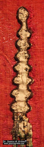 Parchment padding Königsfelden Antependium. The padding material in the embroidery is parchment. During an extensive restoration in 1889, some of the parchment was removed from the back of the figures. Besides a cut-up breviary, they also found the remains of a letter between Queen Agnes of Hungary and Emperor Ludwig of Bavaria. Clever historical research by Jacob Stammler, later bishop of Basel, revealed that this letter was written between 20 October AD 1334 and 20 October AD 1335. The fact that a trivial letter to Queen Agnes was used to pad parts of the embroidery indicates that the embroidery was executed where she resided: Königsfelden Abbey. The style of the figures points to c. AD 1350 as the date for the embroidery. 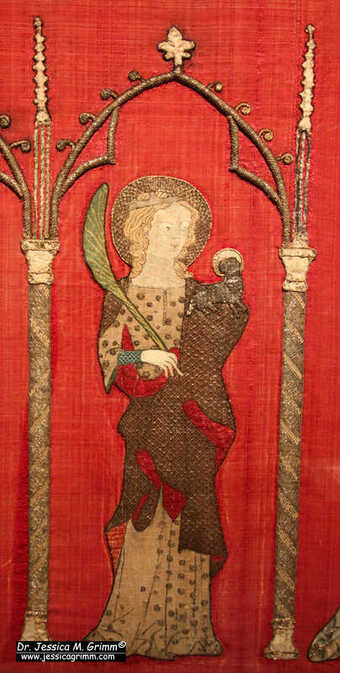 St Agnes on the Königsfelden Antependium. Personally, I quite like to read 19th century papers on medieval embroidery. I love the tone (scholarship with a splash of Ivanhoe) and the beautiful technical drawings. Quite often, the embroidery was better preserved over a 100 years ago and the drawings clearly show that. However, there is a caveat: research marches on. The aforementioned bishop Jacob Stammler was quite convinced that Queen Agnes herself professionally embroidered and was quite capable to produce an altar cloth such as the one shown in an earlier blog post. After all, her biographer said that she was proficient with the needle! Nowadays, we know that these (former) queens were far too busy to embroider professionally. With all the diplomacy they conducted for their families and the overseeing of the royal household, they were probably as busy as any female CEO is today. Good luck embroidering professionally at the same time ... 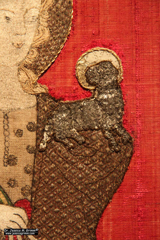 Detail St Agnes on the Königsfelden Antependium. So, who did embroider the additional figures on this second antependium used at Königsfelden Abbey? As Queen Agnes resided at (near?) the abbey for many years and was very active in international diplomacy with many visitors and envoys coming to see her, she basically set up court there. It is thus likely that she had a royal workshop as well. The embroidery on this second antependium is of far too high quality to have been worked by part-time embroidering nuns. This is the work of professionals. The fact that the saints chosen to accompany the central crucifixion scene have a relationship with Queen Agnes and her family (St Andrew for her late husband and St Catherine for several female relations) shows that she was, however, actively involved in choosing the design. If you would like to read the original paper by Jacob Stammler, you can find it here. As it is written in Fraktur, I've prepared a transcript and a translation for my Journeyman Patrons.
Last year, I visited the CIETA conference in Switzerland and we made a field trip to the Bernisches Historisches Museum. It has a large permanent display of medieval textiles well worth a visit. One of the many beautiful pieces is a large two-part antependium made in Vienna around AD 1340-1350. It was gifted by Albert II, Duke of Austria (AD 1298-1358) to the abbey of Königsfelden (now in Switzerland) where his sister, Agnes of Austria (AD 1281-1364) resided. Very kind of him, indeed. It is a stunning piece of embroidery and very well preserved. Let's explore! 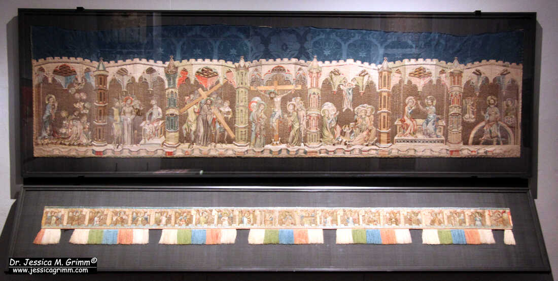 Königsfelden Antependium (c. AD 1340-1350), Bernisches Historisches Museum Inv. 27 & 51. The antependium consists of a larger part (90 x 318 cm) with seven scenes from the life of Jesus. From left to right we see: Gethsemane, Christ in front of Pilate, Christ carrying the cross, Crucifixion, Ascension, Crowning of the Virgin and Christ in Majesty. And a smaller band (18 x 292 cm (cut)) with angels surrounding Mary and Jesus in the middle. 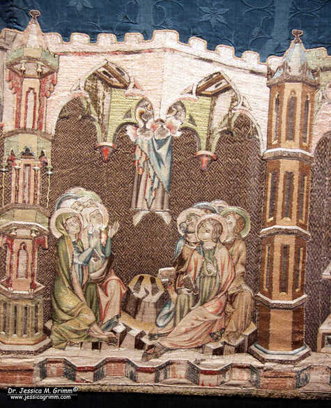 Ascension scene, Königsfelden Antependium (c. AD 1340-1350), Bernisches Historisches Museum Inv. 27 & 51. My personal favourite is this Ascension scene. I just love the naive way this is depicted in medieval art. And this is a particularly detailed depiction. We even have the footprints :). 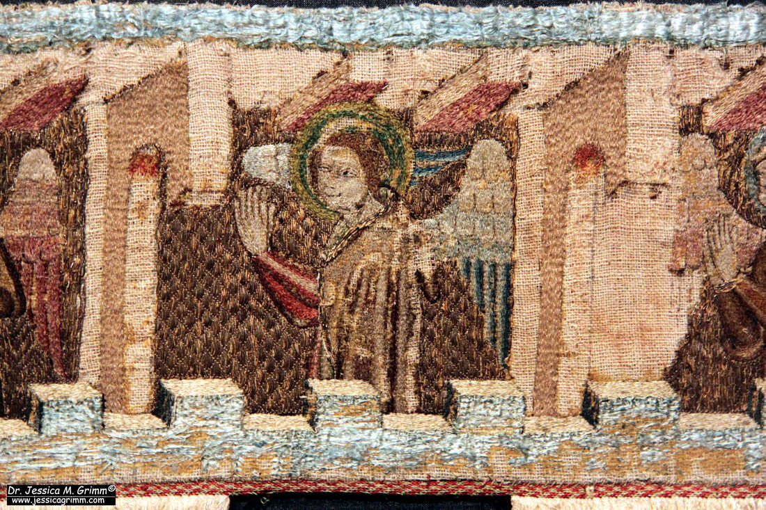 Angel clapping its hands, Königsfelden Antependium (c. AD 1340-1350), Bernisches Historisches Museum Inv. 27 & 51. The smaller band with the angels is really lovely. Two of the angels are playing string instruments. Two others are carrying what looks like a tall white candle. The rest is having a blast. They seem to dance and clap their hands to the music. They form a rich resource for anyone looking to work a medieval musical angel.
The embroidery itself is very fine. The under drawing on the linen is of high quality. The faces of the angels are worked in very fine directional split stitch in untwisted silk. The same technique is used in Opus anglicanum. The other parts of the angels are worked in slightly longer split stitches. Probably because they don't need to be as detailed as the faces. The noses seem to be a little bit padded. And I think they used a knotted stitch for the hair. And it seems that the silk in the halos is laid flat and then couched down. A few additional embellishments on the clothing are stitched in couched gold thread on top of the silk. The background is formed by couching down parallel rows of gold thread with a light-coloured silk. The diaper patterns are relatively simple for the angels but more elaborate for the scenes of the life of Jesus. All in all, the embroidery reminds me a lot of the embroidery made in Bohemia at the same time. This isn't too surprising as Vienna and Prague are relatively close. The Habsburg rulers and the Bohemian kings were also related by marriage and fighting for supremacy in the region. If you ever have the chance, do visit the Bernisches Historischen Museum in Bern, Switzerland. My Journeyman Patrons will have access to many more pictures of this gorgeous embroidery. Please note: I will take a two-week blogging pause whilst teaching for the Alpine Experience. A fresh blog post will go up on the 10th of July. Literature Schuette, M., Müller-Christensen, S., 1963. Das Stickereiwerk. Wasmmuth, Tübingen. Stammler, J., 1891. Königsfelder Kirchenparamente im historischen Museum zu Bern, Berner Taschenbuch 40, p. 26-54. Adding an area of Burden Stitch to my orphrey a couple of weeks ago resulted in some questions and remarks regarding this lovely stitch. First up was the name. A stitch in use during the Middle Ages should probably not be named after a woman who lived in the 19th century. Good point. However, renaming (well-known) stitches is a bit tricky. How do you safeguard that people still know what you are talking about? I could start calling Burden Stitch something like 'Brick Stitch over a foundation thread/padding'. That's technically what Burden Stitch is. Next question: Was Brick Stitch called Brick Stitch during the Middle Ages? I don't know. As far as I am aware, and please correct me if I am wrong, the only technique for which the name can be traced to French accounts of the High Middle Ages is or nue. We could sure do with a Re rustica or Re metallica for embroidery. No such luck. And then there was the mermaid ... 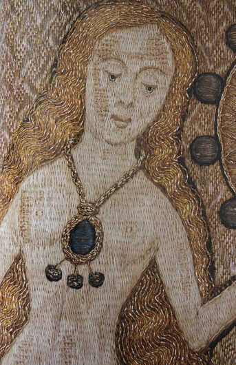 From: Browne, C., G. Davies & M.A. Michael (eds), 2016. English medieval embroidery Opus Anglicanum. London: Victoria & Albert Museum. This mermaid. She is lovely and a bit problematic. Typically mermaid I would say :). Due to a free reference to the website of a textile conservation company in an article by Natalie Dupuis for Piecework magazine, this mermaid is quite well-known in the embroidery world. It was later mentioned on Cynthia Jackson's blog too. After all, it is one of the few free online resources with good pictures of the embroidery. Neither Natalie nor Cynthia mentioned the Burden Stitch in their articles as they focussed on a completely different aspect of the Fishmonger's Pall. Burden Stitch is only mentioned on the website of the conservation company. And I think it is a mistake. The skin of the mermaid (and Saint Peter) is not stitched in Burden Stitch. 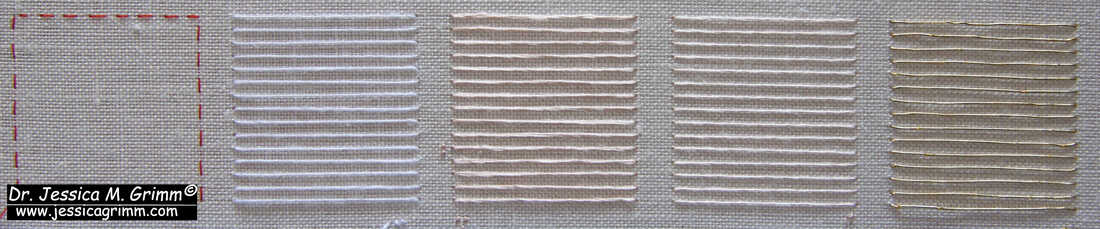 From left: empty square for Brick Stitch, linen thread, double silk, single silk, Stech (passing thread). Identifying embroidery stitches from photographs can be really tricky. When I was alerted to the 'Burden Stitch' on the Fishmonger's Pall by one of my Patrons, I eventually got confused too. When I looked at the pictures, I saw Brick Stitch, not Burden Stitch. As mentioned above, they are similar. Burden Stitch has an added foundation or padding thread. Most needle painting or long-and-short we see in medieval embroidery is actually Brick Stitch or something close to the orderly needle painting as seen in Chinese embroidery. Free-form needle painting as taught by the Royal School of Needlework or Trish Burr, simply does not exist. The medieval embroiderer was a master craftsman and not an artist. Free expression in embroidery was not invented yet. In order to better understand what was going on on the Fishmonger's Pall, I decided to stitch up some samples. I used 46ct even-weave embroidery linen with Chinese flat silk. In order to cover the fabric nicely, I do go over each stitch twice. This gives a flatter result than when you use a double thread in the needle. For my foundation threads, I used: Barkonie linen thread 50/2, a double thread of the Chinese flat silk, a single thread of the Chinese flat silk and gilt Stech 80/90 (passing thread). 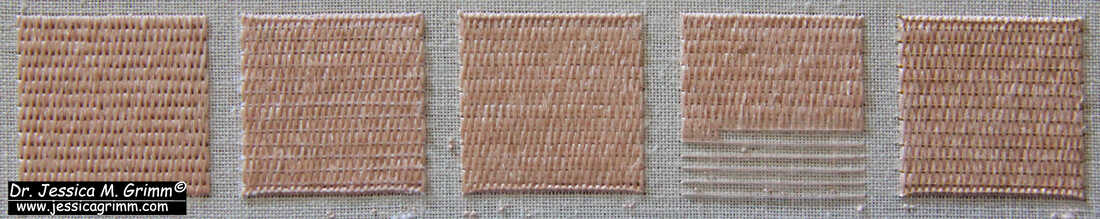 From left: Brick Stitch, Burden Stitch over linen thread, Burden Stitch over double silk, Burden Stitch over single silk, Burden Stitch over Stech (passing thread). Burden Stitch produces a textured surface. To me, skin should be smooth. As you can see from my samples, even the single thread of silk produces a textured surface. Furthermore, it is really hard not to catch any fibres of the foundation threads (not so with the Stech). No matter if you use a sharp or a blunt needle. But my biggest argument why the stitch seen on the Fishmonger's Pall is not a Burden Stitch is the fact that you always see the foundation thread in Burden Stitch. And we do not see one in the pristine areas of the skin of the mermaid. This rules out Burden Stitch for me. The V&A catalogue for the Opus anglicanum exhibition does also not mention Burden Stitch. I, therefore, think that the conservation company misnamed the stitch.
What do you think? Have I missed something? Very well possible! Please chime in below. I will also organise a Zoom meeting on Saturday the 3rd of June for my Journeyman Patrons to further discuss the mermaid and my experiments. Let's see what we can learn!
Literature Browne, C., G. Davies & M.A. Michael (eds), 2016. English medieval embroidery Opus Anglicanum. London: Victoria & Albert Museum. |

Want to keep up with my embroidery adventures? Sign up for my weekly Newsletter to get notified of new blogs, courses and workshops!
Liked my blog? Please consider making a donation or becoming a Patron so that I can keep up the good work and my blog ad-free!

Categories
All
Archives
April 2024
|
 RSS Feed
Contact: info(at)jessicagrimm.com
Copyright Dr Jessica M. Grimm - Mandlweg 3, 82488 Ettal, Deutschland - +49(0)8822 2782219 (Monday, Tuesday, Friday & Saturday 9.00-17.00 CET)
Impressum - Legal Notice - Datenschutzerklärung - Privacy Policy - Webshop ABG - Widerrufsrecht - Disclaimer
Copyright Dr Jessica M. Grimm - Mandlweg 3, 82488 Ettal, Deutschland - +49(0)8822 2782219 (Monday, Tuesday, Friday & Saturday 9.00-17.00 CET)
Impressum - Legal Notice - Datenschutzerklärung - Privacy Policy - Webshop ABG - Widerrufsrecht - Disclaimer