|
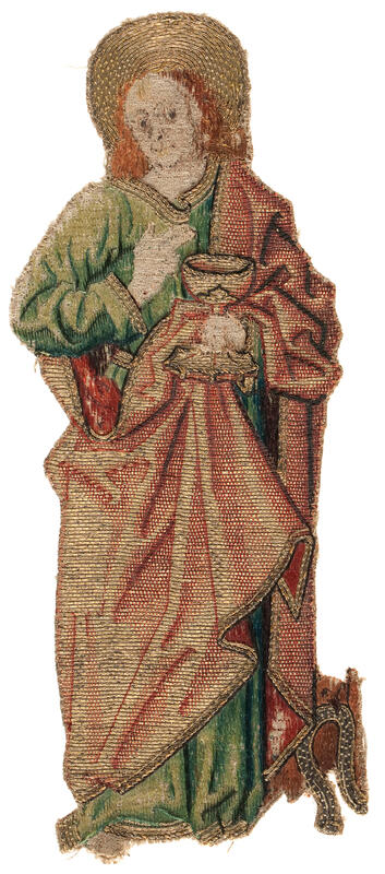
Over the past three weeks, I have compared two orphrey figures of St John (Another John and his identical twin, comparing face and hands & comparing the clothing). In this final blog post, I will compare the or nue and the additional goldwork embellishment. For me, "slow looking" at historical pieces of embroidery is a great form of CPD (Continuing Professional Development). It comes close to the old way of learning where an apprentice would copy the works of the master. Especially when it comes to or nue, copying a piece from the late 15th- or early 16th-century has proven to be essential in mastering this exquisite embroidery technique. In the process, I probably solved the mystery of the two St Johns.
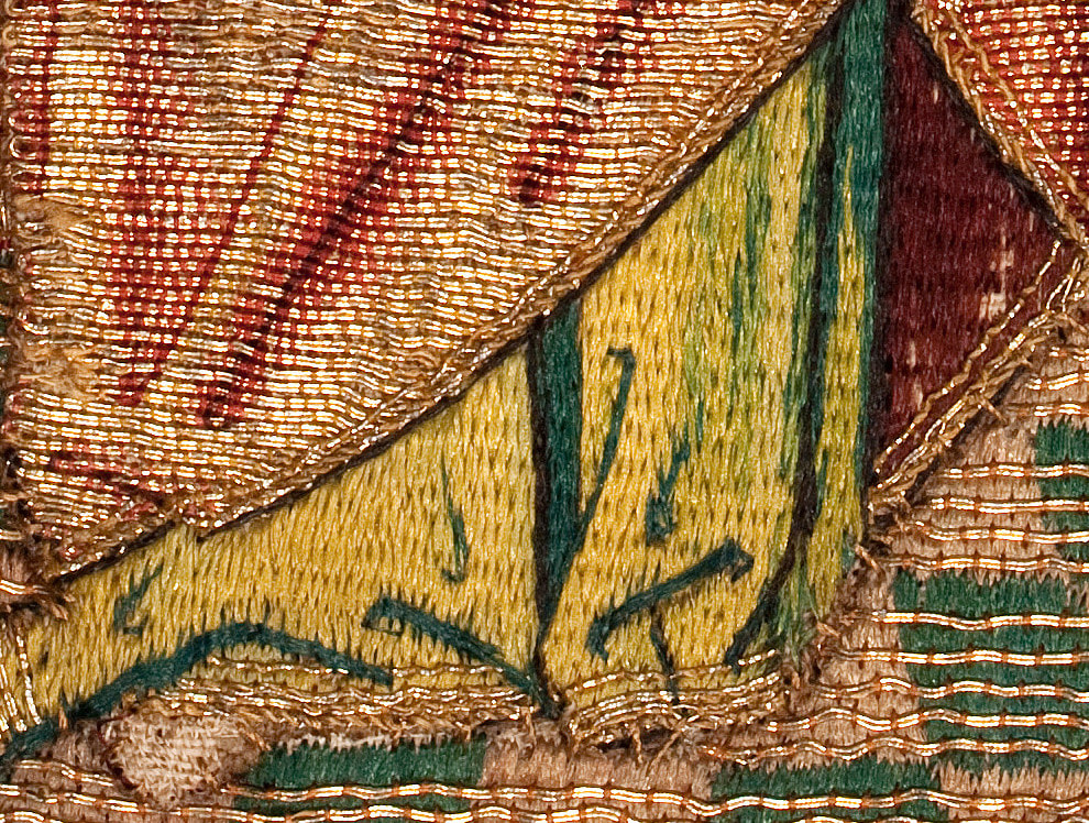
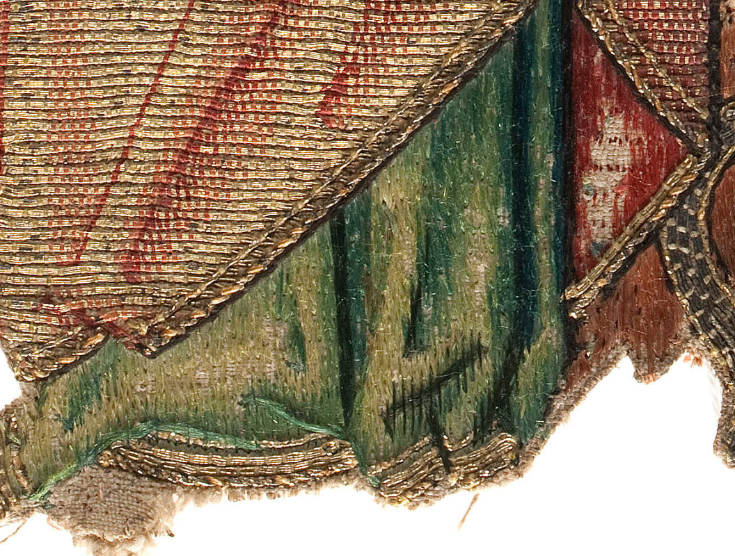
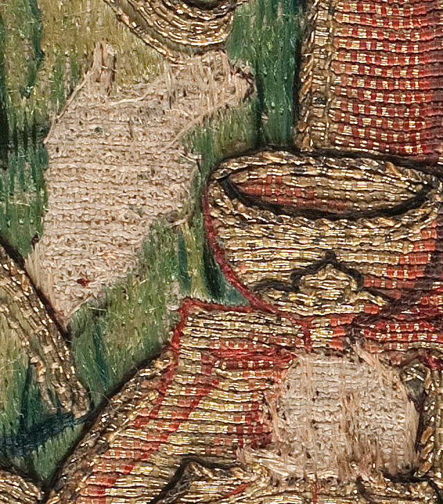
At first glance, the or nue of the red cloaks looks pretty similar. However, when you look at the red cloak in the above pictures: which one gives the better illusion of being three-dimensional? For me, it is ABM t2165 and this is not due to being in a better condition. The folds are more realistic. This is achieved by using one extra shade of red for the shading and the ever so slight curving in the lines of stitches that form the folds. Contrary, the folds of OKM t90a are very straight and the shading is crude. Just like with the silk shading of the green undergarment, the stitcher of ABM t2165 knew what he was trying to convey. The stitcher of OKM t90a just filled the different parts of the design and hoped for the best. The stitcher clearly did "not see" it. As the clothing as a whole (green undergarment and red cloak) was rendered in the same way within the same piece, it is clear that the same stitcher was responsible for the silk shading and the or nue.
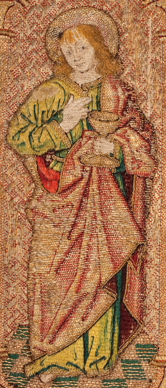
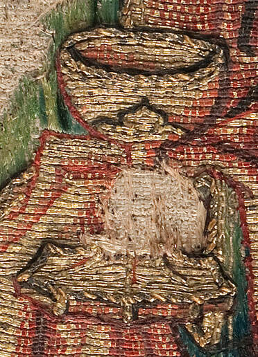
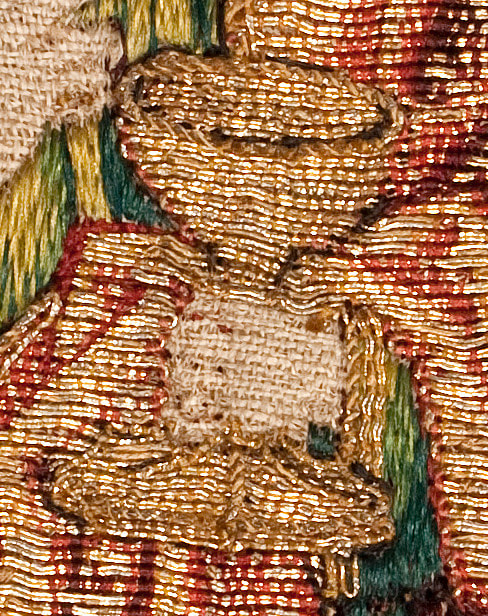
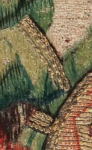
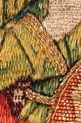
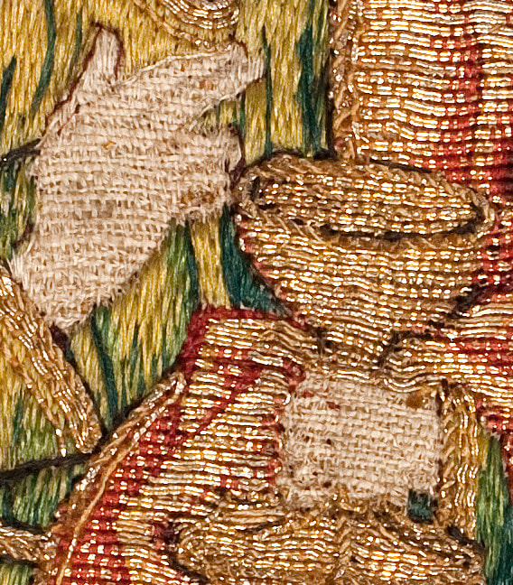
When we look at the cup St John is holding, we see marked differences. And this is interesting in itself! Where the way the clothing was embroidered was apparently very standard (green for undergarment and red for cloak), the stitcher could go wild with the little details. Note: you can clearly see that the cup is "part" of the or nue of the red cloak. The cup of ABM t2165 is expertly worked with a lovely rim worked of a curved pair of goldthreads (two rows on the front and only one row on the inside of the cup) and topped by a single row of twist. The cup has a clear outline achieved with shading on the right and couched red silk on the left to hide the turns of the goldthreads. The "seam" between the stem and the cup is decorated with foliage formed by a pair of couched goldthreads and couched brown silk. The foot of the cup is ornately faceted with couched pairs of goldthread and a rim of twist. The whole cup is clearly recognisable as a Gothic cup of the time. Contrary, the cup of OKM t90a is crude with poor shading and fewer details. The twist is either made with an extra strand of yellow silk or these are the very visible couching stitches.
The clothing of St John is further embellished with goldthreads stitched over the silk shading and the or nue. In both cases, normal goldthread and twist were used. But, as seen with everything else (bar the face!) the stitching on ABM t2165 is more refined. Looking at all the evidence, I don't think the two versions of St John were stitched by the same embroiderer. Not even several years apart. The stitcher of ABM t2165, although not an expert with faces, is clearly the better artist with an expert understanding of how to suggest the third dimension. I get the feeling that ABM t2165 is the work of a single artist, whereas OKM t90a is the work of two stitchers. One mediocre stitcher for the figure and an absolute ace for the face. Could they be produced in the same workshop? Yes. After all, in a large workshop such as that of Jacob van Malborch in Utrecht (AD 1500-1525), many different stitchers were working on the commissions. But something isn't quite right ... 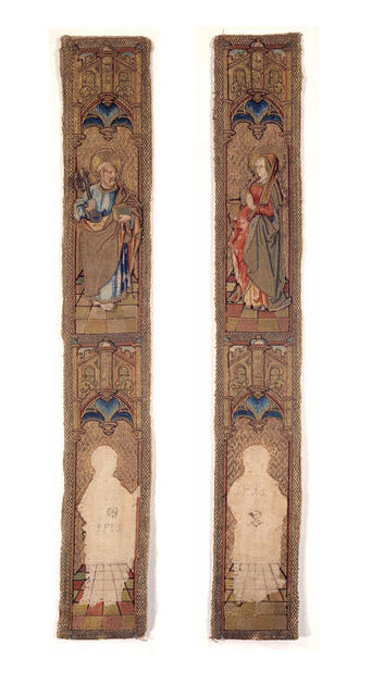 ABM t2165a1, Museum Catharijneconvent, Utrecht, foto Ruben de Heer OKM t90a was certainly stitched by or in the workshop of Jacob van Malborch as we have the work contract from AD 1504. The reason why ABM t2165 is ascribed to Jacob van Malborch is due to the ink inscription on the orphrey beneath the loose figure: I.F.I.S. According to Saskia de Bodt, these letters stand for: I(acobus) F(ecit) I(pse) S(anctam) or Jacob made this saint. Now, ABM t2165 contains four saints in total. Two still attached to the orphreys and two loose ones of which one is our St John. The two attached figures are quite different in style from the two loose figures ... 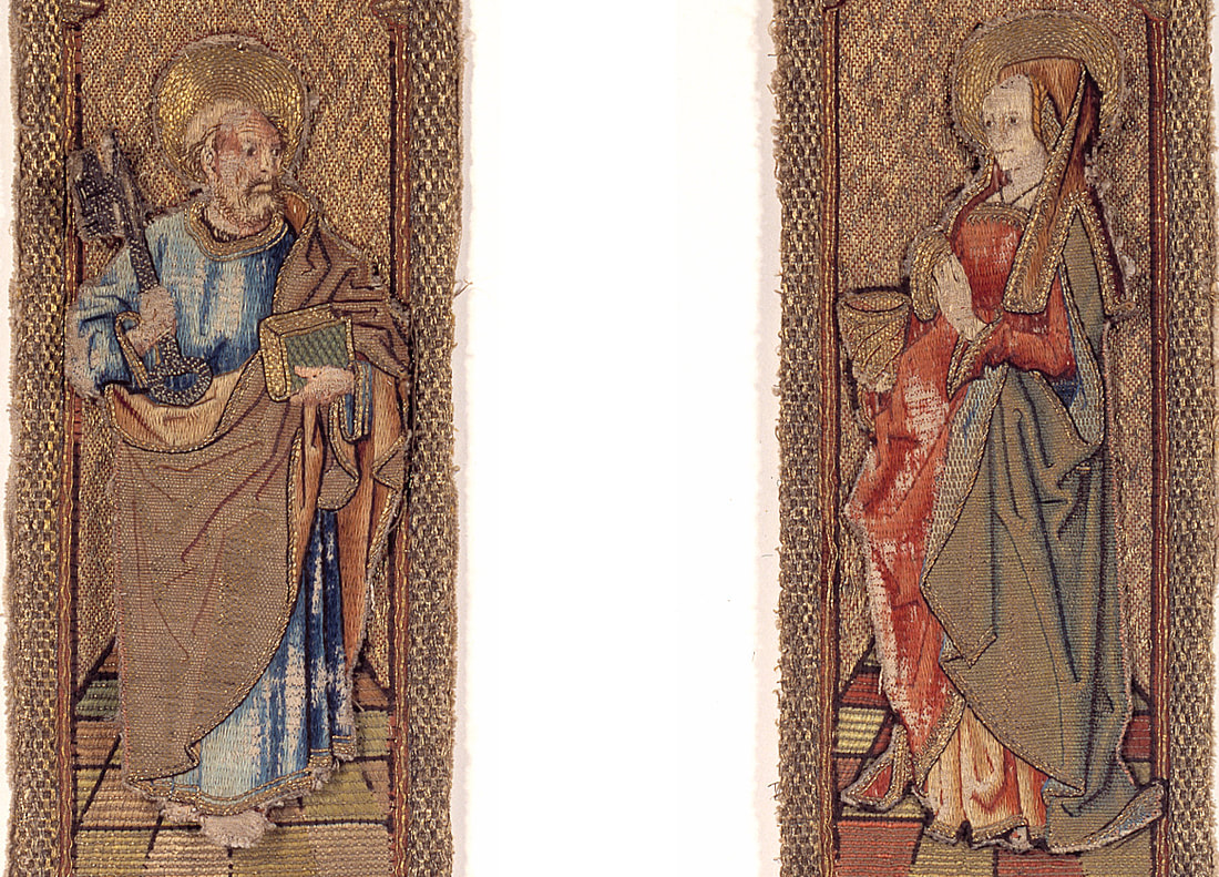 ABM t2165 Museum Catharijneconvent, Utrecht, foto Ruben de Heer St Peter and Mary Magdalene have very pretty faces, but crude silk shading for the undergarments. And simple reduced shading of the or nue with very straight lines for the folds. Sounds familiar! These figures are comparable with OKM t90a. Those that were definitely made by or in the workshop of Jacob van Malborch. The two loose figures of ABM t2165 are not. And a tiny remark in the online catalogue entry proves my point: "Het borduurfragment is groter dan de uitsparingen in de linnen ondergrond. Mogelijk was er eerder een andere Petrus op aangebracht." (The embroidery fragment is larger than the voided areas on the linen background. Maybe originally a different St Peter was once attached.). If St Peter is not original, why should St John be? When vestments wore down, repairing them by patching them with parts of other worn down vestments and/or by adding new parts was common practice (even in rather recent times to make them saleable on the antiquities market). It is very well possible that ABM t2165 is the result of such recycling!
Literature Leeflang, M. & K. van Schooten (eds), 2015. Middeleeuwse borduurkunst uit de Nederlanden. Utrecht: Museum Catharijneconvent.
12 Comments
Last week, we looked at the very fine silk embroidery used to render the face and hands of St John. Today, we will have a look at how his clothing was stitched. We will start with the silk embroidery and look at the or nue and further embellishment with metal threads next week.
The green undergarment and the lining of his red mantle are stitched in silk. This is the same form of vertical silk shading, or tapestry shading, as seen in the face. Last week, we saw that the face of OKM t90a was more finely stitched than that of ABM t2165. We now see a contrast between this finely stitched face and the embroidery of the undergarment and the lining; both are stitched less fine. Contrary, in ABM t2165 there is no such difference; both face and garments are stitched the same way. We know that the fact that the figures and the background were separately made in these orphreys, lead to labour division and thus sped up the embroidery process. In larger workshops, the different jobs were likely awarded according to skill. The stitcher who could realistically render columns and vaults and who was an ace in counting worked the architectural backgrounds. His colleague, who was world-class in shading, worked the figures in tapestry shading and or nue. And I have proposed in the past that there was a third person. A highly skilled one, probably near-sighted, who worked the very fine faces. This seems to have been the workflow for OKM t90a. Contrary, when the workshop was a one-man affair (with an apprentice or journeyman) labour division was less or even absent. I think this is what we see in ABM t2165.
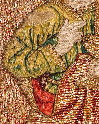
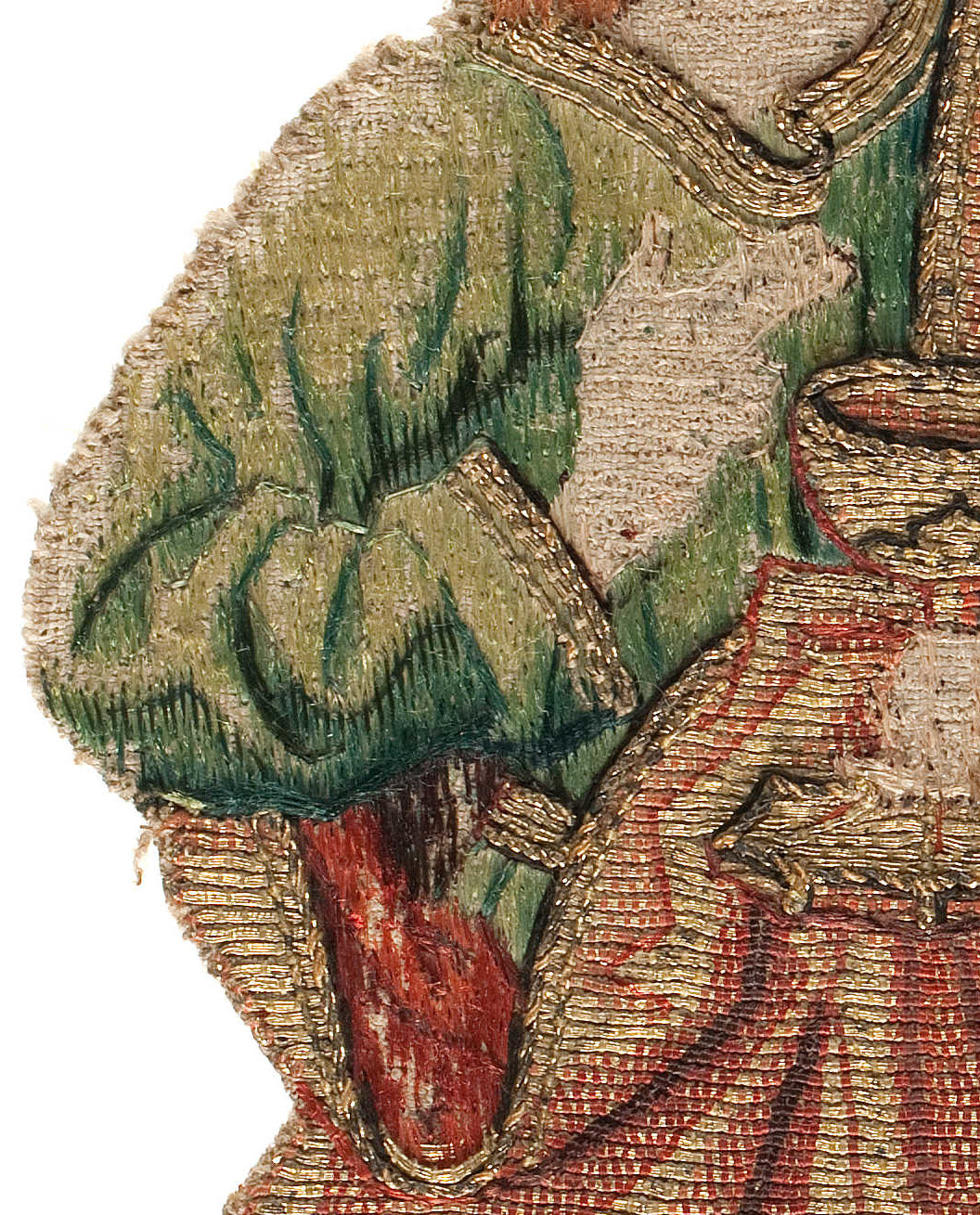
Here you see the upper part of St John's green undergarment. One thing strikes: the silk on OKM t90a is in much better condition than on ABM t2165! How did that happen? Is it simple "wear and tear"? Then the silk of the or nue should have similarly deteriorated. Interestingly, the or nue of OKM t90a is in worse condition than that of ABM t2165. Maybe the silk used was of different quality? Or the linen ground fabric? It looks like the linen of ABM t2165 is a tat more finely woven than that of OKM t90a. Maybe this led to higher abrasion when stitching. Or was the stitcher to blame? As an embroidery teacher, I was often amazed how threads could wear rapidly when used by certain students and not at all whit other students. It is likely that the condition of your skin plays a major role. Was the stitcher of ABM t2165 forced to work with rough winter hands? When we look at the actual stitches, it becomes clear that the maker of ABM t2165 worked very methodical. The stitches go over five horizontal fabric threads and you can clearly see rows forming. Not so with OKM t90a. This is all a bit more irregular. When you look at the dark red patch under the green sleeve (next to his belt) you see three tiny stitches. The other dark red stitches in the vicinity are much larger.
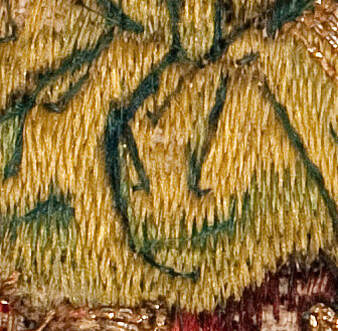
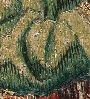
Interestingly, the shading of the sleeve of the green garment is much better on ABM t2165. You really get the impression of a heavy fabric falling in soft rounded folds. Whilst the embroidery on OKM t90a is crude as if the stitcher did not understand how fabric drapes. In both cases, the suggested folds are the result of shading in the satin stitching followed by additional couching on top. In my eyes, the expert rendition of the hair (and probably face) in OKM t90a combined with the sloppy stitching of the folds of the green garment doesn't make sense when we assume that this was done by the same stitcher. Especially not as this isn't a simple case of speeding up the process. The number of stitches on both sleeves seems to be similar. Contrary, the similarities in the stitching of the hair and the green garment on ABM t2165 make it likely that these were stitched by the same person. Who was very apt at stitching garments, but maybe not so good at faces. Maybe the stitcher's eye-sight was no longer good enough to stitch the very fine details needed for the face?
And here you see the bottom part of the green undergarment and the red lining. Interestingly, you can see that both stitchers used the very regular stitching for the dark red part of the lining. The green stitches, on the other hand, look rather crammed towards the left-side on OKM t90a. The stitcher of ABM t2165 kept a much more regular stitch going.
The more I compare these two pieces, the more questions I have! Please do let me know what you think in the comments below. Last week, we looked at two identical orphrey figures of St John held at Museum Catharijneconvent in the Netherlands. From my analysis, it became clear that they were not made with the same pricking. However, they did have the same "origin source" which I called a model book. What these model books looked like, we don't know as they have not survived. Today we will look in-depth at the actual embroidery. How are the different parts of the figures worked? Could this have been done by people in the same workshop or even by the same person? Let's look at the evidence.
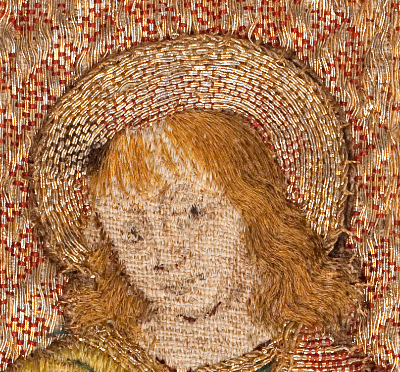
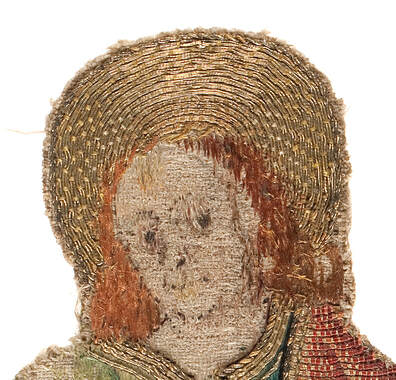
Above, you see a close-up of the faces of the embroideries. It becomes clear that the design drawing differs for both. What is really sad is that the fine silk shading of the faces has completely deteriorated. By working a copy of the orphrey of St Lawrence, I came to understand that the quality of the silk shading in the faces determines the quality of the embroidery. You often read in the literature that the or nue is the most difficult embroidery technique used in these pieces and thus defines the quality. This is not true. After all, or nue is a counted thread technique and as long as you are not colour-blind and you have ample dexterity, you will be able to copy medieval or nue to the highest level. Not so with the very fine silk shading of the faces. Unless you started learning this technique at a very young age (many Chinese for instance start at age three!), you will not be able to reach the highest level in medieval silk shading. 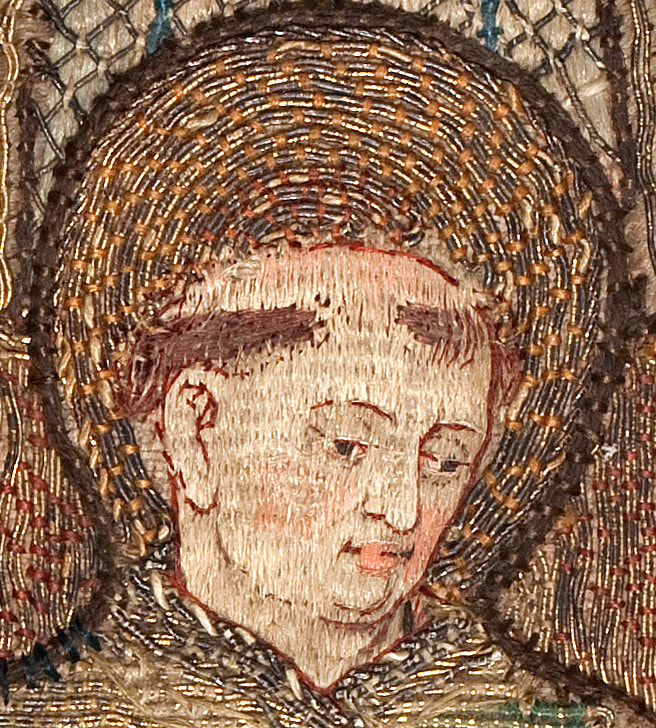 ABM t2107h, Museum Catharijneconvent, Utrecht, foto Ruben de Heer Here is a close-up of the face of St Lawrence. The actual face is about 2,5 cm in height. I call the embroidery technique silk-shading, but this is not quite accurate. This is not the silk-shading as taught at the Royal School of Needlework. You can clearly see rows of stitches. And these rows correspond to the shape of the face and give it the illusion of 3D. Splitting threads is not a necessity. It probably happened, but it wasn't aimed for. This variety of silk shading is closer to certain types of Chinese silk embroidery. Again, just like the or nue, it is for the most part a counted thread technique. Additional details are stitched on top of this foundation of silk-shading stitches. Note the multiple colours in the eyes: blue-grey iris, darker pupil, white of the eye and pink of the corner of the eye!
Back to the heads of St John. The reason that the faces often not survive is due to the fact that the lighter shades of silk were achieved by bleaching the silk. This weakens the fibre. Luckily, the ginger hair of St John did survive. And here we see marked differences in embroidery quality. The stitch direction in ABM t2165 is plain vertical. Contrary, the stitching in OKM t90a gives the illusion of curls. The silk thread has been split into a very fine fraction and multiple colours have been used to achieve this realistic imitation of hair. It is therefore likely that the face of OKM t90a was once more finely stitched too. I even get the impression that the design drawing hints at this too. Furthermore, the halo of OKM t90a is more elaborate too. Whilst for ABM t2165 the halo is plain with no shading, there is elaborate shading in the halo of OKM t90a. But there are similarities too. Both halos are framed with a fine couched down twist.
Although nearly all the stitches have gone, let's have a look at the hands. They are usually stitched in the same technique as the face (but not always: sometimes the silk-shading pierces the underlying or nue, as is the case with St Lawrence). What you can see in the above close-ups is that the stitches of the silk-shading orientate themselves on the grain of the linen fabric. This underlines that this form of silk-shading is indeed different from our modern form of silk-shading.
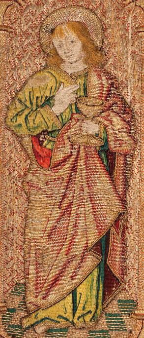
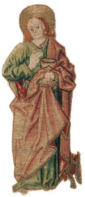
Next time, we will compare the stitching on other areas. Saint John the Evangelist is a popular figure in medieval embroidery. He is often present on the more elaborate vestments with multiple figures. Small wonder that some of these "Johns" look pretty identical. After all, there is only so much variation in depicting a figure that needs to be instantly recognisable. Almost like a caricature. Furthermore, it is likely that designs and prickings were used more than once. Today we are going to look at two Johns kept in Museum Catharijne Convent in the Netherlands. Some scholars have argued that they were made by the same workshop with the same design drawing or even the same pricking. However, I am no longer so sure.
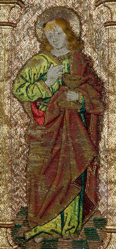
These are the two Johns. On the left, is a loose figure which is part of an orphrey. And on the right is a complete orphrey which is part of a dalmatic. It is also one of only four orphreys that historical sources identify as being made in AD 1504 by (the workshop of) master embroiderer Jacob van Malborch working in Utrecht between AD 1500-1525. Being able to connect the other John to this famous embroidery master or his workshop is somewhat important. As there are many different aspects to the comparison of the two Johns, I am only going to compare the design drawing in this blog post. Future posts will examine the actual stitching. 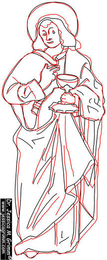 Black: ABM t2165b2 and red: OKM t90a Making tracings from the original embroideries and placing them on top of each other is sometimes done in the literature to prove the use of the same design and/or pricking and thus the production in the same workshop. Minor differences between tracings are always explained by the "uncertainties in the steps of copying" between the different stages of pattern transfer:
- copying the design from a model book onto the medium that will become the pricking (how well does the copyist follow the lines of the original?) - pricking the holes of the pricking (how well does the pricker follow the lines?) - rubbing pounce powder through the holes of the pricking (did the pricking move?) - connecting the pounce dots with paint (which decisions were made by the painter?) - the actual embroidering (skill of the embroiderer) Theoretically, you can end up with very different results when the same design drawing or even the same pricking is being used. But what are minor differences and when are differences too large that they can no longer be explained by the "uncertainties in the steps of copying"? Are the above tracings proof of the use of the same design drawing and/or the same pricking? Were both embroideries made by the same workshop? Firstly, let me explain how these tracings were made. My husband used CAD software and the high-resolution pictures available from the online catalogue of Museum Catharijneconvent. He then made both drawings the same length, whilst keeping their proportions. He also tilted them somewhat to achieve the best fit. Not ideal. But remarkably similar to the tracings which were made by curators of Museum Catharijneconvent from the original pieces. They encountered a problem too, which made their tracings not ideal either: the loose figure could be traced flat whilst the figure on the dalmatic needed to be traced whilst hanging. As the professional pictures in the online catalogue were likely all corrected for perspective distortion by referencing with actual measurements (common practice in archaeology), they are probably better to use as tracings than the original embroideries. When you now look at the two tracings it becomes immediately clear that some parts of especially the top half of the Johns are quite similar. Other parts differ more greatly. The faces are different, especially the placement of the eyes and the extend of the hair. And whilst the bottom seam of his clothing and his foot match, there is no way that the bottom half of the clothing and the folds can be made to fit. When I used the same pricking for the 30 little stars I painted onto silk twill fabric for my recent online workshops for the Diocesan Museum Bamberg, I did not end up with differences of this magnitude. I am therefore pretty sure that we can rule out the use of the same pricking. But what about the use of the same design drawing? I am pretty sure that the same model book was being used. Unfortunately, none are left to us and we have no idea what these model books looked like. Contrary, prickings and design sketches have survived as backing of these embroideries. I can imagine that from a smaller picture in a model book, the embroiderer made a design drawing the size of the desired embroidery (not all orphreys have the same size and thus the figures needed to be drawn taller/shorter, wider/thinner). By using a grid, it is easy to transfer a design to the desired proportions. And whilst you need to be quite precise whit the detailed parts of the design (upper part of John), you could probably fudge the simpler bottom a bit to speed the process up. This might explain the differences in the tracings. So, not the same workshop? Who knows. Normally, you would keep your pricking for future use. After all, paper or parchment was expensive and making the thing was labour intensive. However, prickings are fragile. They don't last forever. Maybe a new design drawing and a new corresponding pricking was made from the same copy of the model book in the same workshop. We will probably never know. In my eyes, the tracings cannot be used to support the theory of the same workshop beyond a doubt. But what we really need is a test. At some point, I will set up a workshop in which all students will use the same complex pricking. After all the embroidery is done, we will compare the outcome. In this way, we will know the margins of error when the same pricking is being used by embroiderers of different ability. P.S. this series of blog articles on the Johns from Utrecht are inspired by a mail thread between me and art historian Stephan Kuhn. He wrote his MA-thesis on the vestments of St Martin in Emmerich. Presently, he is working on his doctoral thesis, but hopes to return to the Emmerich vestments with a proper paper. |

Want to keep up with my embroidery adventures? Sign up for my weekly Newsletter to get notified of new blogs, courses and workshops!
Liked my blog? Please consider making a donation or becoming a Patron so that I can keep up the good work and my blog ad-free!

Categories
All
Archives
July 2024
|


 RSS Feed
Contact: info(at)jessicagrimm.com
Copyright Dr Jessica M. Grimm - Mandlweg 3, 82488 Ettal, Deutschland - +49(0)8822 2782219 (Monday, Tuesday, Friday & Saturday 9.00-17.00 CET)
Impressum - Legal Notice - Datenschutzerklärung - Privacy Policy - Webshop ABG - Widerrufsrecht - Disclaimer
Copyright Dr Jessica M. Grimm - Mandlweg 3, 82488 Ettal, Deutschland - +49(0)8822 2782219 (Monday, Tuesday, Friday & Saturday 9.00-17.00 CET)
Impressum - Legal Notice - Datenschutzerklärung - Privacy Policy - Webshop ABG - Widerrufsrecht - Disclaimer