|
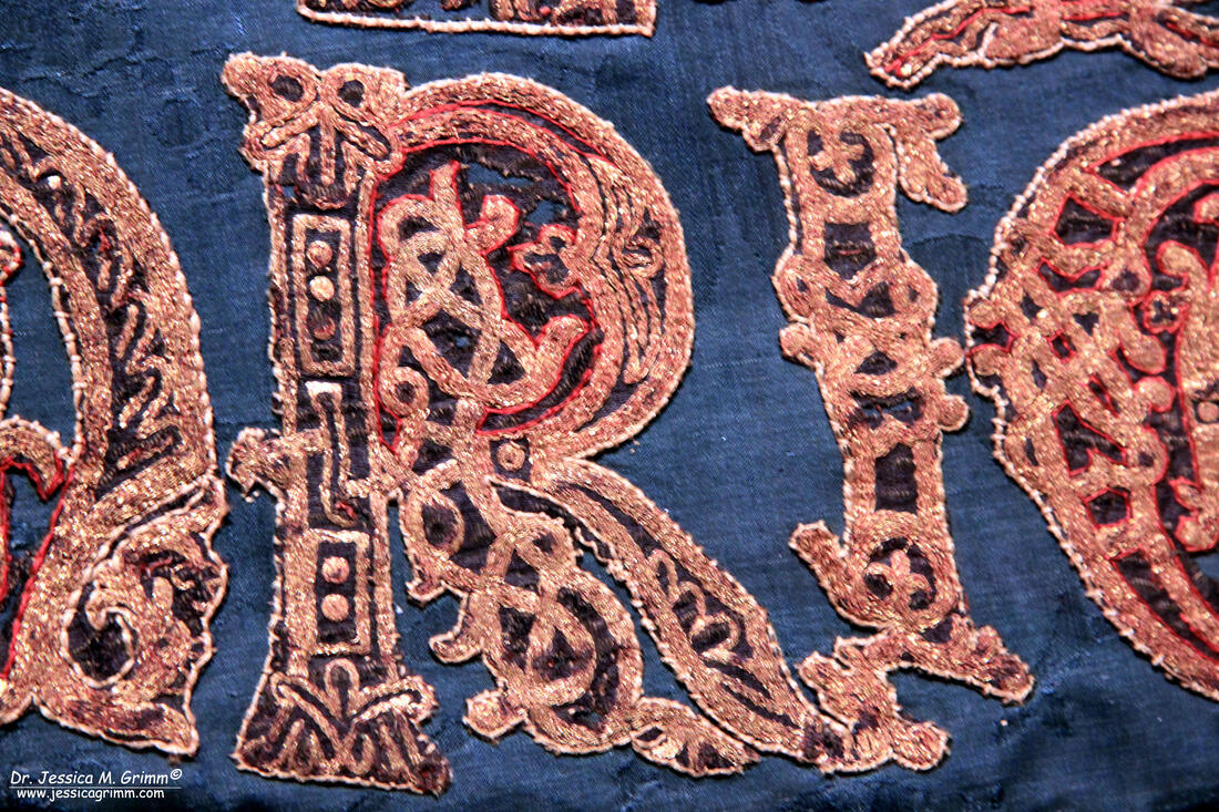
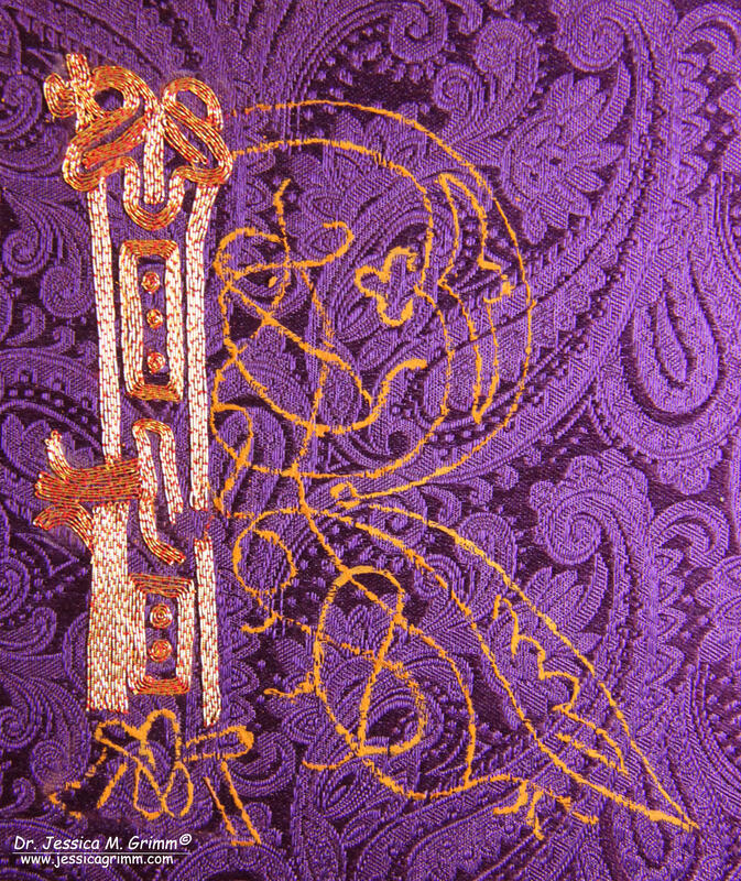
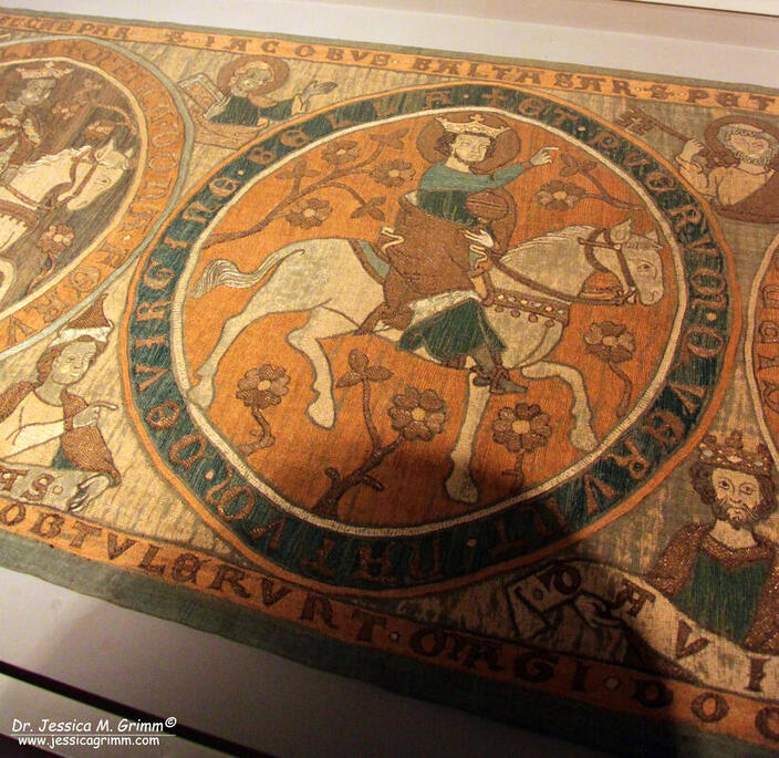
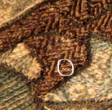
This is the last article in the series accompanying the conference 'Über Stoff und Stein' in Munich. The other three articles can be found here: part I, part II and part III. For my last goldwork embroidery sample, I choose a letter from the Sternenmantel of Holy Roman Emperor Henry II held at Bamberg. You can read about my visit to the museum where it is housed here. As one of the conference organisers, Dr. Tanja Kohwagner-Nikolai, is also head of the research team for the embroideries held at the Diocesan Museum in Bamberg, I was able to ask very specific questions about the embroidery. I was even given a high-resolution picture of the particular letter (for obvious copyright reasons, I can't publish that picture here). Join me in my musings on recreating part of a very elaborate 'R' from a stunning piece of embroidery that's a 1000-years old. The original goldwork embroidery was worked on a dark purple samite. This is a specific twill-type weave for silk fabric which was popular in the Middle Ages. I only once had a small piece in my hand which was found during an archaeological excavation in the medieval parts of Emden in northern Germany. Samite is hard to get hold of nowadays. Czech-based company Sartor recreates historical samites for the re-enactment scene. Fortunately for my purse, they don't have a dark purple one in stock. Instead, I had a look in my fabric stash and came up with a paisley patterned silk damask. Next up was transferring the pattern. The drawing of the 'R' is very intricate and can only be transferred onto the fabric once simplified. I made a pricking of the simplified drawing and used white pounce powder for the transfer. The white dots were then connected with watered-down watercolour Raw Siena (see video above). As the drawing is so intricate, I did my utmost best to keep the paint lines as fine as possible. NB: From the high-resolution picture I could tell that the letter is 9.5 cm tall. As I worked with my original pictures and some crude maths, my copy is about a centimetre taller. The Sternenmantel has undergone major alterations since it was first stitched around AD 1020. The first major re-make took place in the 15th century when the gold embroideries were cut out from the old mantle and appliqued onto the blue silk damask we see today. The thick red and white embroidered lines along the edges of the lettering date to this re-make. The original lettering looked indeed very different. The goldthread used for the lettering is a kind of very fine passing thread. The strips of gold foil wrapped around the silk core are less than half a millimetre wide and have a near pure gold content. In comparison, most ordinary gilt goldthreads used today have a gold content of 0.3% -2%. There are about 46 goldthreads per centimetre and this makes each goldthread around 0.21 mm. This is comparable to a modern-day Stech vergoldet CS 70/80 or a smooth passing #3. The goldthread is couched down as a single thread with red silk yarn. I've used DeVere Yarns Carmine #666. There is no regular couching pattern. Although the high-resolution picture is much better than my original pictures, I still am unable to tell if the tails of the goldthreads are plunged and tied back on the reverse of the fabric or if the ends are simply cut off and secured with an extra couching stitch. It is highly likely that the answers lie beneath the thick white and red contour lines which were added in the 15th century when the goldwork was taken off the original mantle (or mantles) and appliqued onto this 'new' one. I was also told by the head of the research team that the restoration in the 20th century now makes it impossible to inspect the reverse of the embroidery. This is very unfortunate indeed, but also shows the great strides made in textile conservation since then. In my reconstruction, I did not plunge my ends in accordance with the later Gothic embroideries from the Low Countries where there was no plunging either. I know that this is a long stretch both in time and area. However, the goldthread used is so pure that it would have been far too costly to waste any of it on the back. During the conference, I had a lovely discussion with both Tanja and Dr. Holger Kempkens on who made the Sternenmantel and the other magnificent goldwork embroideries held at the Diocesan Museum Bamberg. We readily agreed that it was not noblewomen or nuns, but men in professional workshops. Probably travelling with the highly mobile imperial court. And with connections to both the Western world and the Islamic world. Modern-day professional commercial goldwork embroidery is often executed by men (for instance the cover for the Kaaba in Mecca). The first mentions in the historical records of women doing goldwork embroidery either as creators or repairers are from the 17th century in this part of the world (the situation is different in England). And then there is the embroidery itself. The couching on the lettering is done in a very specific way. Although the couching stitches are placed randomly, the goldthread is by no means laid randomly. The embroiderer made sure that this very precious thread was laid down in the most economic way with as little starts and stops as possible. This is easy to do on the straight parts, but far less easy on the 'knotty' bits. Although I stared long and hard at the picture, I found out halfway through the actual stitching that I had it wrong. In comparison, my husband needed very little time to figure out the correct 'path'. Now please don't get me wrong or accuse me of sexism, but there are things in life MOST men can do better than women and vice versa. Not ALL men or ALL women. And this is not to say that there aren't women out there that can do this job perfectly. But I get the feeling that this particular embroidery job suits men better than women. Please don't hate me. Demonstrating historical goldwork embroidery techniques to the conference delegates was very enjoyable. They were tremendously interested and had lots of questions. It is so important to get both 'head' people and 'hands' people in the same room talking to one another. Tanja's idea of doing just that for this conference was brilliant and I certainly hope that it will get copied like mad by others. Literature
Baumgärtel-Fleischmann, R. 1983. Diözesanmuseum Bamberg ausgewählte Kunstwerke, Bayerische Verlagsanstalt Bamberg. ISBN 3-87052-380-8. Grimm, J.M., 2021. A hands-on approach - Epigraphy in medieval textile art, in: Kohwagner-Nikolai, T., Päffgen, B., Steininger, C. (Eds.), Über Stoff und Stein. Knotenpunkte von Textilkunst und Epigraphik. Harrassowitz, Wiesbaden, pp. 141–147. Kohwagner-Nikolai, T., S. Ruß & U. Drewello, 2016. Goldgestickte Vergangenheitsinszenierung, Restauro 5, pp. 48-53. Kohwagner-Nikolai, T., 2014. O Decus Europae Cesar Heinrice? Die Saumumschrift des sogennanten Bamberger Sternenmantels Kaiser Heinrichs II., Archiv für Diplomatik, Schriftgeschichte, Siegel- und Wappenkunde 60, pp. 135-1646. P.S. Did you like this blog article? Did you learn something new? When yes, then please consider making a small donation. Visiting museums and doing research inevitably costs money. Supporting me and my research is much appreciated ❤!
7 Comments
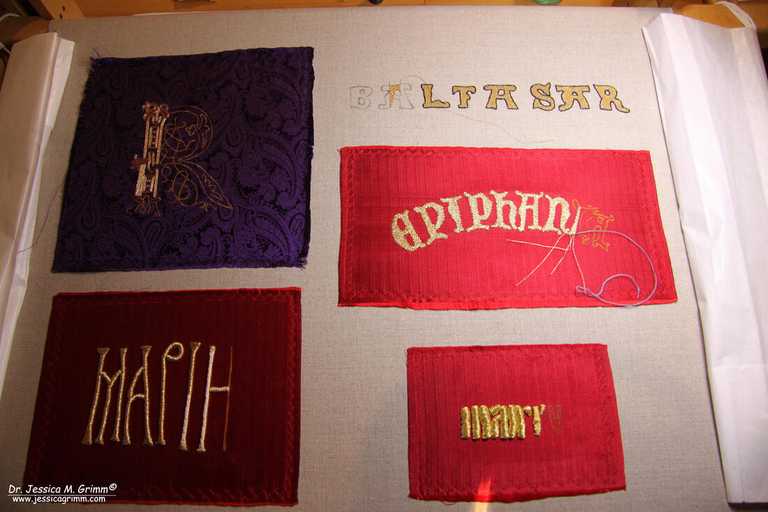
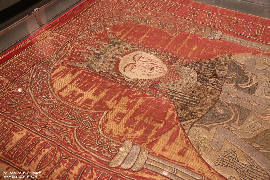
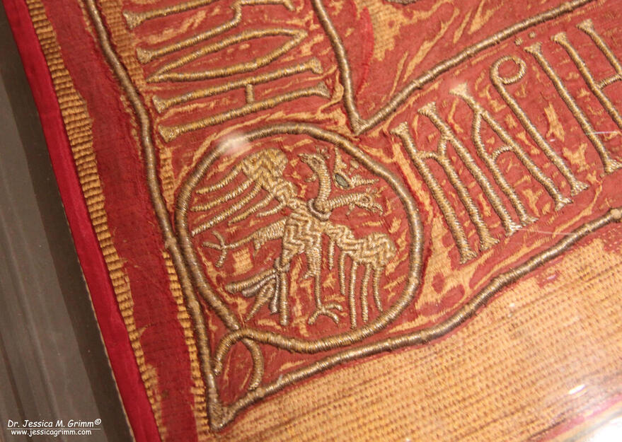
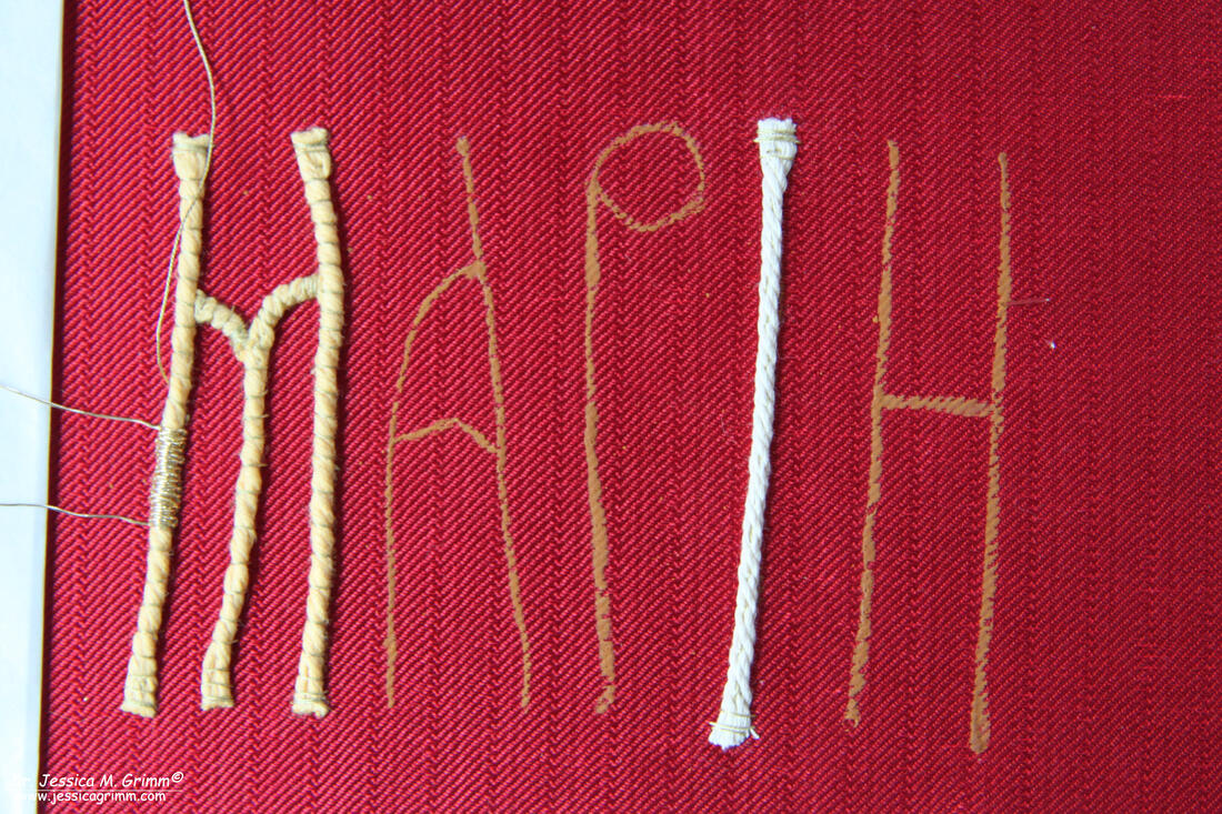
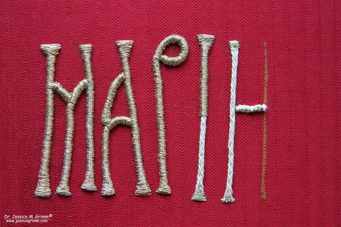
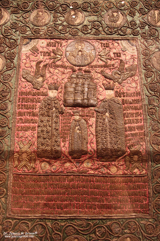
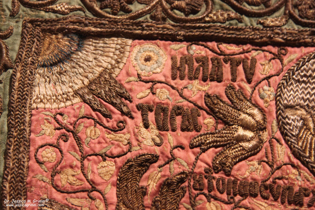
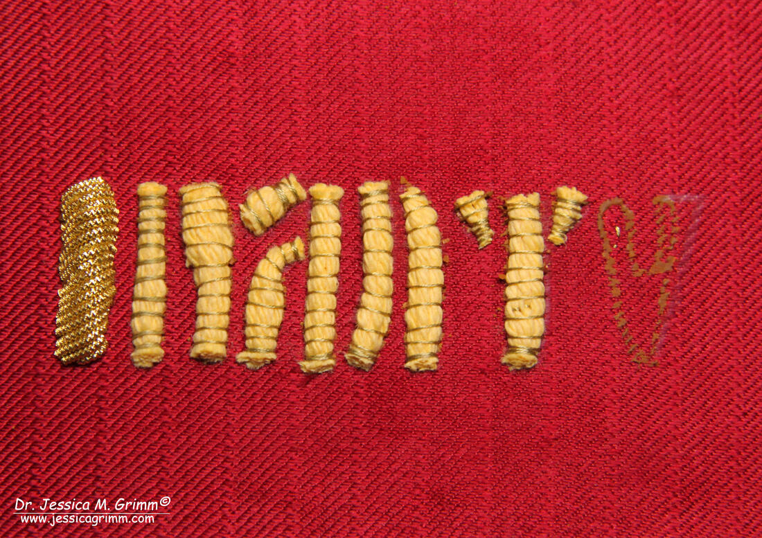
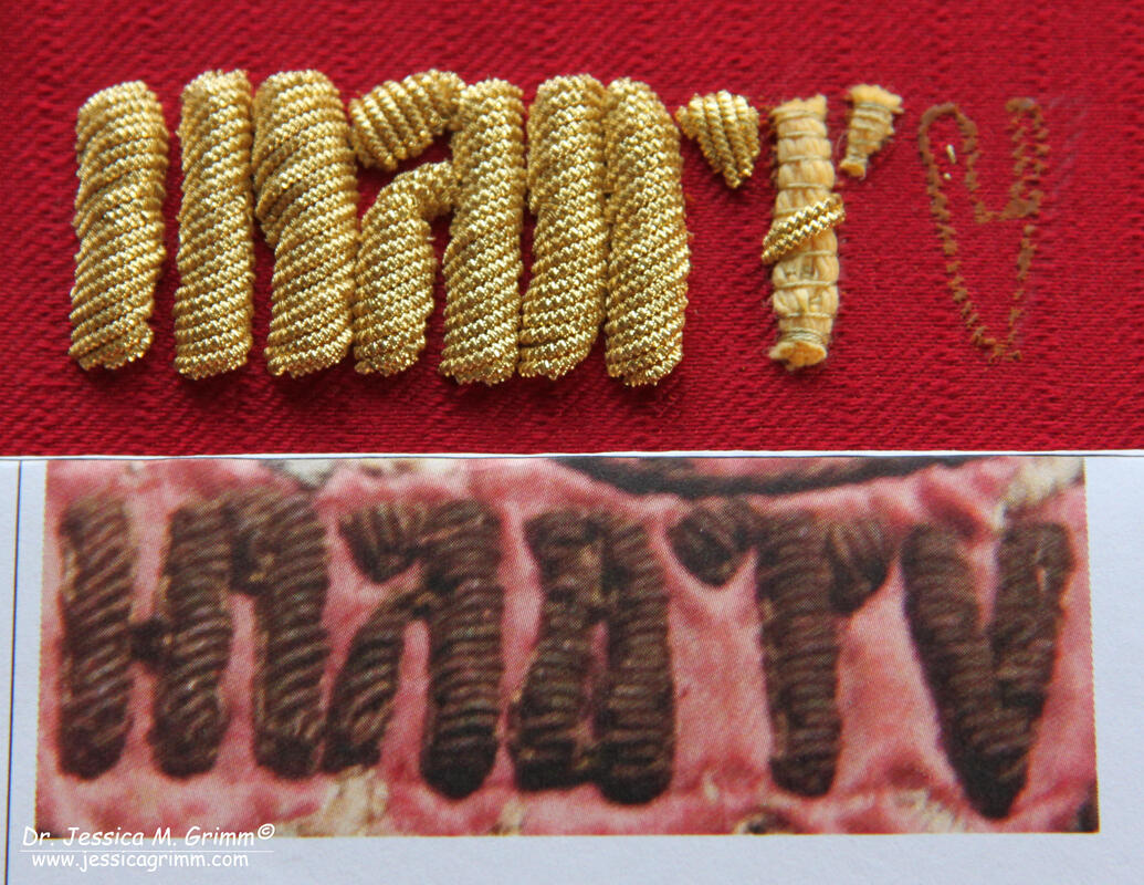
Today we are going to have a look at two more modern examples of lettering in goldwork embroidery. One can be found on the burial shroud of a princess from Romania and the other is part of a dedication on an orthodox podea or icon cover. They were both part of a temporary exhibition on Romanian embroidery in the Louvre Museum last summer. You can read all about that trip here. In recreating these samples, I had to use common padded goldwork embroidery techniques I am no longer very familiar with. And I made a rookie mistake. Read on so you'll learn from that mistake. I for my part have made a big yellow mental post-it :). First up is the burial shroud of Maria of Mangup, second wife of Prince Stephen the Great of Moldavia. The shroud measures 191 x 103 cm and shows Maria laying in her tomb. She is richly dressed in Ottoman clothing and adorned with precious jewellery. The embroidery is executed with silver and gilt threads as well as coloured silks on red silk fabric. Maria likely died on the 19th of December AD 1477 and is buried at Putna monastery in Romania. The church Slavonic text surrounding the depiction of Maria is written in Cyrillic lettering. The four corners show monograms and double-headed eagles in order to point to Maria's family links with the Byzantine empire. For the epigraphy conference 'Über Stoff und Stein' in Munich next week, I decided to recreate Maria's first name. The embroidery technique used for the lettering seems to be gimped couching over string padding. This means that passing thread is laid over the padding and secured on both sides of the padding with a small couching stitch. The passing thread is folded forwards and backwards over the string padding until all of the padding is covered. Think of it as a satin stitch over padding, but without going through the fabric with the passing thread. Although I know I should have used linen string padding to be historically correct, but I was unable to find some. If anyone knows of a good source, I am all ears! First, I tried soft string padding as it is easier to manipulate. However, when applying the passing thread they would shift and sit on top of each other as the padding was just not firm enough (see on the letter M in the picture above). Then I used white string and that was much better. I also noticed that the widened ends of the letters had less height than the 'body' of the letters. This made me think that the embroiderers must have untwisted the padding thread they were using in order to create this effect. The hardest thing with this lettering sample is the joints and the widening at the ends. For what I can see in the original, the embroiderers fudged until it looked pleasing enough. I have used Stech vergoldet 80/90 CS which is comparable to passing thread #4 and DeVere yarns silk Hessian #18267 for my couching thread. Not bad for a first attempt, but certainly not as smooth as the original :). This has likely to do with the modern passing thread having slightly different properties than the original thread used. And I do apologize for the cat hairs visible in the picture; Sammie cat is poorly and clings to me a lot! The youngest sample I included is this magnificent podea or icon cover made in AD 1681. The amount of Greek lettering in cutwork embroidery is unbelievable. The podea measures 120 x 99 cm and shows in the centre the monastery church it has been intended for and the donors: Serban Cantacuzino and his family. Although this particular embroidery piece sits just outside the time frame of the conference (Middle Ages until AD 1650), I included it as it makes use of different materials and a different technique: cutwork over string padding using gilt bright check. For my recreation, I choose the top Greek word to the left of the Madonna with Child medallion. Unfortunately, I can't make out what it says. The first letter seems to be an Iota, then maybe a Pi, then a Lambda it seems, another Pi maybe, then maybe a Tau and then a Ny. This part of the dedication does not seem to be covered in the exhibition catalogue. The lettering on the podea is simple cutwork over string padding. How hard can that be? Very hard when you are me. I absolutely detest cutwork. Not being able to see the world in 3-D, means that cutting purl to the required length is nearly impossible. Why did I still do it? Every so often one of my dear students WANTS to do cutwork. In order to be at least able to explain the technique well, I do need to practice every once in a while. So off I went with putting in the soft string padding. That was a little fiddly with all the tiny bits on some of the letters. But once all the padding was applied, the word still looked rather good. That was not to last. Although I had remembered to place my padding within the design lines of the lettering, it was by no means enough to prevent the above catastrophe happening. The padding on the original piece is quite high, but clearly much narrower than mine. Once I applied the bright check #8, it all went pear-shaped. Not helped by the fact that the size of the original bright check is smaller than a #8 (sizes #9 and #10 do exist, but are not commonly used and I don't have them in my stash). Why didn't I re-do the sample? Why should I? Due to my eye-condition, I can't do a good job. In addition, the conference delegates do get a good impression of how the cutwork technique works. And that's the main thing. I also felt even more admiration for the embroider of the original podea: Master Gherasim de Galata (his name suggests he was from modern-day Istanbul). He must have had a lot of practice to make the tremendous amount of lettering look so regular. Master Gherasim would never have employed me in his workshop :).
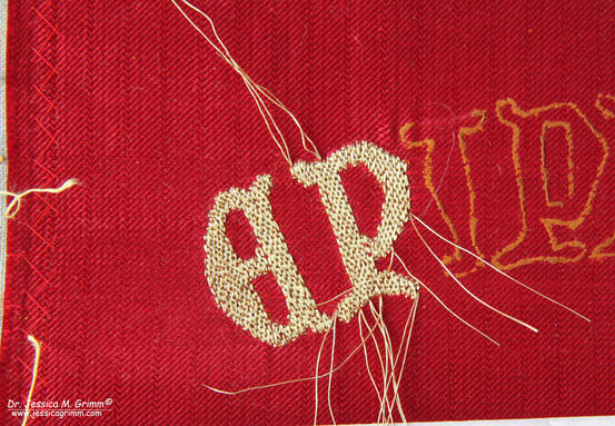
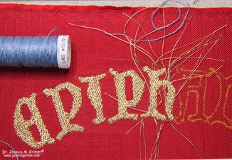
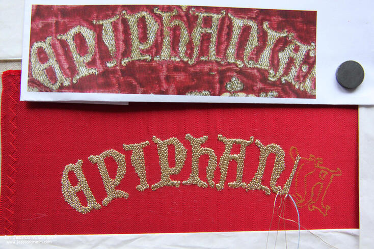
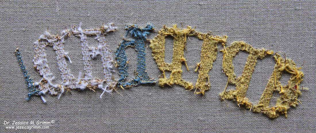
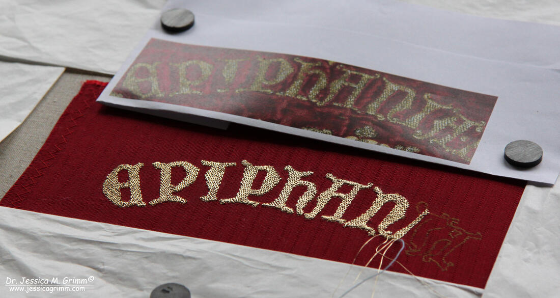
Literature Durand, J. & E. Cernea, 2019. Broderies de tradition Byzantine en Roumanie du XVe au XVIIe Siecle. Musee du Louvre. ISBN 978-2-902302-02-4. Grimm, J.M., 2021. A hands-on approach - Epigraphy in medieval textile art, in: Kohwagner-Nikolai, T., Päffgen, B., Steininger, C. (Eds.), Über Stoff und Stein. Knotenpunkte von Textilkunst und Epigraphik. Harrassowitz, Wiesbaden, pp. 141–147. P.S. Did you like this blog article? Did you learn something new? When yes, then please consider making a small donation. Visiting museums and doing research inevitably costs money. Supporting me and my research is much appreciated ❤! For the epigraphy conference held in Munich next week, I am working on several samples of lettering in goldwork embroidery. More information on the conference can be found in part I of this series. Today we will look at the goldwork lettering on the Vic cope made in England between AD 1350-75. The cope was probably made for, but certainly worn by, Bishop Ramon de Bellera of Vic in Spain. It is all worked in underside couching, typical of Opus Anglicanum. When looking for online information on this particular cope, I found the excellent website of the Museu Episcopal de Vic. The website is in English and there is an abundance of information on their textile collection. Amongst which is a lovely video on the Vic cope (see below). This was my first foray into underside couching and I am going to share my explorations with you below. Unfortunately, my stash did not contain a piece of silk velvet, so I opted for red silk with a twill weave. The original underside couching on the Vic cope is done on three layers of fabric: linen, velvet and plain silk. After the embroidery was finished, the plain silk was carefully cut away. My reconstruction omits the layer of velvet. Although the article (see below for a link to the download) on the recent conservation of the cope mentions a lot of details on the materials used, it does not disclose the width of the gold threads used. However, the pictures in the literature suggest a very fine thread. I decided to go with Stech vergoldet 50/60 CS, which is finer than smooth passing #3. It has a width of 0.12 mm. I started by transferring the lettering of the word 'Epiphania' by using the prick and pounce method. This is the original method for pattern transfer and it would probably have been used by the makers of the Vic cope in the 14th century. I deliberately left my Siena water paint a little thick so that I could scrape off mistakes easily. From the pictures, I could tell that the gold threads were actually couched down in pairs. The couching pattern used for the lettering is the traditional basket weave. I would start with a long stretch down the length of the letter and use the twill pattern of the silk to get my spacing correct between the couching stitches. I found this not too easy as you'll need a rather large needle for the linen couching thread. For the first four letters ('epip') I used Fil de lin glace, au Chinois, #40 colour #363 (yellow), which I bought at Maison Sajou when I was in Paris. It is rather thick and not very strong. Even when I changed from a needle #7 to a chenille needle #22, it broke frequently. No matter how carefully I tried to guide the thread through the fabrics. What else could I use? First up was Londonderry linen thread #5070 cornflower 50/3. It is only slightly thinner than the Maison Sajou thread used before. On stitching the 'H', the thread broke three times. This is far less than when I used the Maison Sajou thread. One other thing that eludes me at the moment: what does one do with the tails of the goldthreads? After consulting with a re-enactment lady on Instagram, she said she plunges them and ties them back with the linen couching thread. Sounds reasonable, don't you think? Except for the fact that the stitches on the back are rock solid and I can't weave any thread tails through them at all. Maybe I should use a finer linen thread? Next up was Goldschild 50/3. Although the numbers suggest the thread is comparable in thickness to the Londonderry, it is actually less thick. It did break easily, especially on the small bar-like parts of the 'A'. These parts are really tricky to do as you can't keep the basket weave pattern going. You'll end up with a kind of underside couching satin stitch. The quick turns for both the gold threads and the linen couching threads take their toll. I had one more brand of linen threads I could test: Bockens Knyppelgarn. I started with the rather thin Nel 90/2 and this was no good as it broke every other stitch. But when I tried the thicker Nel 35/2, it was much better. A similar amount of breaks to the Londonderry thread. But again, I am unable to tie back the goldthreads with the linen couching thread on the back. Since I know that medieval stitchers were not averse to using knots, I did the same. Works a treat. So what did I learn from this experiment? Quite a lot actually! Firstly, turning your threads at the design line is done with an underside couching stitch. There is no additional 'normal' couching stitch on top to achieve this. Secondly, underside couching is a bit like constantly plunging. No matter how drum taut your slate frame is, it will lose a bit of tension. Thirdly: my silk did not take the stitching very well. Fibres of the weft were pulled out. Fourth: the stitching is rather harsh on your body. My fingers are all swollen and my back aches (muscle ache). How the flip did they do it back then? They worked through three layers of fabric. That puts even more strain on your body and on the linen threads. I must have some of the parameters wrong. Suggestions are greatly appreciated! Literature
Brow, C, G. Davies & M.A. Michael (eds.), 2016. English medieval embroidery. Yale University Press. ISBN: 978-0-300-22200-5. Calonder, N. & A. Wos-Jucker, 2008. Conservation of the Cope of Bishop Ramon de Bellera, Quaderns del Museu Episcopal de Vic 2, pp. 83-99. Grimm, J.M., 2021. A hands-on approach - Epigraphy in medieval textile art, in: Kohwagner-Nikolai, T., Päffgen, B., Steininger, C. (Eds.), Über Stoff und Stein. Knotenpunkte von Textilkunst und Epigraphik. Harrassowitz, Wiesbaden, pp. 141–147. P.S. Did you like this blog article? Did you learn something new? When yes, then please consider making a small donation. Visiting museums and doing research inevitably costs money. Supporting me and my research is much appreciated ❤! From 12-14 February, the Bavarian Academy of Sciences will host the 15th international conference on medieval and early modern epigraphy. They have asked me to demonstrate the various ways in which lettering can be represented in goldwork embroidery during this long period. I've decided to concentrate my efforts on five different historical pieces: 1) the Sternenmantel of Henry II Holy Roman Emperor, dating to AD 1010-20, 2) the Bamberger Antependium from AD 1300, 3) the Vice cope from AD 1350-75, 4) the funeral pall of Maria of Mangup AD 1477 and 5) a podea (icon cover) donated by Serban Cantacuzino in AD 1671. I have seen all these pieces in the past couple of years and taken my own pictures. However, determining how the lettering was stitched, proved to be difficult. In order to keep a log of my findings and to teach you a thing or two about goldwork embroidery, I am going to write four blog posts on this project.
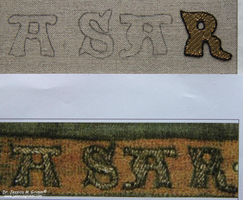
First up is preparation. Apart from the Bamberger Antependium, all these goldwork letters were stitched on very luxurious silk fabric. So I dressed my slate frame with Zweigart Bergen linen and kept the tension a bit slack. Then I applied pieces of my silk fabrics using herringbone stitch. It is important to orientate the fabric pieces on the grain of the linen fabric. Once the pieces are applied, the frame is stretched to drum taut. In the two short videos above, you'll see slack on the left and drum taut on the right. I'd like my lettering to be as close to the originals as possible. The first thing to do is to determine how large the lettering in question is. Lighting in the textile department of the Bayrische Nationalmuseum is rather poor and I had to take all of my pictures under an angle. Not suitable. Luckily, I found a perfect picture in a book. It had the whole height of the Antependium on there and since I knew that height in centimetres, basic math led me to an approximation of their size. The word Baltasar measures about 25 cm from B to S. Since the goldwork was stitched directly onto the linen, I used a pencil and a lightbox for the transfer. The original transfer was probably done free-hand: look at the irregular spacing between the individual letters and the irregular shape of the three As. Next up I tried to determine the size of the gold threads used. Without actually measuring them, this is a rather wild guess. Since the piece is quite old, the gold thread used is probably very fine. But from my memory, it was not as fine as what I recently saw in Bamberg. So I originally went for a gilt passing thread #3 (but had to later change to the even finer gilt Stech 50/60 CS as my edges became too round compared to the original). From the literature, I knew that couching in goldwork embroidery went from single thread to pairs of thread being couched down in one go, somewhere in the 12th century. Since the Bamberger Antependium was stitched around AD 1300, it could well be that this newer and faster method of couching down pairs of thread was employed. And I think the picture above proves this. From the literature, I knew that yellow silk was used for the couching stitches. I went with DeVere Yarns Chamoix #682. One of the things I can't tell from my pictures nor is it mentioned in the literature: what happened to the tail of the goldthread? Was it plunged? Did they simply secure them on the surface and clip them close? The latter method is used in the orphreys from the 15th and 16th centuries, so I went with that. The couching pattern used is not our now very common bricking pattern. Instead, it is a slanted line or slash. And since the ground fabric is linen, the couching process becomes a counted thread embroidery technique. I opted for five fabric threads between each couching stitch. As stated above, I did stitch the first letter twice as I couldn't copy the sharp turns of the original with the ticker thread. The way the letter is shaped also meant that I had to start and stop my goldthreads several times as just bending them would not have accommodated the shape of the letter. Once I was happy with how my R turned out, I needed to stitch a black silken outline around it. As all of the silk embroidery in this piece is done in stem stitch (yup, everything! Rows and rows of alternating stem stitch to fill every design element that's not filled with couched goldthreads), I used stem stitch for the outline too. I used four plies of black Chinese flat silk. Literature
Durian-Ress, S., 1986. Meisterwerke mittelalterliche Textilkunst aus dem Bayrischen Nationalmuseum. Schnell & Steiner. ISBN 3-7954-0636-6. Grimm, J.M., 2021. A hands-on approach - Epigraphy in medieval textile art, in: Kohwagner-Nikolai, T., Päffgen, B., Steininger, C. (Eds.), Über Stoff und Stein. Knotenpunkte von Textilkunst und Epigraphik. Harrassowitz, Wiesbaden, pp. 141–147. Müller-Christensen, S. & M. Schuette, 1963. Das Stickereiwerk. Wasmuth. No ISBN. P.S. Did you like this blog article? Did you learn something new? When yes, then please consider making a small donation. Visiting museums and doing research inevitably costs money. Supporting me and my research is much appreciated ❤! |
Want to keep up with my embroidery adventures? Sign up for my weekly Newsletter to get notified of new blogs, courses and workshops!
Liked my blog? Please consider making a donation or becoming a Patron so that I can keep up the good work and my blog ad-free!
Categories
All
Archives
July 2024
|
Contact: info(at)jessicagrimm.com
Copyright Dr Jessica M. Grimm - Mandlweg 3, 82488 Ettal, Deutschland - +49(0)8822 2782219 (Monday, Tuesday, Friday & Saturday 9.00-17.00 CET)
Impressum - Legal Notice - Datenschutzerklärung - Privacy Policy - Webshop ABG - Widerrufsrecht - Disclaimer
Copyright Dr Jessica M. Grimm - Mandlweg 3, 82488 Ettal, Deutschland - +49(0)8822 2782219 (Monday, Tuesday, Friday & Saturday 9.00-17.00 CET)
Impressum - Legal Notice - Datenschutzerklärung - Privacy Policy - Webshop ABG - Widerrufsrecht - Disclaimer




 RSS Feed