|
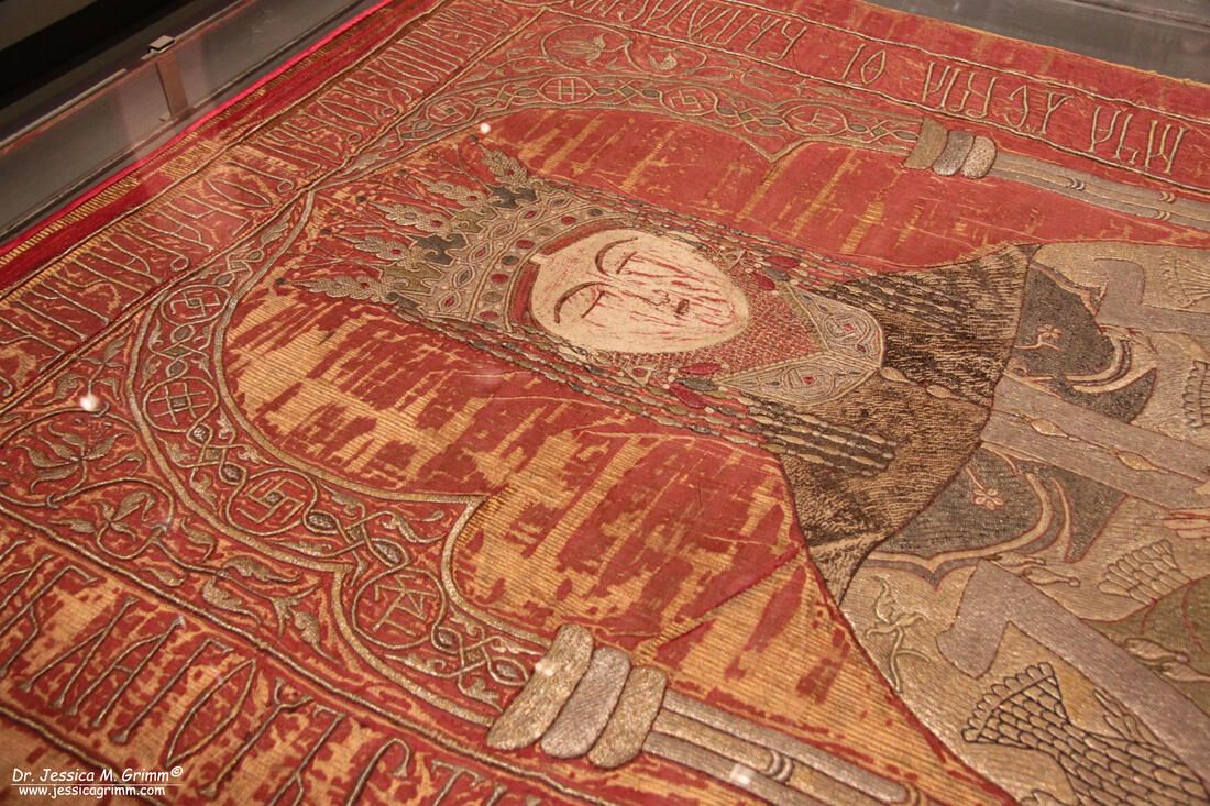
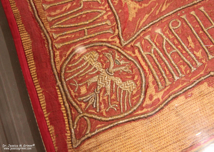
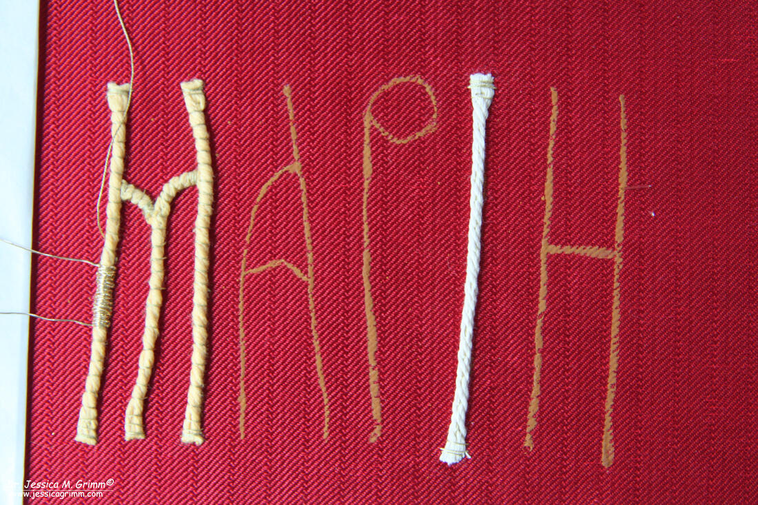
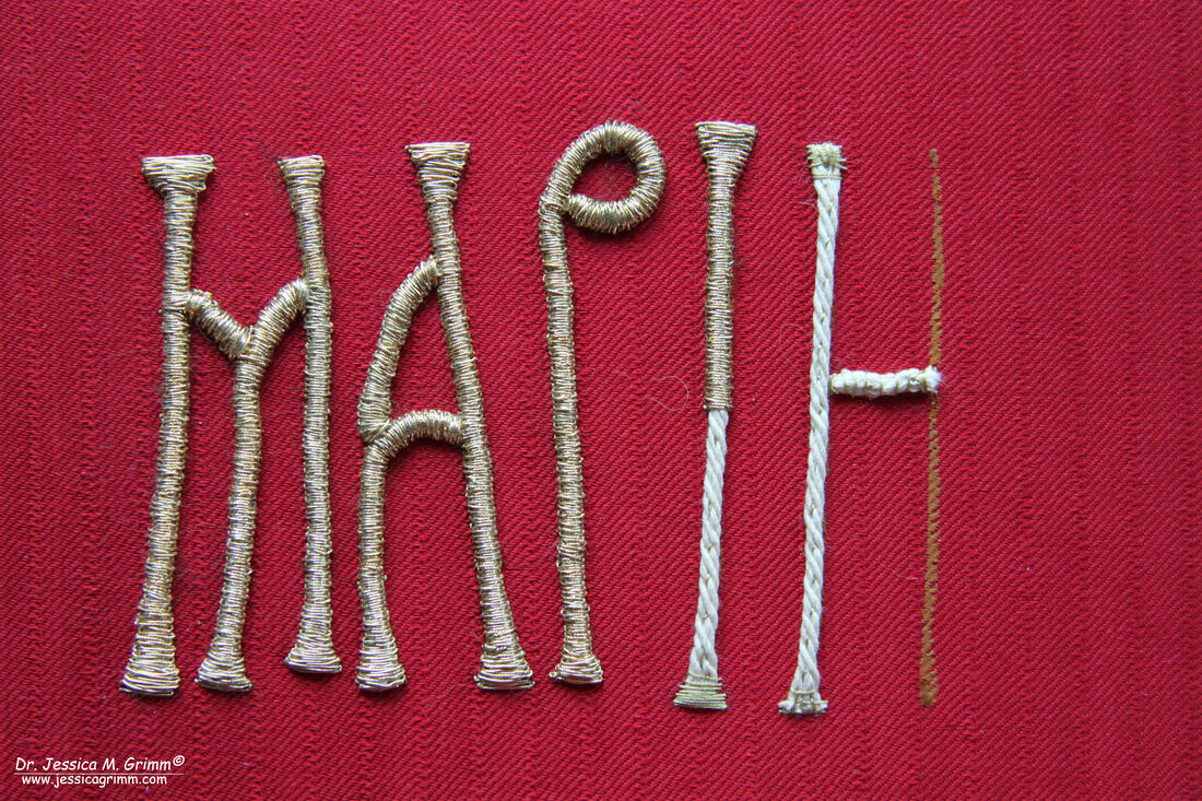
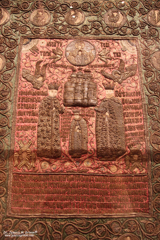
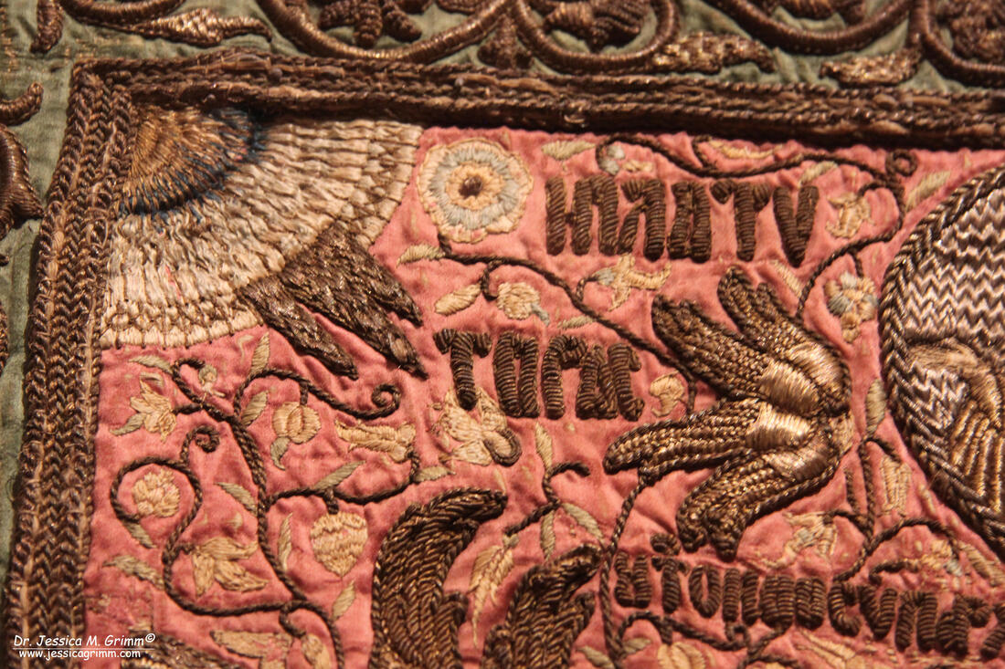
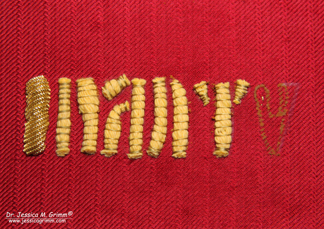
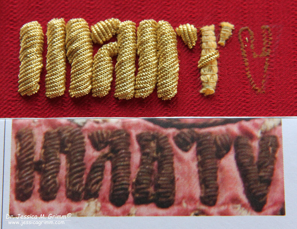
Today we are going to have a look at two more modern examples of lettering in goldwork embroidery. One can be found on the burial shroud of a princess from Romania and the other is part of a dedication on an orthodox podea or icon cover. They were both part of a temporary exhibition on Romanian embroidery in the Louvre Museum last summer. You can read all about that trip here. In recreating these samples, I had to use common padded goldwork embroidery techniques I am no longer very familiar with. And I made a rookie mistake. Read on so you'll learn from that mistake. I for my part have made a big yellow mental post-it :). First up is the burial shroud of Maria of Mangup, second wife of Prince Stephen the Great of Moldavia. The shroud measures 191 x 103 cm and shows Maria laying in her tomb. She is richly dressed in Ottoman clothing and adorned with precious jewellery. The embroidery is executed with silver and gilt threads as well as coloured silks on red silk fabric. Maria likely died on the 19th of December AD 1477 and is buried at Putna monastery in Romania. The church Slavonic text surrounding the depiction of Maria is written in Cyrillic lettering. The four corners show monograms and double-headed eagles in order to point to Maria's family links with the Byzantine empire. For the epigraphy conference 'Über Stoff und Stein' in Munich next week, I decided to recreate Maria's first name. The embroidery technique used for the lettering seems to be gimped couching over string padding. This means that passing thread is laid over the padding and secured on both sides of the padding with a small couching stitch. The passing thread is folded forwards and backwards over the string padding until all of the padding is covered. Think of it as a satin stitch over padding, but without going through the fabric with the passing thread. Although I know I should have used linen string padding to be historically correct, but I was unable to find some. If anyone knows of a good source, I am all ears! First, I tried soft string padding as it is easier to manipulate. However, when applying the passing thread they would shift and sit on top of each other as the padding was just not firm enough (see on the letter M in the picture above). Then I used white string and that was much better. I also noticed that the widened ends of the letters had less height than the 'body' of the letters. This made me think that the embroiderers must have untwisted the padding thread they were using in order to create this effect. The hardest thing with this lettering sample is the joints and the widening at the ends. For what I can see in the original, the embroiderers fudged until it looked pleasing enough. I have used Stech vergoldet 80/90 CS which is comparable to passing thread #4 and DeVere yarns silk Hessian #18267 for my couching thread. Not bad for a first attempt, but certainly not as smooth as the original :). This has likely to do with the modern passing thread having slightly different properties than the original thread used. And I do apologize for the cat hairs visible in the picture; Sammie cat is poorly and clings to me a lot! The youngest sample I included is this magnificent podea or icon cover made in AD 1681. The amount of Greek lettering in cutwork embroidery is unbelievable. The podea measures 120 x 99 cm and shows in the centre the monastery church it has been intended for and the donors: Serban Cantacuzino and his family. Although this particular embroidery piece sits just outside the time frame of the conference (Middle Ages until AD 1650), I included it as it makes use of different materials and a different technique: cutwork over string padding using gilt bright check. For my recreation, I choose the top Greek word to the left of the Madonna with Child medallion. Unfortunately, I can't make out what it says. The first letter seems to be an Iota, then maybe a Pi, then a Lambda it seems, another Pi maybe, then maybe a Tau and then a Ny. This part of the dedication does not seem to be covered in the exhibition catalogue. The lettering on the podea is simple cutwork over string padding. How hard can that be? Very hard when you are me. I absolutely detest cutwork. Not being able to see the world in 3-D, means that cutting purl to the required length is nearly impossible. Why did I still do it? Every so often one of my dear students WANTS to do cutwork. In order to be at least able to explain the technique well, I do need to practice every once in a while. So off I went with putting in the soft string padding. That was a little fiddly with all the tiny bits on some of the letters. But once all the padding was applied, the word still looked rather good. That was not to last. Although I had remembered to place my padding within the design lines of the lettering, it was by no means enough to prevent the above catastrophe happening. The padding on the original piece is quite high, but clearly much narrower than mine. Once I applied the bright check #8, it all went pear-shaped. Not helped by the fact that the size of the original bright check is smaller than a #8 (sizes #9 and #10 do exist, but are not commonly used and I don't have them in my stash). Why didn't I re-do the sample? Why should I? Due to my eye-condition, I can't do a good job. In addition, the conference delegates do get a good impression of how the cutwork technique works. And that's the main thing. I also felt even more admiration for the embroider of the original podea: Master Gherasim de Galata (his name suggests he was from modern-day Istanbul). He must have had a lot of practice to make the tremendous amount of lettering look so regular. Master Gherasim would never have employed me in his workshop :).
Literature Durand, J. & E. Cernea, 2019. Broderies de tradition Byzantine en Roumanie du XVe au XVIIe Siecle. Musee du Louvre. ISBN 978-2-902302-02-4. Grimm, J.M., 2021. A hands-on approach - Epigraphy in medieval textile art, in: Kohwagner-Nikolai, T., Päffgen, B., Steininger, C. (Eds.), Über Stoff und Stein. Knotenpunkte von Textilkunst und Epigraphik. Harrassowitz, Wiesbaden, pp. 141–147. P.S. Did you like this blog article? Did you learn something new? When yes, then please consider making a small donation. Visiting museums and doing research inevitably costs money. Supporting me and my research is much appreciated ❤!
10 Comments
10/2/2020 13:32:53
You are very sweet Meri! And it would be wonderful if you could ask a local producer if they have linen string. I am wondering if it is even firmer than the braided cotton one I used.
Reply
Claire
10/2/2020 14:51:32
Dear Jessica, thank you so much for those explanations - I had wondered how this first work had been made. The thread seemed too big to go through the fabric but just too many of them to do the usual plunging either.
Reply
10/2/2020 15:24:45
Dear Claire,
Reply
Marina Berts
10/2/2020 21:47:25
Hi Jessica,
Reply
10/2/2020 22:00:48
Thank you Marina! I personally feel that it is a good thing to share the bad and the ugly too. After all, it is a learning moment. And by sharing it, it becomes a learning moment for all.
Reply
11/2/2020 11:52:34
Indeed Rachel! It will be very interesting to see what the reactions will be. But that's for a future blog post :).
Reply
I’m so glad I’m not alone in my cutwork battles! Though after a lot of practice it is getting marginally better. And just think how much harder it could have been had they used smooth pearl! From an educational perspective I think your sample is a great example of not only the technique, but also the various considerations that need to be made.
Reply
13/2/2020 12:17:56
Thank you Catherine! Yes, smooth purl would have been a true nightmare :).
Reply
Your comment will be posted after it is approved.
Leave a Reply. |
Want to keep up with my embroidery adventures? Sign up for my weekly Newsletter to get notified of new blogs, courses and workshops!
Liked my blog? Please consider making a donation or becoming a Patron so that I can keep up the good work and my blog ad-free!
Categories
All
Archives
July 2024
|
Contact: info(at)jessicagrimm.com
Copyright Dr Jessica M. Grimm - Mandlweg 3, 82488 Ettal, Deutschland - +49(0)8822 2782219 (Monday, Tuesday, Friday & Saturday 9.00-17.00 CET)
Impressum - Legal Notice - Datenschutzerklärung - Privacy Policy - Webshop ABG - Widerrufsrecht - Disclaimer
Copyright Dr Jessica M. Grimm - Mandlweg 3, 82488 Ettal, Deutschland - +49(0)8822 2782219 (Monday, Tuesday, Friday & Saturday 9.00-17.00 CET)
Impressum - Legal Notice - Datenschutzerklärung - Privacy Policy - Webshop ABG - Widerrufsrecht - Disclaimer




 RSS Feed