|
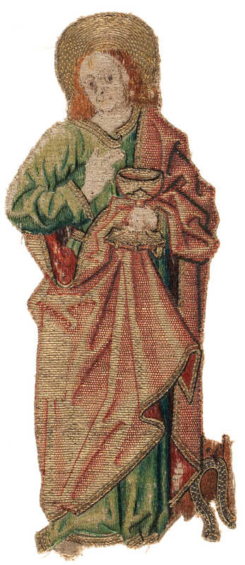
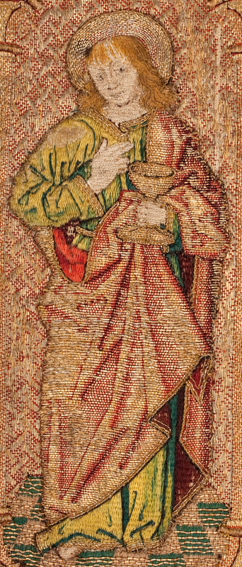
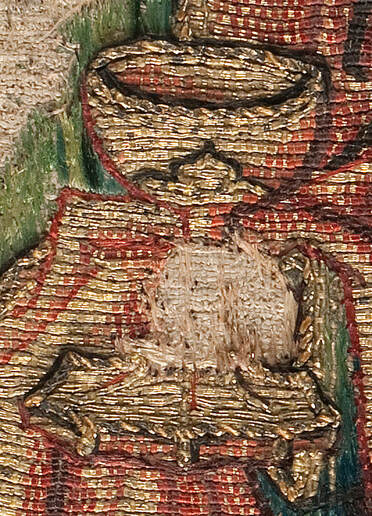
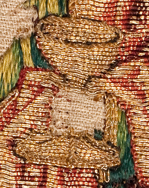
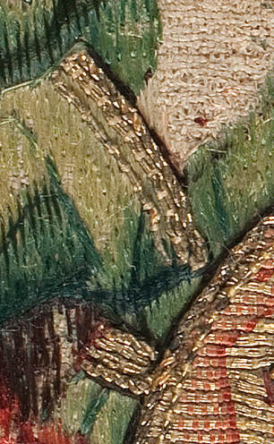
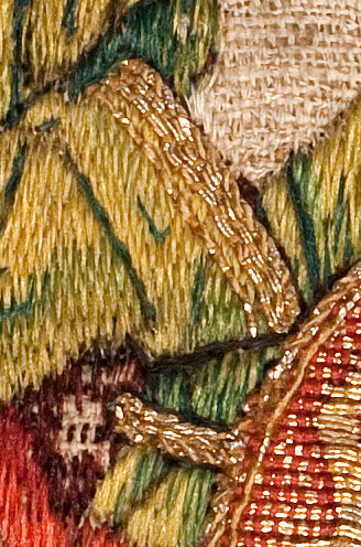
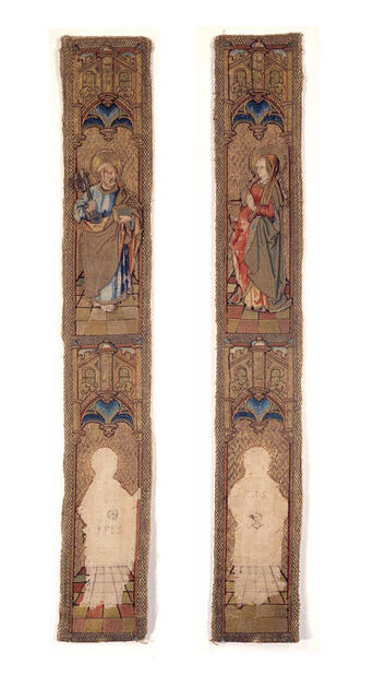
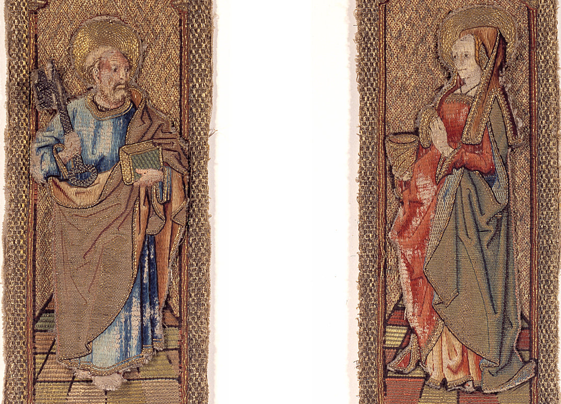
Over the past three weeks, I have compared two orphrey figures of St John (Another John and his identical twin, comparing face and hands & comparing the clothing). In this final blog post, I will compare the or nue and the additional goldwork embellishment. For me, "slow looking" at historical pieces of embroidery is a great form of CPD (Continuing Professional Development). It comes close to the old way of learning where an apprentice would copy the works of the master. Especially when it comes to or nue, copying a piece from the late 15th- or early 16th-century has proven to be essential in mastering this exquisite embroidery technique. In the process, I probably solved the mystery of the two St Johns. At first glance, the or nue of the red cloaks looks pretty similar. However, when you look at the red cloak in the above pictures: which one gives the better illusion of being three-dimensional? For me, it is ABM t2165 and this is not due to being in a better condition. The folds are more realistic. This is achieved by using one extra shade of red for the shading and the ever so slight curving in the lines of stitches that form the folds. Contrary, the folds of OKM t90a are very straight and the shading is crude. Just like with the silk shading of the green undergarment, the stitcher of ABM t2165 knew what he was trying to convey. The stitcher of OKM t90a just filled the different parts of the design and hoped for the best. The stitcher clearly did "not see" it. As the clothing as a whole (green undergarment and red cloak) was rendered in the same way within the same piece, it is clear that the same stitcher was responsible for the silk shading and the or nue. When we look at the cup St John is holding, we see marked differences. And this is interesting in itself! Where the way the clothing was embroidered was apparently very standard (green for undergarment and red for cloak), the stitcher could go wild with the little details. Note: you can clearly see that the cup is "part" of the or nue of the red cloak. The cup of ABM t2165 is expertly worked with a lovely rim worked of a curved pair of goldthreads (two rows on the front and only one row on the inside of the cup) and topped by a single row of twist. The cup has a clear outline achieved with shading on the right and couched red silk on the left to hide the turns of the goldthreads. The "seam" between the stem and the cup is decorated with foliage formed by a pair of couched goldthreads and couched brown silk. The foot of the cup is ornately faceted with couched pairs of goldthread and a rim of twist. The whole cup is clearly recognisable as a Gothic cup of the time. Contrary, the cup of OKM t90a is crude with poor shading and fewer details. The twist is either made with an extra strand of yellow silk or these are the very visible couching stitches. The clothing of St John is further embellished with goldthreads stitched over the silk shading and the or nue. In both cases, normal goldthread and twist were used. But, as seen with everything else (bar the face!) the stitching on ABM t2165 is more refined. Looking at all the evidence, I don't think the two versions of St John were stitched by the same embroiderer. Not even several years apart. The stitcher of ABM t2165, although not an expert with faces, is clearly the better artist with an expert understanding of how to suggest the third dimension. I get the feeling that ABM t2165 is the work of a single artist, whereas OKM t90a is the work of two stitchers. One mediocre stitcher for the figure and an absolute ace for the face. Could they be produced in the same workshop? Yes. After all, in a large workshop such as that of Jacob van Malborch in Utrecht (AD 1500-1525), many different stitchers were working on the commissions. But something isn't quite right ... OKM t90a was certainly stitched by or in the workshop of Jacob van Malborch as we have the work contract from AD 1504. The reason why ABM t2165 is ascribed to Jacob van Malborch is due to the ink inscription on the orphrey beneath the loose figure: I.F.I.S. According to Saskia de Bodt, these letters stand for: I(acobus) F(ecit) I(pse) S(anctam) or Jacob made this saint. Now, ABM t2165 contains four saints in total. Two still attached to the orphreys and two loose ones of which one is our St John. The two attached figures are quite different in style from the two loose figures ... St Peter and Mary Magdalene have very pretty faces, but crude silk shading for the undergarments. And simple reduced shading of the or nue with very straight lines for the folds. Sounds familiar! These figures are comparable with OKM t90a. Those that were definitely made by or in the workshop of Jacob van Malborch. The two loose figures of ABM t2165 are not. And a tiny remark in the online catalogue entry proves my point: "Het borduurfragment is groter dan de uitsparingen in de linnen ondergrond. Mogelijk was er eerder een andere Petrus op aangebracht." (The embroidery fragment is larger than the voided areas on the linen background. Maybe originally a different St Peter was once attached.). If St Peter is not original, why should St John be? When vestments wore down, repairing them by patching them with parts of other worn down vestments and/or by adding new parts was common practice (even in rather recent times to make them saleable on the antiquities market). It is very well possible that ABM t2165 is the result of such recycling!
Literature Leeflang, M. & K. van Schooten (eds), 2015. Middeleeuwse borduurkunst uit de Nederlanden. Utrecht: Museum Catharijneconvent.
12 Comments
28/6/2021 14:38:21
I love your studies and commentaries. Thank you for sharing.
Reply
Betsy
28/6/2021 14:49:27
Thank you so much for sharing your discoveries! This has been a fascinating series of articles.
Reply
28/6/2021 22:46:48
I am a recent follower of your site. Exploring or nue and what differences tell us is very interesting. The long-held European attitude is so not like what I have come across in the US .I am glad you share such information.
Reply
29/6/2021 08:58:40
Thank you, Elizabeth! I have seen some pretty wild explanations and instructions from across the pond(s) too. When you want to study Western embroidery, you need to be able to at least read several European languages. If you are limited to English you will miss a lot.
Reply
29/6/2021 13:10:29
And the lame excusses :). It wasn't me! It was the textile conservator.
Reply
Claire de Pourtalès
29/6/2021 13:40:06
Fascinating! you're teaching me to have a better eye! Thank you!
Reply
Debbie
9/7/2021 11:17:17
This is really wonderful to see the stitches so close up . Thankyou !
Reply
Your comment will be posted after it is approved.
Leave a Reply. |
Want to keep up with my embroidery adventures? Sign up for my weekly Newsletter to get notified of new blogs, courses and workshops!
Liked my blog? Please consider making a donation or becoming a Patron so that I can keep up the good work and my blog ad-free!
Categories
All
Archives
July 2024
|
Contact: info(at)jessicagrimm.com
Copyright Dr Jessica M. Grimm - Mandlweg 3, 82488 Ettal, Deutschland - +49(0)8822 2782219 (Monday, Tuesday, Friday & Saturday 9.00-17.00 CET)
Impressum - Legal Notice - Datenschutzerklärung - Privacy Policy - Webshop ABG - Widerrufsrecht - Disclaimer
Copyright Dr Jessica M. Grimm - Mandlweg 3, 82488 Ettal, Deutschland - +49(0)8822 2782219 (Monday, Tuesday, Friday & Saturday 9.00-17.00 CET)
Impressum - Legal Notice - Datenschutzerklärung - Privacy Policy - Webshop ABG - Widerrufsrecht - Disclaimer


 RSS Feed