|
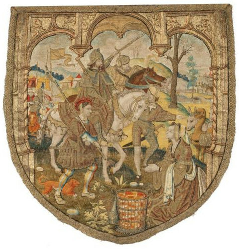
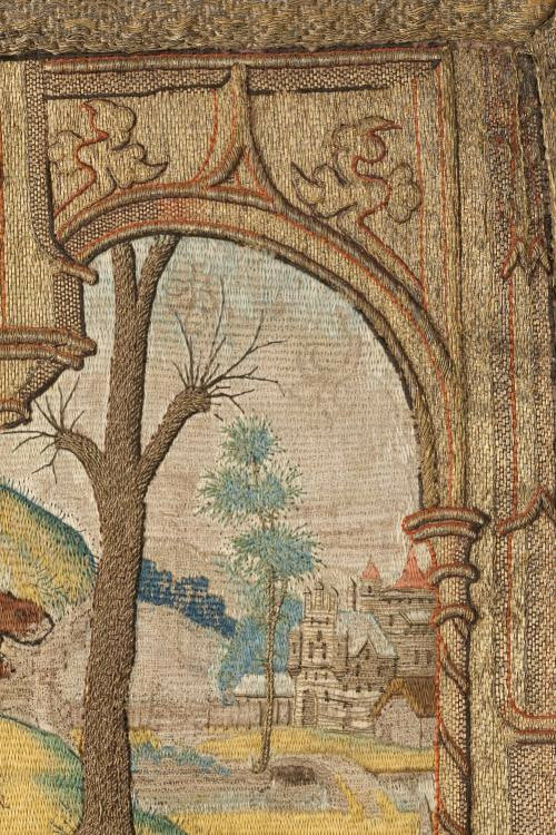
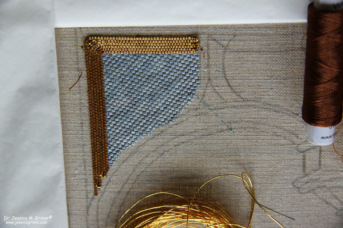
When I was researching medieval cope shields for my latest goldwork project 'On the shores of St. Nick', I saw that many had some kind of architectural frame going around the scene. I wanted one too! So I picked the one from a cope shield showing Abigail and David made around 1520-1530 in the Northern Netherlands. The piece is kept at the Catherijne Convent in the Netherlands and can be viewed in great detail online (click the image and watch 16 additional pictures which you can enlarge as well!). The pictures below come from this fantastic online catalogue. It is a beautiful and ornate piece. But when you really start to look at it, you will find some curiosities. Look for instance at the innermost columns (those with the spiral going around). Notice anything amiss? The base of the column is behind the outermost column, but the capital is in front of it!!! Turns out M.C. Escher wasn't that original :). A similar thing can be seen in the piece of St. Laurence: the floor tiles in the original are completely wrong perspective-wise. Why did the late-medieval embroidery designers make these mistakes? Well, the Renaissance had only started in Italy roughly a century before this piece was made. Interestingly, early Netherlandish art (1425-1525) developed independently from the movement in Italy. Wikipedia says: "The Netherlandish painters did not approach the creation of a picture through a framework of linear perspective and correct proportion. They maintained a medieval view of hierarchical proportion and religious symbolism, while delighting in a realistic treatment of material elements, both natural and man-made." And that's exactly what we see here. But that`s not all! The average medieval embroiderer was clearly not aiming for 'distinction' at the Regiis schola opere plumarii. Yup, that's Royal School of Needlework in Latin according to Google translate :). In this case, there are some issues with the padding. I've marked them with white in the picture on the right. Can you see the problem? The string padding runs in the same direction as the couched gold threads should run. That doesn't work at all. Imagine trying to couch down a round goldwork thread on top of a round piece of string? They will always try to get away from each other and roll. The solution? Fudge as you go. But it doesn't really work. Quite a lot of the definition is lost and it looks messy. But in a world with dark churches and only candlelight, it didn't matter. As long as it sparkled to the greater glory of God and the wearer, it was okay. P.S. Note that the original background drawing was different and more ornate? I love the fact that the embroiderer had a degree of freedom in stitching the design! Unfortunately for me, I did attend the Regiis schola opere plumarii (sorry, but I now like it better than the English name). I already sorted out the mess underneath St. Laurence's arm and I intend on sorting out this mess too. But it is a slow process. Especially as things are perspectively wrong, I really need to think a lot first, before I couch down any gold. The plan is to lay the gold in the direction of the architecture, instead of working strictly vertical. The above is the result so far. I am using House of Embroidery fine silk colour Forget me Not in a condensed Scotch stitch for the sky. The Japanese thread #8 is couched down with DeVere Yarns 6-fold silk colour Allspice. I really like how well this warm brown colour combines with the gold!
10 Comments
Ann Bernard
9/4/2019 13:59:42
Interesting to see a new piece right from the beginning. Mostly, stitchers do not post until there is quite a lot to see. I will be watching progress.
Reply
9/4/2019 16:54:57
Thank you Ann! It is a little scary to show so much right from the beginning. Especially as, for various reasons, progress is really slow at the moment. But things will soon speed up, I hope!
Reply
9/4/2019 14:37:29
I am in total awe of your work with this beautiful embroidery and your knowledge of the details. Your work is exquisite! Lovely!
Reply
10/4/2019 13:05:17
It sure is Rachel! And I have become a great fan of the non-plunging that's going on in these old pieces. And the occasional drop of glue :)
Reply
Maureen Troake
10/4/2019 10:34:38
I am quite sure that the Regiis schola opere plumarii would give you full marks already! It is beautiful!
Reply
10/4/2019 13:06:14
Thank you Maureen! But the RSOP would not approve of my non-plunging technique :).
Reply
Your comment will be posted after it is approved.
Leave a Reply. |
Want to keep up with my embroidery adventures? Sign up for my weekly Newsletter to get notified of new blogs, courses and workshops!
Liked my blog? Please consider making a donation or becoming a Patron so that I can keep up the good work and my blog ad-free!
Categories
All
Archives
July 2024
|
Contact: info(at)jessicagrimm.com
Copyright Dr Jessica M. Grimm - Mandlweg 3, 82488 Ettal, Deutschland - +49(0)8822 2782219 (Monday, Tuesday, Friday & Saturday 9.00-17.00 CET)
Impressum - Legal Notice - Datenschutzerklärung - Privacy Policy - Webshop ABG - Widerrufsrecht - Disclaimer
Copyright Dr Jessica M. Grimm - Mandlweg 3, 82488 Ettal, Deutschland - +49(0)8822 2782219 (Monday, Tuesday, Friday & Saturday 9.00-17.00 CET)
Impressum - Legal Notice - Datenschutzerklärung - Privacy Policy - Webshop ABG - Widerrufsrecht - Disclaimer


 RSS Feed