|
On Tuesday, I arrived back home from my amazing trip to the International Festival of Gold Embroidery in Bukhara, Uzbekistan. Although I am an experienced traveller, with places like Libya under my belt, I have never experienced anything like this. The people were warm, open and very interested in my craft. Some festival visitors had been gold embroiderers themselves or had close relatives who were gold embroiderers. As gold embroidery is still very much visible in Bukhara, people see it as their precious heritage worthy of preservation. Some were amazed that, in far-away very exotic Western Europe, gold embroidery is practised too. I even met an elderly lady who had been a German teacher all her life. She was so happy to speak with a near-native speaker for the first time in her life.  Dr Jessica Grimm and volunteer Shaxina in front of the Dutch booth at the International Festival of Gold Embroidery, Bukhara, Uzbekistan So, what did I do? As you can see in the picture above, I had a small booth. My embroideries were in the display case behind me. Two posters explained my goal of understanding medieval goldwork embroidery by making replicas. During the festival, I sat in front of my booth and demonstrated goldwork embroidery. My Lowery workstand and Jenny Adin Christie slate frame were much admired by my fellow embroiderers from all over the world. Behind me stands my trusty volunteer Shaxina. She was a gem! As she studied to become an English teacher she was able to translate for me between Uzbek/Russian and English. We soon found out that Uzbek and Russian people ask exactly the same question as European visitors do: Is that real gold? However, their question has a deeper layer. Modern Uzbek gold embroidery is often done with fake gold. The real deal is just too expensive. Only in special cases do they still use gilt threads.  Dr Jessica Grimm teaching a gold embroiderer from South Korea how to stitch the medieval way at the International Festival of Gold Embroidery, Bukhara, Uzbekistan The fact that I demonstrated goldwork embroidery all day long was much appreciated. Many visitors took pictures with me. And I was hugged many times :). The fact that I was couching down a single very thin real gold thread on a silken background was somewhat unusual. Modern Uzbek embroidery often uses multiple gold threads. Just like in Europe, in order to survive as a craft the techniques had to adapt to speed the process up. One policeman took pity on me and offered to bring his mum's embroidery machine ...
It is hard to describe the festive atmosphere of the festival. We were located just opposite the ancient citadel. The main thoroughfare was blocked and turned into an elongated square along which our booths were set up. When we arrived at Bukhara train station we were welcomed with song and dance. The same on the first day of the festival. A long procession of gigantic puppets, dancers and musicians came past our booths. The costumes of the people were decorated with elaborate goldwork embroidery. On the first evening, we were invited to a lovely concert with yet more song and dance. And probably a history lesson with actors coming out of the citadel. You can see a video of it on YouTube. It contains beautiful close-ups of the gold-embroidered costumes the dancers are wearing. On the last evening, I was awarded $900 for becoming second in the category: "The gold embroiderer who revived ancient traditions" (c. 59:19 in the above video). I felt valued and grateful. Especially as I had a nasty experience with a Dutch visitor earlier that day. She walked up to my booth and exclaimed: "This has absolutely nothing to do with the Netherlands. Why are you here pretending that this is a Dutch tradition?". Yup, even after travelling 4300 km my own people can not be nice. However, the beautiful award on my wall will daily remind me that my work as an embroiderer and researcher is valued and on par with similar international efforts!
Although the days were very full and tiring, I did manage to ask questions and observe goldwork embroiderers from all over the world. I even traded my broche for a Bukhara one with the grand dame of Bukhara goldwork embroidery: Muqaddas Jumayeva. Observing her work was a treat! All festival participants were also given a traditional gold embroidered (machine) velvet mantle and a book on the history of gold embroidery in Bukhara. More on the book next week!
23 Comments
After a successful week of teaching for Creative Experiences in Les Carroz, France, I decided to drive a further 330 km to visit Le-Puy-en-Velay. The Cathedral Treasury houses the Cougard-Fruman textile collection. Judging from the catalogue, the collection comprises of c. 180 pieces. Most of it is liturgical textiles. And a few pieces are medieval goldwork embroidery. The museum is well worth a visit. And even a repeat visit as the pieces on display rotate. The town itself is beautiful too with a medieval 'haute-ville'. It is also one of the main places in France from which to start the Camino pilgrimage to Santiago de Compostela in Spain. But let's have a closer look at one of the embroidered chasubles in the museum. It turned out that I was already somewhat familiar with it ...
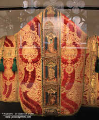
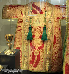
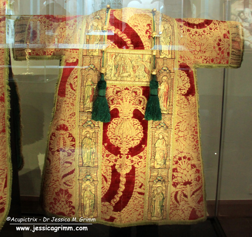
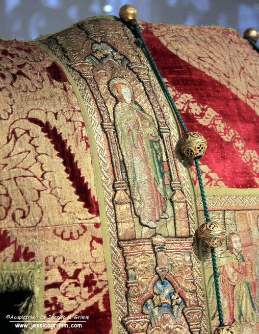
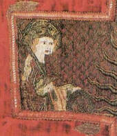
This is the said chasuble. It was made in Flanders (Brussels?) in the 15th-century according to the museum caption. On the front, we see Catherine of Alexandria above Philip the Apostle (identification uncertain). The cross on the back shows the Trinity at the top flanked by two angels. Below are Saint John and Saint Peter. 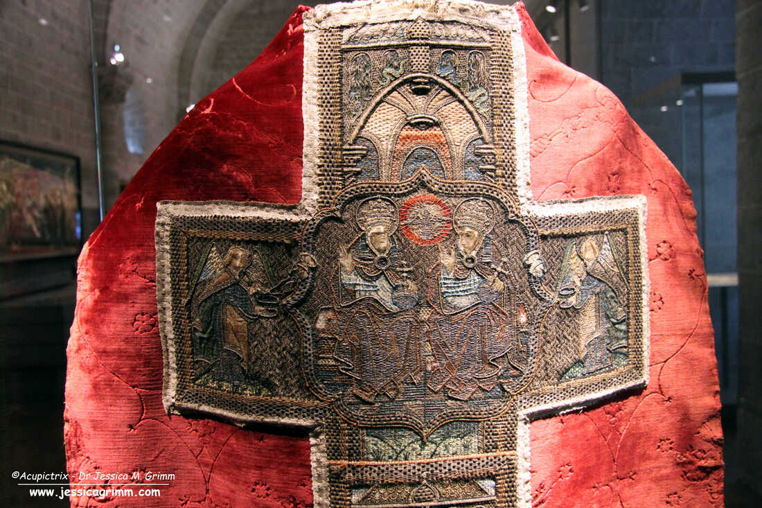 Trinity on the back of chasuble 1212.BL115 Cathedral Traesury Le-Puy-en-Velay, France Although the embroidery does not sport high-quality silk shading or brilliant or nue, the chasuble is a high-end piece. The composition of the Trinity with the two censer swinging angels on either side is balanced and full of movement. The string-padded frame within a string-padded frame for the central depiction of the Trinity also adds extra texture. 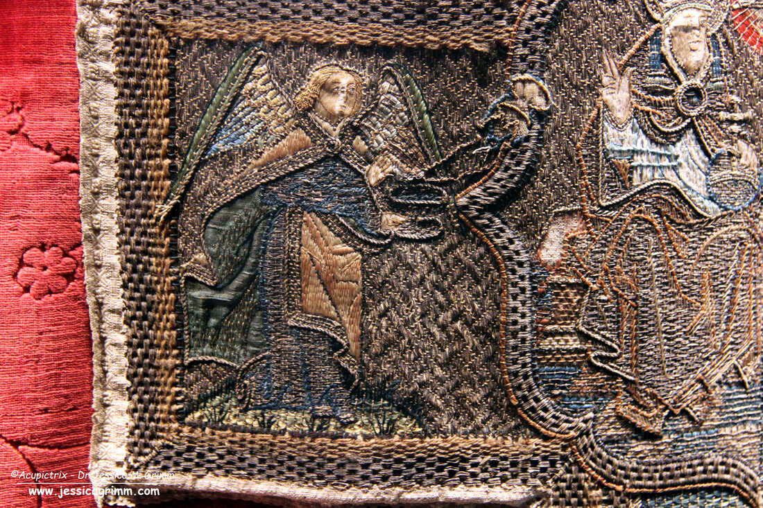 Censer swinging angel on the back of chasuble 1212.BL115 Cathedral Traesury Le-Puy-en-Velay, France The lining of the cloaks of the angels is made by couching a piece of blue-green heavy silk in place. The goldwork embroidery is executed with membrane threads. The membrane threads are now badly oxidised and dull. When the embroidery was originally made the threads would have looked golden and shiny. The silk embroidery is done with untwisted silk. I am a bit puzzled by the twisted textile thread used in the padded basket-weave border around the orphrey. It is reddish-brown and much duller than the silks. To me, it looks like wool. However, it might be a thick spun silk. 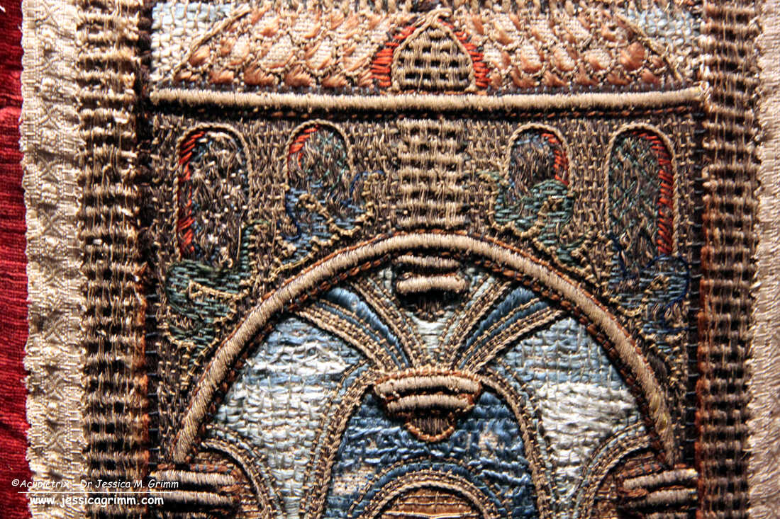 Detail of the orphrey with Catherine of Alexandria on the front of chasuble 1212.BL115 Cathedral Traesury Le-Puy-en-Velay, France From the pictures in the catalogue, I had not realised that one of the orphreys I bought at an auction is related to the orphreys on this chasuble. When I stood in front of the display case in the museum, it suddenly dawned on me that I had something similar. Luck will have it that I brought the orphrey with me for my students at Les Carroz to study. The museum personnel was very nice and helpful and they allowed me to fetch the orphrey from my car and bring it into the museum for comparison. How cool is that?! 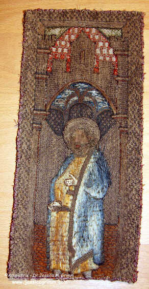 Medieval orphrey with Bartholomew. As you can see from the above picture of my orphrey, the materials, colours, style of the figure and embroidery techniques are quite similar to that seen on the chasuble in Le Puy. My orphrey is just very dirty and will need some TLC. It was glued onto velvet which was glued onto plywood. As the wood was mouldy, I had to remove the orphrey by cutting through the velvet and glue with a surgical knife. Not a delicate task. But it worked. I will write more on the orphrey and what I did to it in a future blog post.
But first, I am off to the International Festival of Gold Embroidery and Jewelery in Bukhara, Uzbekistan. Got my flight tickets yesterday and will leave on Wednesday. As I will still be in Uzbekistan next Monday there will be no blog post. As always, my Patrons will be able to follow me on my travels. Literature Cougard-Fruman, J. & D.H. Fruman (2010). Le trésor brodé de la cathédrale du Puy-en-Velay. Centre des Monuments Nationaux. Before I let you know what I think of the catalogue accompanying the latest textile exhibition of Museum Catharijneconvent, I have some lovely announcements. Firstly, I have been re-invited to join the International Festival of Goldwork and Jewelery in Bukhara, Uzbekistan. Two years ago, I sadly couldn't honour the invitation as I was very sick with Covid. So, fingers crossed that I stay healthy this time! Secondly, I have been notified by the Royal Dutch National Library that they will yearly archive a copy of my website and make it available in their collection. That's pretty cool too, I think! And now on to my book review proper. 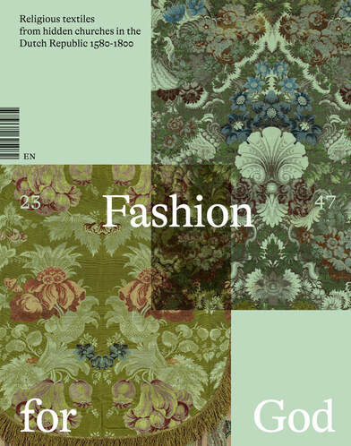 Exhibition catalogue: Fashion for God Last year, I visited the exhibition 'Fashion for God' (Religious textiles from the clandestine churches of the Northern Netherlands 1580-1800) in Museum Catharijneconvent in the Netherlands. It was the long-awaited sequel to 'Middeleeuwse Borduurkunst uit de Nederlanden' (medieval embroidery from the Netherlands) from 2015. And it was very much 'Dirty Dancing' and 'Dirty Dancing: Havana Nights' :). I only watched that sequel as Patrick Swayze had a teeny-tiny part in it. I only went to this exhibition as there would be a few medieval vestments on display that are hardly ever on display as their respective churches still own them. And it was a joy to be able to study them up close and take as many pictures, with sufficient light, as I liked. I also learned a lot about how these vestments survived and what the role of certain people and groups of people was. And I bought the catalogue for the sake of completion. Flicking through it before buying, it didn't exactly shout 'quality'. And now that I have read most of it, I don't know if I want to cry or start to laugh hysterically... 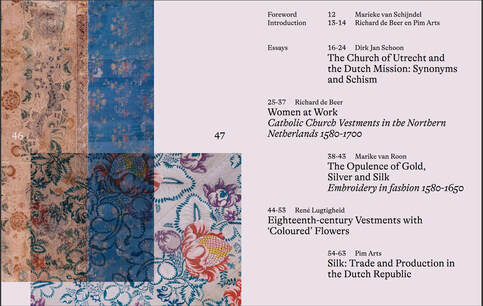 Exhibition catalogue: Fashion for God The layout of the book, in my opinion, is a disaster. Pages with text have different background colours, the typeface is HUGE and pages with detailed pictures have been inserted at random as to imitate a fabric sample book. The paper of these 'fabric samples' is flimsy. There's an awful lot of empty space on the pages. The same information could have been printed on a fraction of the pages. Why this waste? Why not use a normal-size typeface and fill the pages properly? Use the freed-up space for close-up pictures of the embroidery or the fabrics, please! There are no close-up pictures of the embroidery in this book. Pretty odd for a book with embroidered textiles in it.  Exhibition catalogue: Fashion for God The book consists of two parts. In the first part, there are five essays written by the Old Catholic bishop of Haarlem, a curator and a former curator of the museum, and two art historians specialising in (embroidered) textiles. Only one essay is well written. The others barely scratch the surface of the subject and just don't flow. One even has a pretty big omission/mistake regarding the types of gold thread used in medieval Dutch goldwork embroidery. But what is really missing from this part of the catalogue is a thorough essay on the embroidery and tailoring techniques used in the making of post-reformation catholic vestments. Why is this missing? After all, the socio-economic analysis shows that we move from (male) professional to (female) non-professional makers. Surely this is reflected in how things are being made.  Detailed picture I took of a cope hood, probably made in Haarlem around 1540-1550. The second part of the book consists of the catalogue proper. There are 48 entries. Written details of the embroidery are very sparse. And since these are not illustrated with close-up pictures; good luck to the reader.
And the worst thing? The catalogue of the 2015 exhibition was only available in Dutch. Very disappointing for most of you and not good practice when you own a world-class collection. This one is available in English also. But why would you want one? At most, it serves as a list of textiles available in the Netherlands that you can then track down for proper study. Don't get me wrong. The exhibition itself was lovely. The fact that you can see many of the textiles up close and in sufficient light (often not even behind glass) is fantastic! And I really learned a lot about the religious women and some men who saved and preserved the late-medieval vestments and made new ones in the old style. But if you hoped to get a good impression of the exhibition through the catalogue, you will probably be pretty disappointed. When they did the medieval exhibition in 2015, all the pieces in the collection of the museum were photographed and made available in high-resolution online. Not so this time. So, you can't even use the paper catalogue as a starting point to enter better close-up pictures in their online catalogue. What a missed opportunity. Literature Beer, R. de & P. Arts (2023), Fashion for God. Religious textiles from northern Dutch hideaway churches 1580-1800, Waanders Uitgevers Zwolle/Museum Catharijneconvent Utrecht. My recreation of the 'Angel Choir' is finished. It is based on a chasuble cross fragment kept at the Bayerische Nationalmuseum in Munich. The fragment is part of a much larger group of embroideries showing the life of Mary and Jesus. There is evidence that these mass-produced embroideries were made with the help of printing blocks. The design drawings were printed onto the embroidery linen. They prove that some embroiderers immediately incorporated the newest technology (printing) into their workshop workflow. The resulting embroideries are very standardised and have a lovely primitive feel. They are perfect as teaching models. The techniques used are not very complicated and the shading in the silk embroidery is rather simple. Still, the result is quite striking! 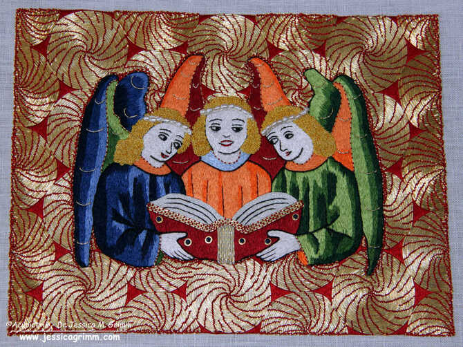 Angel choir embroidered in silk and gold threads To me, the most striking part of these embroideries is their background. They always consist of these sunny spirals. Most of them worked with red couching stitches, but yellow/white/beige suns also exist. And there is a myriad of ways in which these sunny spirals can be worked. A few examples are very neat and exact; the majority aren't. Sometimes, the spirals are drawn (or printed?) onto the background fabric. In other cases, the embroiderer just started somewhere and probably used the length of his fingers to achieve a more or less regular pattern. The spirals can be worked in a grid or like the way I have done. The rectangular or triangular areas between the spirals can be filled with silk embroidery or with more gold. Either way: there's a lot of fudging going on. Perfect for students to try!
The background also has another interesting 'function'. It tricks your eyes into believing that the angels hover above the golden background. As the spirals result in the gold threads catching the light from many different directions, there is a lot of movement. Not unlike those spiral patterns seen in the 1960s. So, even though the angels and the gold are worked at the same level (i.e. the angels are not a slip), the background pattern creates depth. This is something a 'normal' diaper pattern cannot create. The pattern probably first appears as a background filling in Bohemia and/or Poland in the late 14th century. But it became the hallmark of embroideries from the German-speaking lands in the 15th century. It is not seen on embroideries from the Netherlands or Southern Europe. If you would like to try your hand at recreating the orphrey with the Angel Choir you can join me at Open Air Museum Glentleiten in July or Domschatz Halberstadt end of August/beginning of September. Literature Fircks, J. von (2010): Serienproduktion im Medium mittelalterlicher Stickerei - Holzschnitte als Vorlagenmaterial für eine Gruppe mittelrheinischer Kaselkreuze des 15. Jahrhunderts. In: U-Ch. Bergemann, A. Stauffer (Eds.): Reiche Bilder. Aspekte zur Produktion und Funktion von Stickereien im Spätmittelalter. Regensburg: Schnell & Steiner, pp. 65–82. When I started work on this week's stitch tutorial, I had the increasing feeling that things weren't quite what they seemed to be at first. That's the great thing about doing research. I usually have no idea where the medieval embroideries will lead me. Dead ends are common. But so are those 'aha' moments. In this case, it was the latter. Let's dive in! 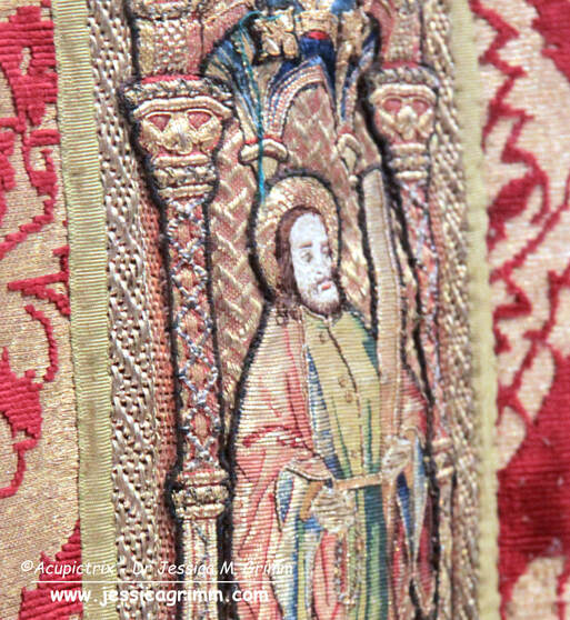 Detail Dalmatic (Nativity) of the Schlosser Ornat, Inv. Nr. 124 I-III, Dommuseum Frankfurt. And here is the culprit. No, not Saint Andrew. It is the columns on either side of him. They are odd. The layering of goldwork is a common thing in late-medieval goldwork embroidery. But this is simply too OTT. It does not make sense. Let's start our tutorial proper and I'll point the oddness out to you. 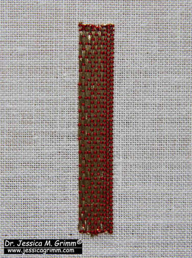 Start with a layer of shaded couched goldwork. For my sample (c. 0.8 x 5.0 cm), I used 46ct linen and passing thread #3 couched down with a single ply of red Chinese flat silk.
Next up, add the silver passing thread. You will be mainly stitching in between the rows of gold thread of the first layer. However, you will inevitably hit threads of the first layer. Make sure you use a fine needle. A new #12 would be perfect. You might also like to wax your silken couching thread (one ply of grey silk). 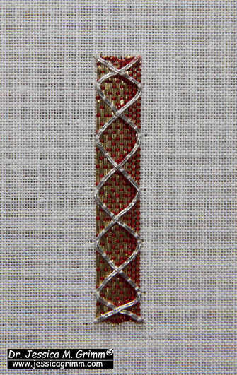 The "original" embroiderer then went on to add a layer of thicker red stitches along each side of the silver passing thread. I've used a full thread of red Chinese flat silk to do this for the inside of the right-hand side only. By now, I was pretty certain that this was not all done in the late Middle Ages ... So much additional stitching in such a relatively small space is nuts. It does not add anything to the design. On the contrary, you lose quite a bit of the original lovely shading of the first layer. When additional details are stitched in, they usually add to the design. They bling things up or they make the design easier to read by accentuating things. That does not seem to be the case here. So, what's going on? 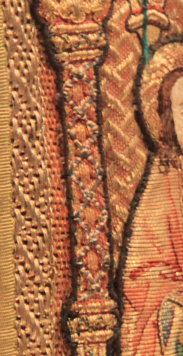 Detail Dalmatic (Nativity) of the Schlosser Ornat, Inv. Nr. 124 I-III, Dommuseum Frankfurt. Here's an extreme blown-up detail of that same column. Can you see the thick white/beige couching stitches used to couch down those silver threads? The silver threads themselves are also much thicker than all the other threads used in the embroidery. The added red stitches to the outside of the silver threads are also comparable in thickness to the white/beige stuff. It all looks so much cruder than the original very high-quality stitching done in the medieval period.
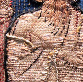
As I already told you in my earlier blog posts, these vestments saw extensive restoration in the 1840s. The addition of these silver passing threads on top of the columns was likely done then. It likely serves several purposes. Maybe some columns had so many damaged loose gold threads that this was a decorative way of cleaning things up. But it also does something else. This additional stitching likely goes through many of the layers that these vestments are made of. This stabilizes the whole construction. You often see horrible bulging on non-restored late-medieval vestments. By stitching through multiple layers, you have a chance to make things very stable and secure. It can't really bulge anymore. Is that was what attempted here? What do you think? Do you also feel that not all of the embroidery on these columns is original? My Journeyman and Master Patrons find a downloadable PDF of this tutorial on my Patreon page. After all, working layers of metal thread on top of each other is quite fun to do! Not sure how many of you studied last week's pictures of the Schlosser set of vestments in great detail. If you did, you might have spotted the same oddities as I did. For starters, there's the 'enhancement' of the faces with oil paint. Not an unusual practice. The skill needed to work these super fine silken stitches to render the faces was something that the restorers of these late-medieval embroideries could no longer do from about the 17th century onwards. Another thing which you might have spotted was the cutting up of orphreys. Some were made less wide (breast pieces of the dalmatics) and others were turned into real patchwork pieces to cover the ends of the sleeves of the dalmatics. But there is something else. And it reminded me of a 2021 French article on or nué that I had read a while ago. 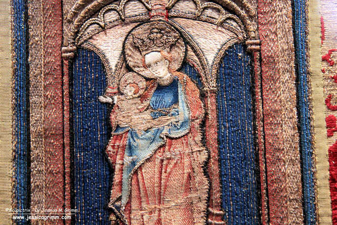 Mary with Child on the chasuble of the Schlosser Ornat, Inv. Nr. 124 I-III, Dommuseum Frankfurt. Do you notice something odd about the embroidery techniques used for Mary's clothing? The 'red' is clearly or nué. But what about the 'blue'? Let's zoom in a bit! 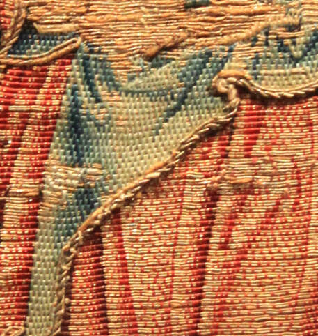 Detail of Mary with Child on the chasuble of the Schlosser Ornat, Inv. Nr. 124 I-III, Dommuseum Frankfurt. See?! The red is or nué. But the blue isn't. It is shaded brick stitching over pairs of gold threads. You could call this Burden Stitch. However, this stitch is commonly executed over a single gold thread. Odd. Since all of Mary's 'blue bits' are worked in this stitch you are forgiven for thinking that this is original. Luckily, John the Baptist can help us out here.
And here is John the Baptist. His outer garment is almost completely executed in beautifully shaded or nué. But look at his left shoulder. There's a patch of this other stitch again. Executed in colours that come close to the original, but that are not the same. This 'bastard' Burden stitch is thus clearly not original. It was likely used to repair the original or nué in the mid-19th century. Probably executed by the Cologne vestment maker and his two daughters. Why did they not simply repair the area with true or nué?
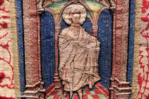
To me, or nué is a relatively simple embroidery technique. It has absolutely never intimidated me. Neither does silk shading or shaded art blackwork. There's a common theme here: I can shade. It does not matter to me if I have to do the shading as part of blackwork, with long-and-short stitch or over pairs of gold threads. Neither does it bother me that or nué and blackwork are counted thread techniques and silk shading is not. It is all just shading to me. However, being in the embroidery teaching business, I soon learned that there are roughly two types of embroiderers: those that can shade and those that can't. Embroiderers who can shade a little, do not seem to exist :). Embroiderers who are, at first, intimidated by or nué often quickly get comfortable with the technique when they realise that it is just counted silk shading over a pair of gold threads. That is: embroiderers who can shade. Those that can't shade, cannot work or nué. These modern observations make the embroidery on the chasuble of the Schlosser vestment set all the more intriguing. The 'bastard' Burden stitch on Mary is very well shaded. The embroiderer could shade! Why then did he or she not work true or nué? Was it a time issue? Or did he or she not recognise the or nué technique in the first place? The latter could really have been the case. According to a comprehensive study by Astrid Castres published in 2021, the technique of or nué might have been completely lost for a couple of hundred years. It was then likely re-discovered in the second half of the 19th century. Just slightly after the restauration of the Schlosser vestments. Fascinating, don't you think? Literature Castres, A. (2021): Des premiers témoins médiévaux aux broderies des Clarisses de Mazamet : une petite histoire de l’or nué (XIVe-XXe siècle), Patrimoines du Sud 14, pp. 1–27. One of the highlights of my museum tour at the end of November last year, was the Dommuseum Frankfurt. It has nine medieval embroidered vestments on permanent display. Well worth a visit! At the beginning of the year, I showed you a green chasuble with embroideries from the mid-14th century and the second quarter 15th century made in Cologne. This time, I will introduce you to the Schlosser vestment set with embroideries made in both the Netherlands and Cologne. Both were made around AD 1460. The or nue, or shaded gold, used on the figures is very beautiful. Let's have a look.
The Schlosser vestment set consists of a chasuble and two dalmatics. It was bought by Johann Friedrich Heinrich, known as Fritz Schlosser (1780-1851), a councillor from Frankfurt, in 1842/43 from the dealer Fontaine in Cologne. Fritz Schlosser asked his painter friend Edward von Steinle, a vestment maker in Cologne with his two daughters and painter and conservator Johann Anton Ramboux, also in Cologne, to restore the set. Apparently, the vestments were taken apart completely. Loose parts were affixed. But what really astonishes me, is that they treated the new gold threads with acid to make them look old. The vestment maker and his two daughters worked for about a year and were paid a 100 Taler (roughly €4243 today, according to some pretty tricky maths). This was not a living wage when compared to living costs around 1850 in this part of Germany. The vestment maker and his daughters must have had additional income. Thanks to the names and coats of arms embroidered onto the chasuble, we know where it originally came from. The names and coats of arms are of Merten Moench/Maarten Monicx (born in 's-Hertogenbosch (Netherlands), died 1466) councillor in Cologne and his wife Drutgin von den Groeven (died 1451). He probably donated the vestment set to a church in his hometown of 's-Hertogenbosch in 1460. Likely to the chapel of the Fraternity of Our Lady in the St. John's Cathedral. A couple of years later, Maarten also donated the orphreys for a cope. The fraternity had to provide for the fabric and the tailoring of the cope. Unfortunately, the cope has not survived.  Mary with Child on the back of the chasuble of the Schlosser Ornat, Inv. Nr. 124 I-III, Dommuseum Frankfurt. The curious thing about the embroideries on the Schlosser set of vestments is that they come from two different places. The orphreys on the chasuble were made in Cologne. We see a typical architectural background with saints standing on a tiled floor. However, instead of a golden background, the niche behind the figures consists of horizontally laid blue silk couched down with vertically laid gold. This is a technique not used in the Netherlands. 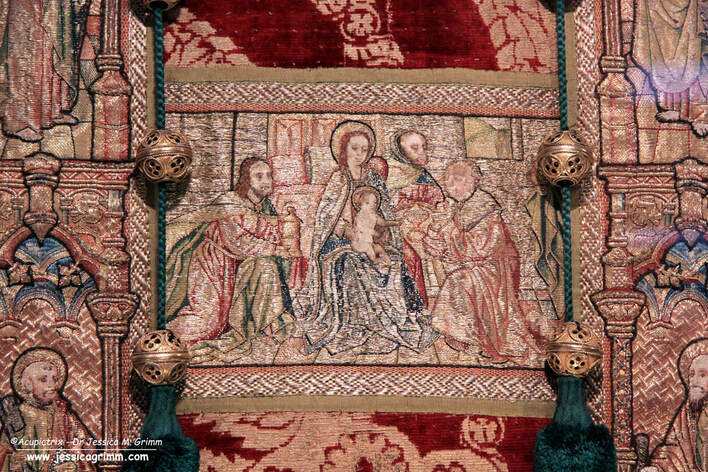 Detail dalmatic (Adoration of the Magi) of the Schlosser Ornat, Inv. Nr. 124 I-III, Dommuseum Frankfurt. Contrary, the embroideries on the dalmatics were made in the Netherlands. This time, the figures are completely stitched in or nue. The background of the niche in which the saints stand is filled with a basket weave diaper pattern in red. As the original silken stitches of the finely worked faces had fallen out, they were 'restored' with paint. Not sure if this was part of the 1842/43 restoration by the vestment maker of Cologne. Given that there were two accomplished painters in the group of restorers, it would not surprise me if one of them had wielded a brush.
By taking a picture under an angle, you can clearly see the different slips that make up the orphreys on the dalmatic. The or nue on the robes of Saint John is absolutely stunning. However, these orphreys are the product of mass production. An identical Saint John can be found on the other dalmatic too. And Saint John isn't the only one. We also have doppelgänger for Saint Paul, Saint Peter, Simon the Zealot, Gregory the Great, James the Great and Saint Andrew. James the Great is even found in the same spot ... And this is only on the front. The backs of the vestments are not really accessible and have not been published either.
Given the fact that Merten Moench was born in what is now the Netherlands and died in what is now Germany, it is probably not that surprising that orphreys from both places were used in this set of vestments. It is likely that the family of Merten moved freely in the area that's now the border between Germany and the Netherlands. What does strike me as odd is that the orphreys of the chasuble on the one hand and the orphreys on the dalmatics on the other hand are quite different. Apparently, this did not matter much to the people who made, gifted and used these vestments in the middle of the 15th century. My Journeyman and Master Patrons find 37 additional pictures of the vestments on my Patreon page. Your monthly contributions made this research possible. Thank you very much! Literature Fircks, Juliane von (2010): Serienproduktion im Medium mittelalterlicher Stickerei - Holzschnitte als Vorlagenmaterial für eine Gruppe mittelrheinischer Kaselkreuze des 15. Jahrhunderts. In: Uta-Christiane Bergemann, Annemarie Stauffer (Eds.): Reiche Bilder. Aspekte zur Produktion und Funktion von Stickereien im Spätmittelalter. Regensburg: Schnell & Steiner, pp. 65–82. Koldeweij, J., Vandenbroeck, P., Vermet, B., 2001. Hieronymus Bosch - das Gesamtwerk: [Katalog]. Belser, Stuttgart. Stolleis, Karen (1992): Der Frankfurter Domschatz: Die Paramente. Liturgische Gewänder und Stickereien 14. bis 20. Jahrhundert. Band I. Frankfurt am Main: Waldemar Kramer. Asking for beer at 9:30h in the morning raised a few eyebrows next door at the abbey. Assuring Friar Markus that it was needed for an embroidery experiment did not improve things much. But it was the truth. What had happened? During my talk for MEDATS, I asked the audience for help with the madder conundrum. Whilst oil will do the trick, the greasy halo is very unsightly. Afterwards, I was contacted by Deborah Fox, who had done some dyeing experiments herself and she suggested alcohol. Ale was omnipresent in the Middle Ages as most water was too polluted to drink. I had always dismissed this option as I had a feeling that the hydrophobic madder would still think beer was too watery. However, I live next door to Ettal Abbey and they have been brewing and making liqueur for hundreds of years. Friar Markus was kind enough to sponsor the experiment with some homemade booze. 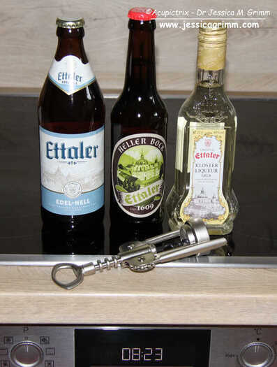 Pale lager, stout and Liqueur homemade at Ettal Abbey For the experiment, I dissolved (or tried to dissolve) an 8th of a teaspoon of madder powder into a teaspoon of pale lager (5.2%), a stout (7.2%) and liqueur (40%). I drew three 3x3 cm rectangles with iron gall ink on my normal white embroidery linen. 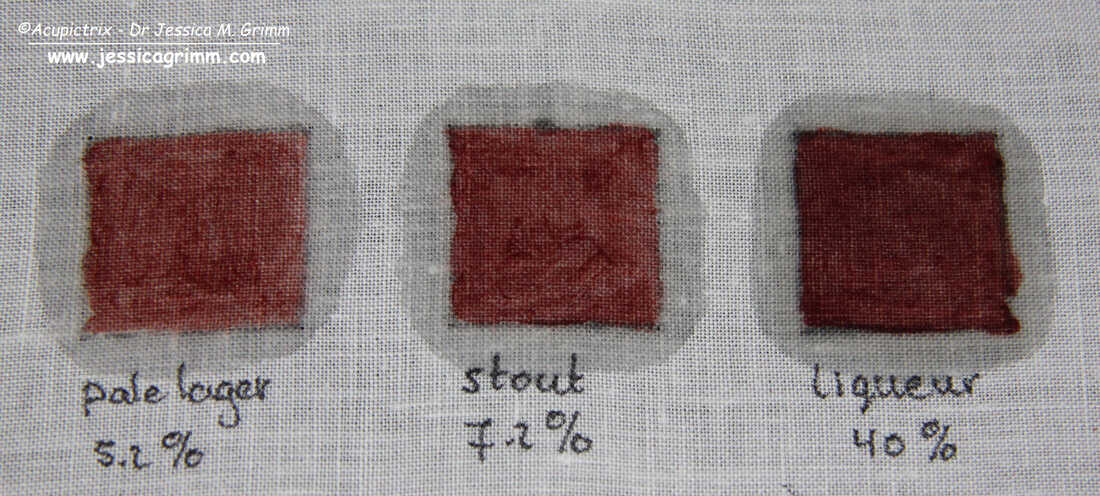 Paint-like substances made with madder powder and booze, still wet As I had expected, the pale lager and the stout were too watery for the madder's taste. It would not dissolve at all. But it did dissolve beautifully in the liqueur. And the smell was really nice too. Very herbal. 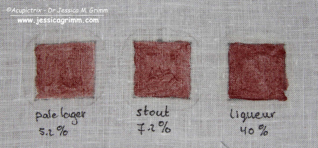 Paint-like substances made with madder powder and booze, dried I let the samples dry for a couple of hours. All did produce a bit of a halo but nothing too bad, I think. 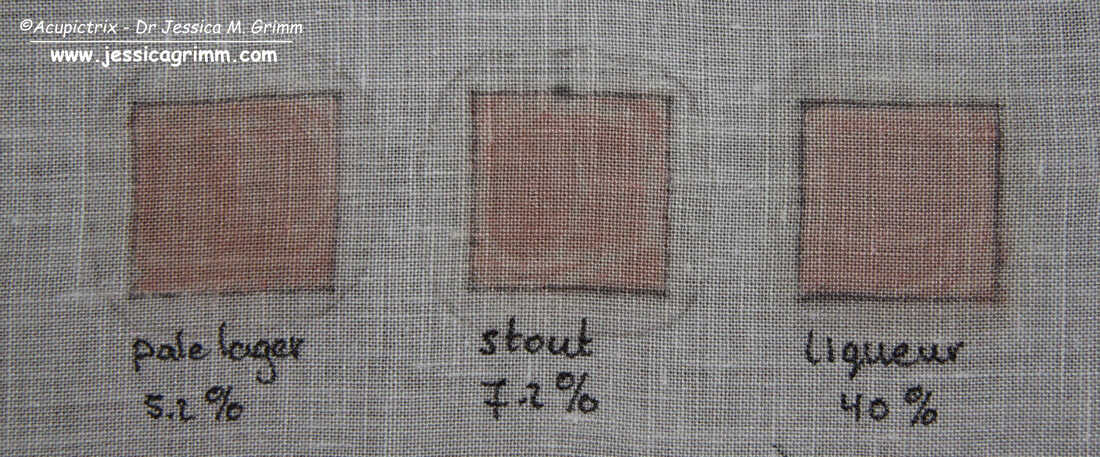 Paint-like substances made with madder powder and booze, after brushing When the samples were completely dry, I brushed off the excess madder powder. Oh, dear! We get a very similar result to my experiments with only water. The madder just does not go into the linen enough as it does with the oil. And we still have a halo. This probably means that booze isn't the complete solution either. Maybe several substances were mixed with the madder powder to get the right result? More experiments are needed!
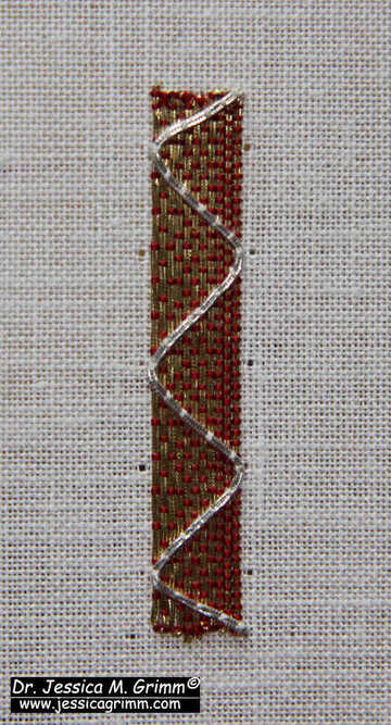
Two weeks ago, we looked at a late 15th century embroidered chasuble kept in the Domschatz of Fritzlar. It had these lovely textured bands or borders between the individual orphreys. The border is made my couching gold threads and coloured silks over string padding. It seems to be a very 'Central European' thing to do. The technique is not difficult at all and would look great in a modern piece of goldwork embroidery or on a piece of needlepoint/canvaswork. So, let me show you how it is done. As always, my Journeyman and Master Patrons can download a practical PDF with all the instructions from my Patreon page. 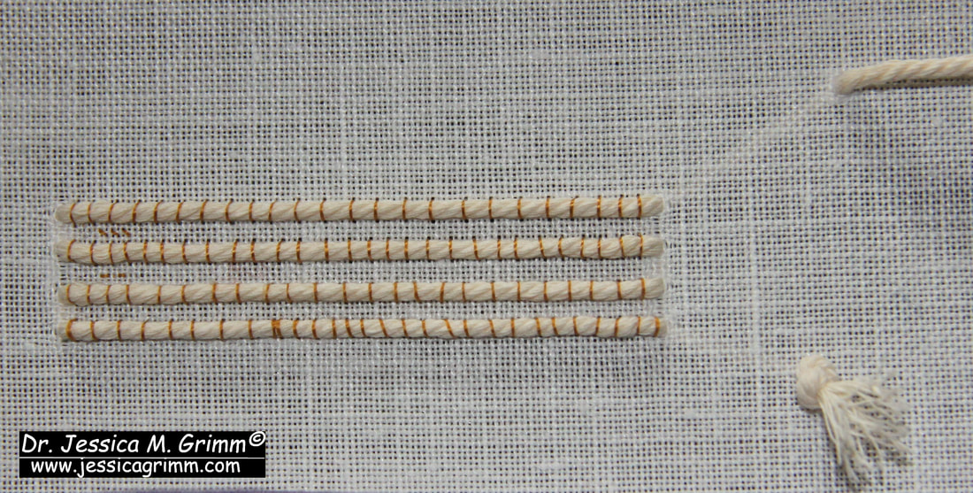 Tutorial for a padded goldwork border Start by couching down four parallel rows of padding thread or string on your embroidery linen. I am working on a 46ct evenweave. For my couching thread, I used DeVere yarns #6 silk in a gold colour. 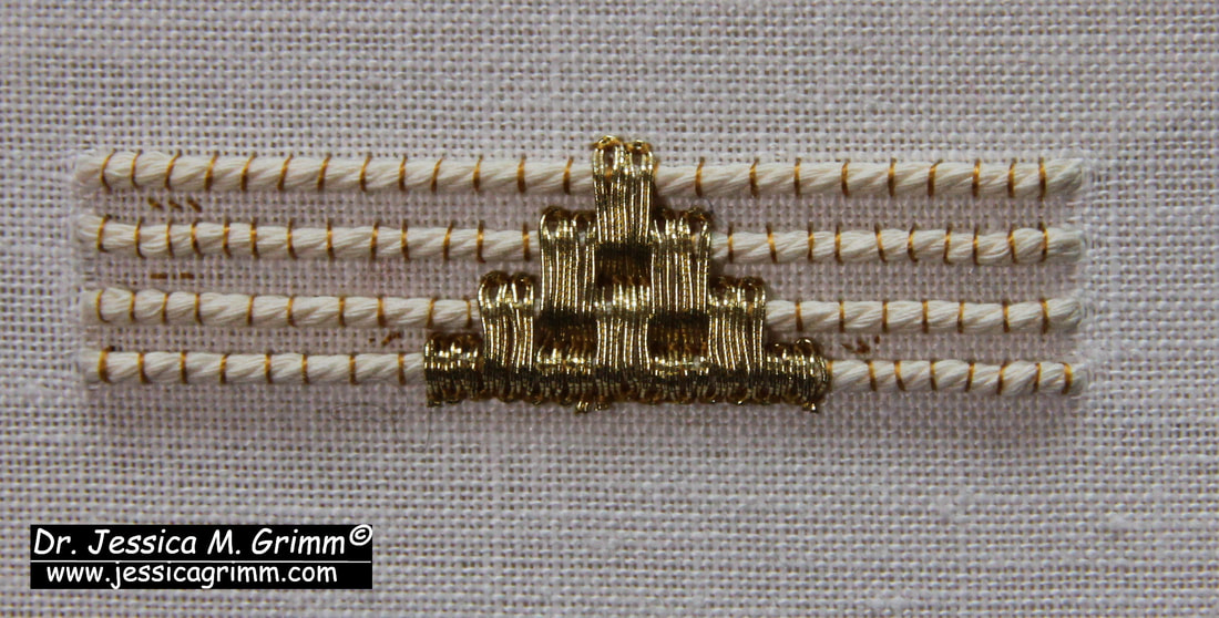 Tutorial for a padded goldwork border By looking closely at the original, I could see that the gold threads were applied first followed by the silk. The golden triangles consists of 7 blocks of 4 rows of gold thread. The gold threads are couched down in pairs. I've used a passing thread #3 and the same DeVere yarns gold-coloured silk. Start from the middle. As the border is quite narrow, your gold threads need a lot of manipulation at the turns. Tweezers might come in handy and you might need an extra couching stitch in the turn. As silk is very slippery, I like to go over my couching stitches twice (i.e. place two couching stitches on top of each other). Alternatively, you can wax your silk thread. Remove any exess wax crumbs before you start to stitch. 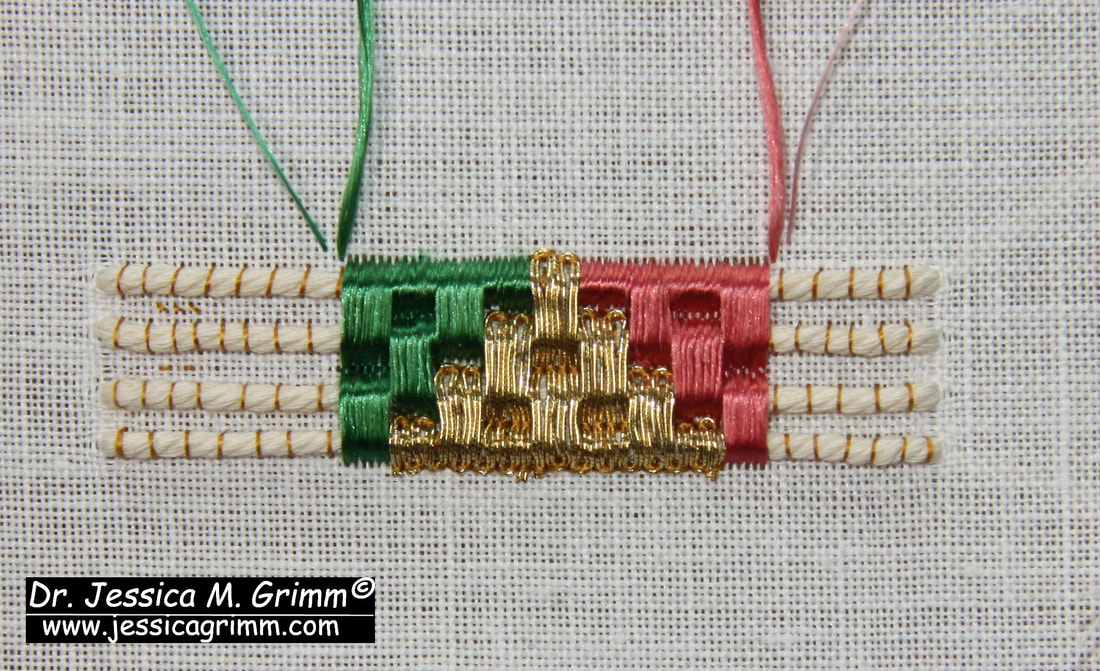 Tutorial for a padded goldwork border In the original, it becomes clear that the embroiderer went over the turns with their silks when they added the silken triangles. That's how I can see that the gold was stitched first. However, I don't like that as your silk snags so easily on the gold. Instead, I angled my needle under the turns. I've used Au ver a soie ovale with a matching colour DeVere yarns #6 for the couching. Start with only half a silken triangle. Measure the top of the golden triangle and match that for the silken triangles. 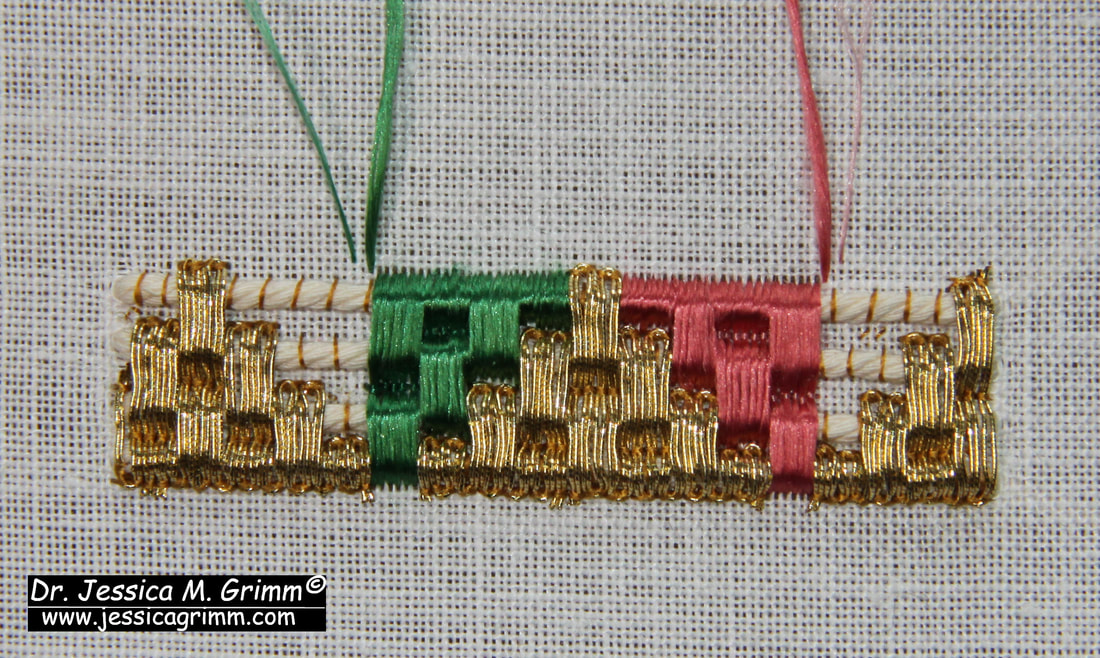 Tutorial for a padded goldwork border Add golden triangles before finishing the silken triangles. Your threads will have a tendency to roll off the end of your string padding. In the original, this was solved with a red binding. Very clever indeed. 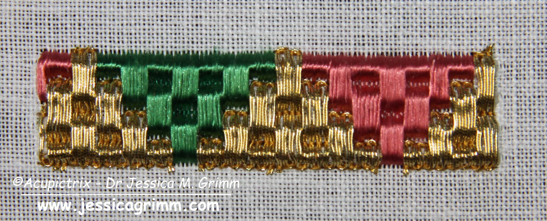 Tutorial for a padded goldwork border And this is what my finished sample looks like. Wouldn't it be fun to figure out how to turn a 90 degree corner with this technique?
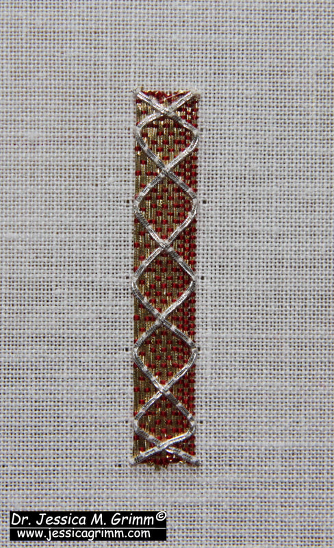
When we looked at the embroidered chasuble from Fritzlar with the Virgo inter Virgines iconography last week, I was sure that I would be able to find many Doppelgänger. I had seen this iconography many times before and I was quite sure that these pieces were all very similar. Nope. They are not. As soon as you start to look at these pieces in more detail you will find that they are all different. Either in the placement of the individual figures and/or in the embroidery techniques used. Now what does this mean? On the one hand, these pieces are readily recognisable as a group and on the other hand, they are all different. This, I think, must mean that there was a late medieval model book that was in use by embroiderers in Central Europe. As no medieval model books used by embroiderers seem to have survived, reconstructing one using actual medieval goldwork embroidery is pretty exciting.
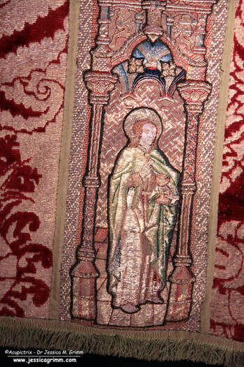
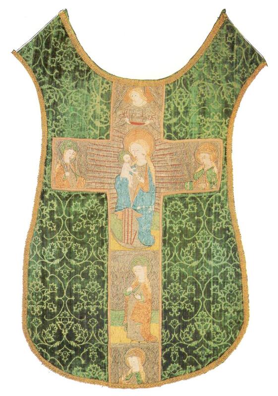
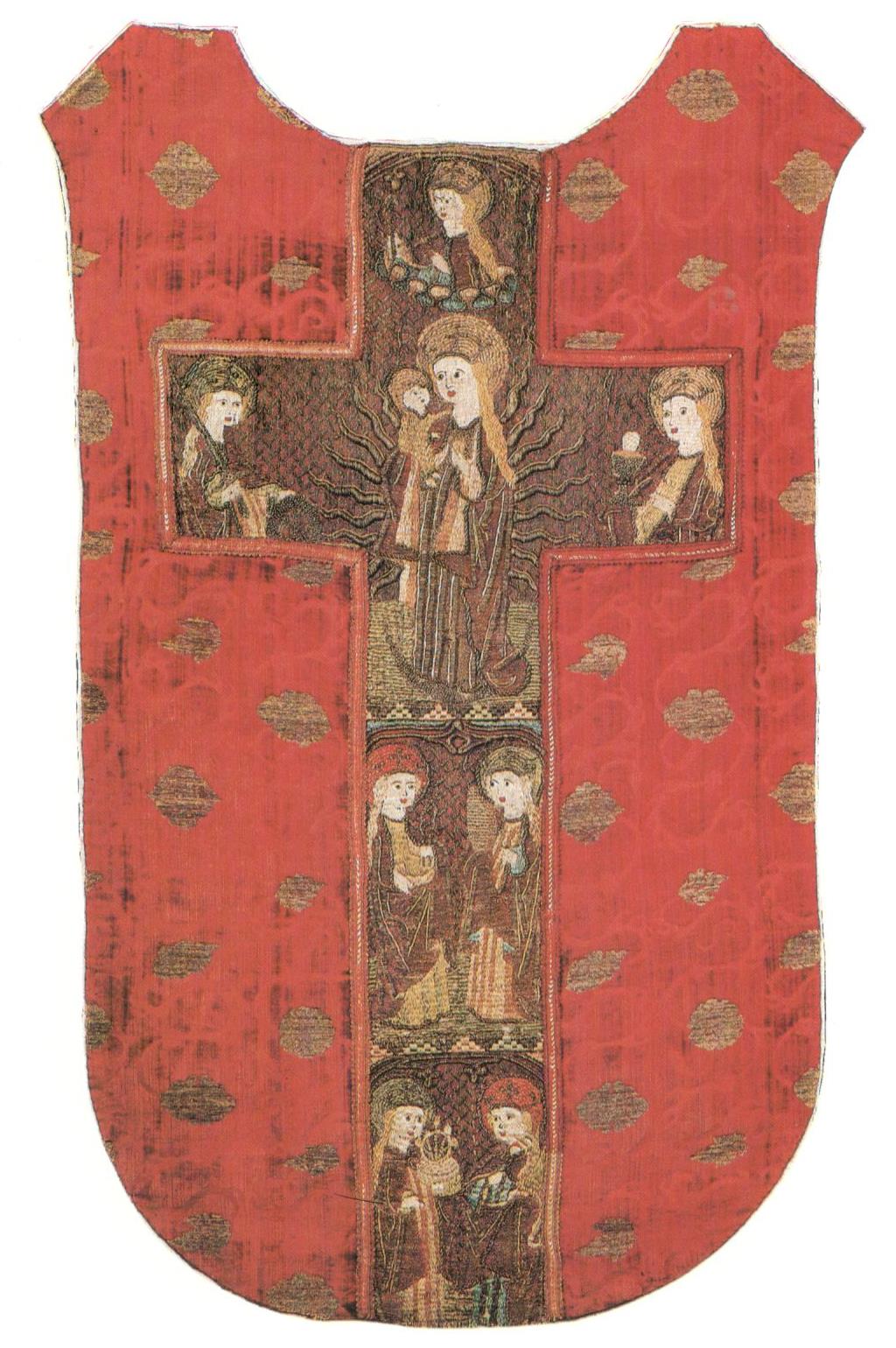
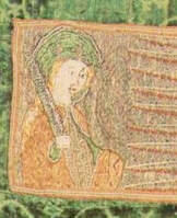
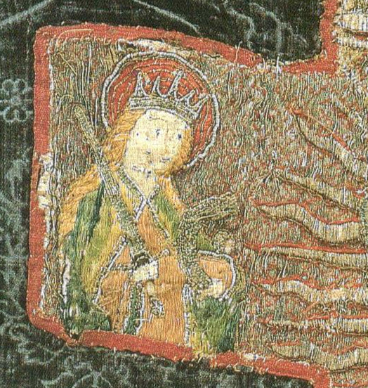
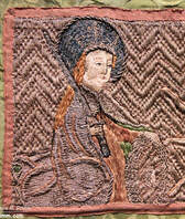
Here you see two typical embroidered chasuble crosses showing the Virgo inter Virgines from the late 15th century. The left chasuble was made in Austria in the second half of the 15th century and is kept at the Hungarian Museum of Applied Arts. The piece on the right is part of the private collection of the Bernheimer family. It was made in Southern Germany shortly before AD 1500. In both embroideries, Mary is depicted as the Madonna with child standing on the crescent moon with rays of light behind her. This 'Mondsichelmadonna' was very popular in the 15th century and refers to the Woman of the Apocalypse. On both embroidered chasubles the figures accompanying the Madonna in the large top orphrey are Catherine of Alexandria (with sword) on the left and Saint Barbara (with chalice) on the right. Everything else differs. No angel is crowning Mary on the Bernheimer chasuble. The figures in the two smaller orphreys below the Madonna differ for both embroideries too. On the left, we see Saint Apollonia (?) followed by Saint Ursula. On the right, we see Mary Magdalene followed by Catherine of Siena (?). When we look at the embroidery techniques used, there are differences but also many similarities. For starters, the colours used are very similar. There's mainly blue for Mary and a combination of green and orange for the other virgins. Both embroideries use the same diaper pattern for the golden background: open basket weave. Couched down with a yellow thread for the piece from Austria and couched down with a red thread for the piece from Southern Germany. The treatment of the halos is also identical. There's a layer of silken flat stitches as the base with a couched gold thread on top. The halo is edged with one of these composite threads: a thick textile yarn with a gold thread wound around it. This is sometimes called gold gimp in the German literature. These similarities in both iconography and embroidery techniques show that these pieces are made in the same geographical area. After all, Southern Germany shares a border with Austria. The differences show that the pieces were not made in the same town or guild. Likely, the customer could choose which additional figures to add to the central scene of the Madonna. These additional figures likely had some special meaning for the customer. As the iconography of the Virgo inter Virgines is strongly associated with convents, name days and patron saints of the nuns probably played a role here.
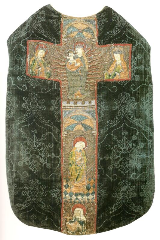
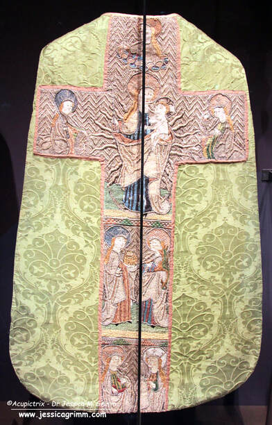
And here you see the other main type of the Virgo inter Virgines iconography. The central top orphrey with the Madonna is very similar to that of the two previous examples (Catherine, Ursula, Barbara and Madonna). However, the two smaller orphreys below now show two saints each. We see Dorothea of Caesarea (basket) with Margaret the Virgin (dragon) and Saint Apollonia (thongs with tooth) with Mary Magdalene (ointment box). These two chasuble crosses are identical in their iconography. The treatment of Saint Ursula on a cloud above the Madonna is only seen on these two embroideries as far as I am aware. But there is more. There are other identical embroidery techniques too. See the bands that separate the different orphreys? They are made by couching silk and gold threads over horizontal string padding. And they are identical on both embroidered chasuble crosses. To me, this suggests that both embroideries were made in the same town. Will we ever find out which one?
And when we look at the Saint Catherine's of all four embroidered chasuble crosses, they look pretty similar. How did this happen? In the 15th century, ecclesiastical embroidery had already evolved into mass production. Certain scenes were very popular and every self-respecting church wanted them. The 15th century also saw the invention of block book printing (major centres in the South of Germany) and the printing press (invented in Mainz, Central Germany). Likely, cheap block books with simple line drawings of the different Virgins existed in this geographical area too. These would have been used in the embroidery workshops as design inspiration. Designs would have been drawn free-hand or by using a grid to enlarge them more easily. Especially the faces differ between the various versions of a particular figure. This seems to be quite understandable as this is the hardest thing to get right in both drawing and subsequent embroidering.
By consequently digitizing these embroidered figures into line drawings and combining these with the used embroidery techniques, I have a feeling that it should be possible to group them. This hopefully leads to more precise provenances for these embroidered chasuble crosses. It should also help with the identification of incomplete figures on cut orphreys. I am planning to spend my summer holiday learning how to digitize with the help of Inkccape. In the meantime, I am collecting the Virgo inter Virgines embroideries on a Padlet for my Journeyman and Master Patrons to enjoy. Next week, we will work a practical sample based on the above embroideries! |

Want to keep up with my embroidery adventures? Sign up for my weekly Newsletter to get notified of new blogs, courses and workshops!
Liked my blog? Please consider making a donation or becoming a Patron so that I can keep up the good work and my blog ad-free!

Categories
All
Archives
July 2024
|


 RSS Feed
Contact: info(at)jessicagrimm.com
Copyright Dr Jessica M. Grimm - Mandlweg 3, 82488 Ettal, Deutschland - +49(0)8822 2782219 (Monday, Tuesday, Friday & Saturday 9.00-17.00 CET)
Impressum - Legal Notice - Datenschutzerklärung - Privacy Policy - Webshop ABG - Widerrufsrecht - Disclaimer
Copyright Dr Jessica M. Grimm - Mandlweg 3, 82488 Ettal, Deutschland - +49(0)8822 2782219 (Monday, Tuesday, Friday & Saturday 9.00-17.00 CET)
Impressum - Legal Notice - Datenschutzerklärung - Privacy Policy - Webshop ABG - Widerrufsrecht - Disclaimer